Unlock a world of possibilities! Login now and discover the exclusive benefits awaiting you.
- Qlik Community
- :
- All Forums
- :
- QlikView App Dev
- :
- Creating a bar chart of hours worked per person
- Subscribe to RSS Feed
- Mark Topic as New
- Mark Topic as Read
- Float this Topic for Current User
- Bookmark
- Subscribe
- Mute
- Printer Friendly Page
- Mark as New
- Bookmark
- Subscribe
- Mute
- Subscribe to RSS Feed
- Permalink
- Report Inappropriate Content
Creating a bar chart of hours worked per person
Mighty and benevolent Qlik community,
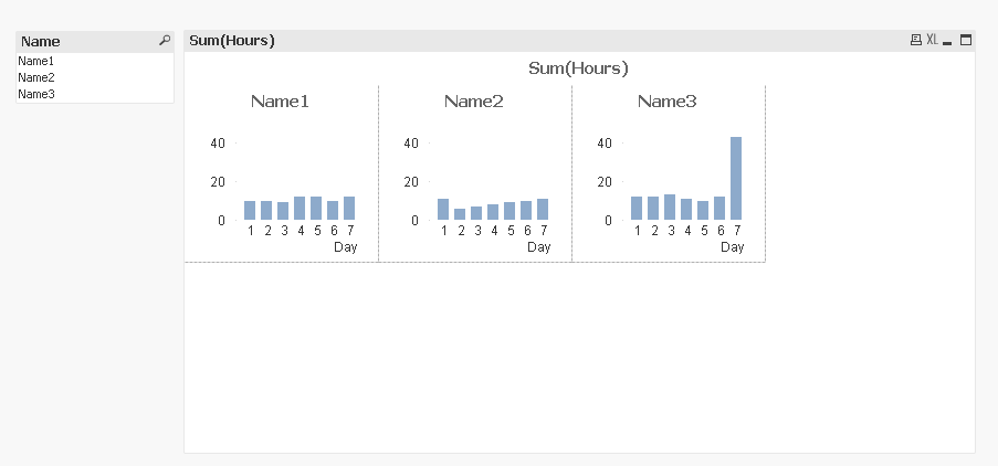
I am trying to create a chart that allows me to show a bar chart of hours worked per day for resources in my company. So I want something that looks like this:
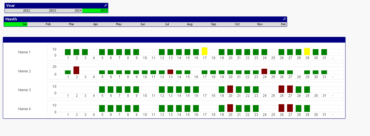
Now quite clearly I have achieved this. My problem is that I am not that smart so I have done this by creating multiple bar charts and multiple name tabs then I added them to a container. The problem with this is that I cannot dynamically select names.
My question, quite simply, is whether anybody has come across something like this? Alternatively is there a better way of building the structure in Qlikview?
Any help would be appreciated as I will otherwise be tied to be the administrator for this for ever more.
Mike
Accepted Solutions
- Mark as New
- Bookmark
- Subscribe
- Mute
- Subscribe to RSS Feed
- Permalink
- Report Inappropriate Content
- Mark as New
- Bookmark
- Subscribe
- Mute
- Subscribe to RSS Feed
- Permalink
- Report Inappropriate Content
Hi Mike
have you tried using a trellis chart?
Andy
- Mark as New
- Bookmark
- Subscribe
- Mute
- Subscribe to RSS Feed
- Permalink
- Report Inappropriate Content
Thanks Andrew, I spent hours clicking buttons looking for that, perfect!
- Mark as New
- Bookmark
- Subscribe
- Mute
- Subscribe to RSS Feed
- Permalink
- Report Inappropriate Content
You're Welcome!
Andy