Unlock a world of possibilities! Login now and discover the exclusive benefits awaiting you.
- Qlik Community
- :
- All Forums
- :
- QlikView App Dev
- :
- Creation of Line chart
- Subscribe to RSS Feed
- Mark Topic as New
- Mark Topic as Read
- Float this Topic for Current User
- Bookmark
- Subscribe
- Mute
- Printer Friendly Page
- Mark as New
- Bookmark
- Subscribe
- Mute
- Subscribe to RSS Feed
- Permalink
- Report Inappropriate Content
Creation of Line chart
Hi
I'm having difficulty creating a line chart with my data.
I have the following twelve fields that have a value and each field relates to a month ( See Below)
WOG001 = £100
WOG002 = £150
WOG003 = £300
And so on through to 012
I want to create a line chart that accumulates the fields for each period
Period 1 = WOG001 = £100
Period 2 = WOG001 + WOG002 = £200
And so on
At the moment the data set does not contain a year or period field and I'm having trouble working out how I can create a line chart that has year and period on the horizontal and value as the vertical. The fields above only contain a value and it is the field itself that defines that it relates to a particular period.
- Tags:
- qlikview_scripting
- « Previous Replies
-
- 1
- 2
- Next Replies »
- Mark as New
- Bookmark
- Subscribe
- Mute
- Subscribe to RSS Feed
- Permalink
- Report Inappropriate Content
Hi I can't see an attachement
- Mark as New
- Bookmark
- Subscribe
- Mute
- Subscribe to RSS Feed
- Permalink
- Report Inappropriate Content
Hi
Can you explain
1. The reason for the dummy field
2. The code in T2 and what it is doing
I've created the code and I get output but now not sure what the row is for or the Kum
- Mark as New
- Bookmark
- Subscribe
- Mute
- Subscribe to RSS Feed
- Permalink
- Report Inappropriate Content
Hi Andrew,
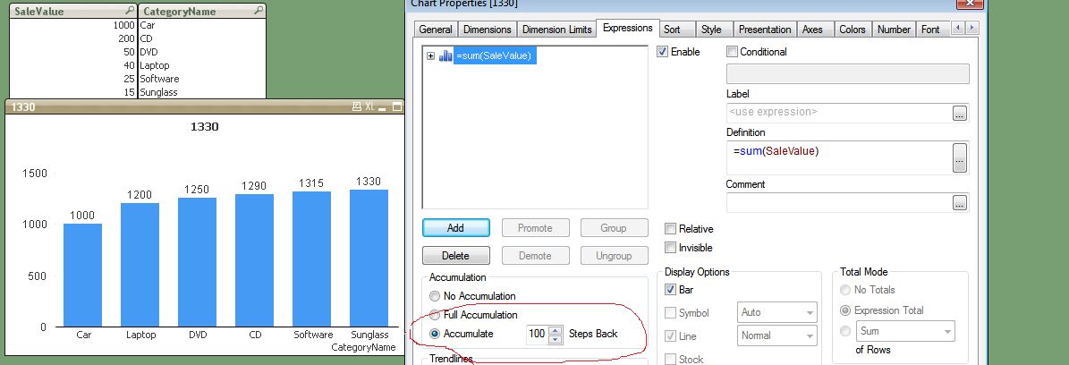
like this?
- Mark as New
- Bookmark
- Subscribe
- Mute
- Subscribe to RSS Feed
- Permalink
- Report Inappropriate Content
Weird, I can see it attached, Ahh! you need to open the original thread.
Andy
- Mark as New
- Bookmark
- Subscribe
- Mute
- Subscribe to RSS Feed
- Permalink
- Report Inappropriate Content
The crosstable-statement needs at least one category-column and because your source seems to miss such column I have created this dummy. The second load is here only to show that you could easily cumulate values within the script but this could also be done within the charts.
- Marcus
- « Previous Replies
-
- 1
- 2
- Next Replies »