Unlock a world of possibilities! Login now and discover the exclusive benefits awaiting you.
- Qlik Community
- :
- All Forums
- :
- QlikView App Dev
- :
- Custom y-axis values
- Subscribe to RSS Feed
- Mark Topic as New
- Mark Topic as Read
- Float this Topic for Current User
- Bookmark
- Subscribe
- Mute
- Printer Friendly Page
- Mark as New
- Bookmark
- Subscribe
- Mute
- Subscribe to RSS Feed
- Permalink
- Report Inappropriate Content
Custom y-axis values
Hi,
I'm trying to produce a chart with string labels for the y-axis. The y-axis is currently numeric and is the result of a calculation.
Data is like this:
LOAD * INLINE [
Month, Class, Value
Jan, A, 200
Jan, B, 300
Jan, C, 200
Feb, A, 150
Feb, B, 100
Feb, C, 600
];
This is transformed as follows:
round( sum(if( Class='A',(1*Value), if( Class='B',(2*Value), 3*Value))) / sum(Value) )
To give these weighted values (this is what I have):
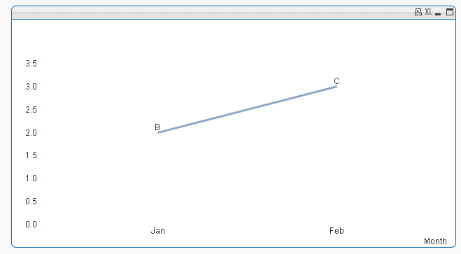
Jan, 2
Feb, 3
No I want to get to a chart showing:
Jan, B
Feb, C
I haven't been able to figure out if Dual() can be used for this.
Any help would be greatly appreciated
Regards
Rutger
Accepted Solutions
- Mark as New
- Bookmark
- Subscribe
- Mute
- Subscribe to RSS Feed
- Permalink
- Report Inappropriate Content
- Mark as New
- Bookmark
- Subscribe
- Mute
- Subscribe to RSS Feed
- Permalink
- Report Inappropriate Content
Are you looking for something like this?
- Mark as New
- Bookmark
- Subscribe
- Mute
- Subscribe to RSS Feed
- Permalink
- Report Inappropriate Content
Hi Sunny,
Yes, it comes close but is it possible to get the Y-axis to show A, B, where it currently shows 1, 2 & 3?
Thanks very much,
Rutger