Unlock a world of possibilities! Login now and discover the exclusive benefits awaiting you.
- Qlik Community
- :
- All Forums
- :
- QlikView App Dev
- :
- Re: Date problems
- Subscribe to RSS Feed
- Mark Topic as New
- Mark Topic as Read
- Float this Topic for Current User
- Bookmark
- Subscribe
- Mute
- Printer Friendly Page
- Mark as New
- Bookmark
- Subscribe
- Mute
- Subscribe to RSS Feed
- Permalink
- Report Inappropriate Content
Date problems
Hi all
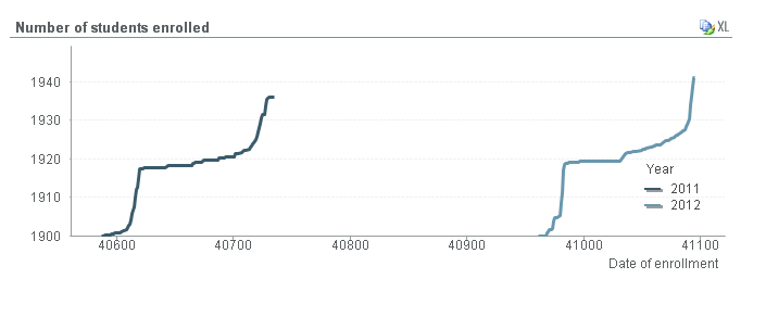
I've run into two problems with a line chart showing accumulated number of students enrolled per date over a period from March 1st to July 7th.
Problem 1:
The problem is that I want to show two years on the same chart, but I can't seem to find a dateformat that convert my variable "Date of Enrollment (format=DDMMYYYY) to just days and month. Therefore the chart looks like the one underneath here. Can anyone help me on this? Or maybe there is another clever way?

Problem 2:
Secondly I need to make a similar chart on the same data, but restricted to the last 10 days og June and the first 7 days of July. Is that possible to achieve with a conditionally expression (if yes, How?).
I hope someone can help me
Thanks a lot
Cheers
Bruno
- Mark as New
- Bookmark
- Subscribe
- Mute
- Subscribe to RSS Feed
- Permalink
- Report Inappropriate Content
Hi,
it is possible to provide test data .
Regards
![]()
![]()
![]()
- Mark as New
- Bookmark
- Subscribe
- Mute
- Subscribe to RSS Feed
- Permalink
- Report Inappropriate Content
Yes
Here you go ![]()
Thanks
Bruno
- Mark as New
- Bookmark
- Subscribe
- Mute
- Subscribe to RSS Feed
- Permalink
- Report Inappropriate Content
See attached qvw.
talk is cheap, supply exceeds demand
- Mark as New
- Bookmark
- Subscribe
- Mute
- Subscribe to RSS Feed
- Permalink
- Report Inappropriate Content
Hi,
Problem 1:
Convert date to day number :-
=Day(DATE)
= Month(DATE)
Problem 2:
Expert might be able to help
Let me know if Problem 1 is solved.
Regards,
Gabriel
- Mark as New
- Bookmark
- Subscribe
- Mute
- Subscribe to RSS Feed
- Permalink
- Report Inappropriate Content
Hi Gysbert
Thanks for the answer and sorry for the late reply. Took monday off after Superbowl ![]()
I'm still having some problems though. I also want to accumulate data in the chart that's just showing a particular timeperiode but if I thick off the "Full accumulation" in the second chart you've made, it starts accumulating at 0.
If this is hard to change in QV its possible for me to maniputate my rawdata instead (I'm using SAS to "wash" my data before it's shown in a BI-system). However if there is an easy way to do it in QV its preferred ![]()
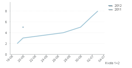
And another problem I came across. I have a selection making it possible to choose a single education (for example "Biology" or "Construction Engineering"). However if there is only one application within the chosen timeperiod I only get a dot, even though I've thicked of "Full accumulation" (see chart underneath). How can I get it to draw a straight line between the first and the last date at the chart?

Thanks in advance
Cheers Bruno
- Mark as New
- Bookmark
- Subscribe
- Mute
- Subscribe to RSS Feed
- Permalink
- Report Inappropriate Content
Hi all
Thanks for your replies, but I'm still having some problems though. I also want to accumulate data in the chart that's just showing a particular timeperiode but if I thick off the "Full accumulation" in the second chart you've made, it starts accumulating at 0.
If this is hard to change in QV its possible for me to maniputate my rawdata instead (I'm using SAS to "wash" my data before it's shown in a BI-system). However if there is an easy way to do it in QV its preferred ![]()
And another problem I came across. I have a selection making it possible to choose a single education (for example "Biology" or "Construction Engineering"). However if there is only one application within the chosen timeperiod I only get a dot, even though I've thicked of "Full accumulation" (see chart underneath). How can I get it to draw a straight line between the first and the last date at the chart?
Thanks in advance
Cheers Bruno
