Unlock a world of possibilities! Login now and discover the exclusive benefits awaiting you.
- Qlik Community
- :
- All Forums
- :
- QlikView App Dev
- :
- Re: Day of Week chart
- Subscribe to RSS Feed
- Mark Topic as New
- Mark Topic as Read
- Float this Topic for Current User
- Bookmark
- Subscribe
- Mute
- Printer Friendly Page
- Mark as New
- Bookmark
- Subscribe
- Mute
- Subscribe to RSS Feed
- Permalink
- Report Inappropriate Content
Day of Week chart
Hello -
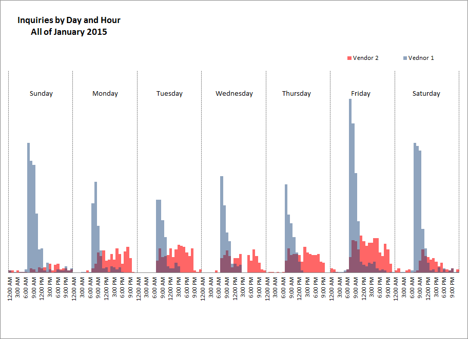
I have created a chart in excel that i would like to replicate in QV. It is a sum of inquiries broken down by hour within each day of the week for a whole month. When I create the bar chart, i used 2 dimensions (hour and day) and summed my inquires for the total. However, the x-axis will not display in the same fashion as my example, nor can i get different colors for the 2 vendors. Any insight would be appreciated. Excel example below:
- Mark as New
- Bookmark
- Subscribe
- Mute
- Subscribe to RSS Feed
- Permalink
- Report Inappropriate Content
hi Adam,
I had a similar graph to be build, the best way to do so is create a create a drill down group
In Hierarchial order like:
-day
-hr
and set the above group as one dimension and vendor as your second dimesion, it will get closer to your expectation.
- Mark as New
- Bookmark
- Subscribe
- Mute
- Subscribe to RSS Feed
- Permalink
- Report Inappropriate Content
PERFECT! Thank you, Saurabh.