Unlock a world of possibilities! Login now and discover the exclusive benefits awaiting you.
- Qlik Community
- :
- All Forums
- :
- QlikView App Dev
- :
- Defining range based on series of values and creat...
- Subscribe to RSS Feed
- Mark Topic as New
- Mark Topic as Read
- Float this Topic for Current User
- Bookmark
- Subscribe
- Mute
- Printer Friendly Page
- Mark as New
- Bookmark
- Subscribe
- Mute
- Subscribe to RSS Feed
- Permalink
- Report Inappropriate Content
Defining range based on series of values and creating a bar chart based on that
Hi Guys,
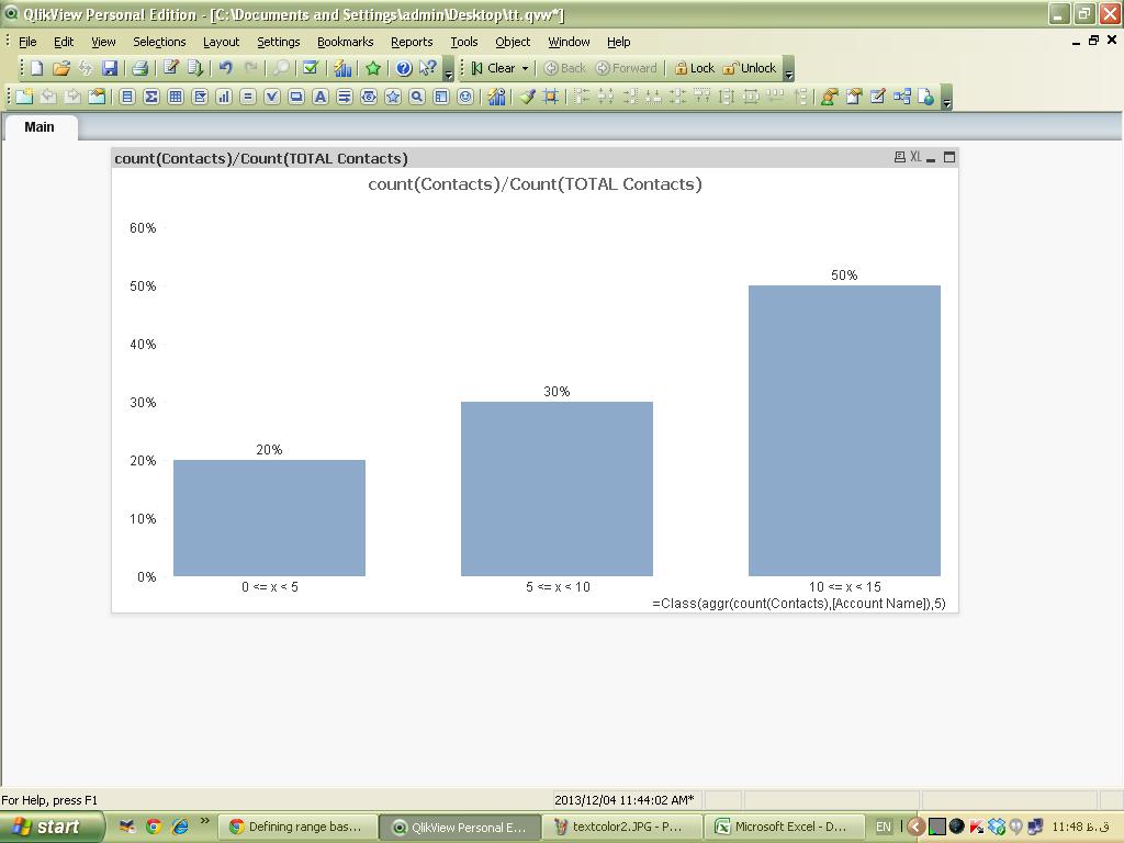
I have come across a problem. I have different accounts and each account have multiple contacts.
I want to create a chart which shows the x% of accounts (in Y axis) have contacts in range 1-5, 6-10, etc.(on X axis).
I am attching a excel file with dummy data.
Please help me out.
- Mark as New
- Bookmark
- Subscribe
- Mute
- Subscribe to RSS Feed
- Permalink
- Report Inappropriate Content
Hi Rishikesh,
Check the attached QVW for the solution.
Thanks,
Shruthi
- Mark as New
- Bookmark
- Subscribe
- Mute
- Subscribe to RSS Feed
- Permalink
- Report Inappropriate Content
PFA
Hope this will help you
-Nilesh
- Mark as New
- Bookmark
- Subscribe
- Mute
- Subscribe to RSS Feed
- Permalink
- Report Inappropriate Content
hi
please check this
hope it helps u
- Mark as New
- Bookmark
- Subscribe
- Mute
- Subscribe to RSS Feed
- Permalink
- Report Inappropriate Content
Guys..thank you very much for your replies. I really appreciate all of yours solutions, but Shruthi's solution served my purpose the best, Thanks Shruthi and thanks all of you 
- Mark as New
- Bookmark
- Subscribe
- Mute
- Subscribe to RSS Feed
- Permalink
- Report Inappropriate Content
Hi Rishikesh,
Please mark the question as answered.