Unlock a world of possibilities! Login now and discover the exclusive benefits awaiting you.
- Qlik Community
- :
- All Forums
- :
- QlikView App Dev
- :
- Re: Different Colors in Grouped Bar chart
- Subscribe to RSS Feed
- Mark Topic as New
- Mark Topic as Read
- Float this Topic for Current User
- Bookmark
- Subscribe
- Mute
- Printer Friendly Page
- Mark as New
- Bookmark
- Subscribe
- Mute
- Subscribe to RSS Feed
- Permalink
- Report Inappropriate Content
Different Colors in Grouped Bar chart
Hi All,
I need to create a bar chart based on below attached data. Need to create a bars based on Field data. Again I need variant different colours based on Field1.
The output needs like below Capture image with two colours for total tickets as it's combination of two fields data(
| Back log |
Received) |
and with two colours for Open tickets as it's combination of two fields data(
| Pending with user/Vendor |
Inprogress) |
- Mark as New
- Bookmark
- Subscribe
- Mute
- Subscribe to RSS Feed
- Permalink
- Report Inappropriate Content
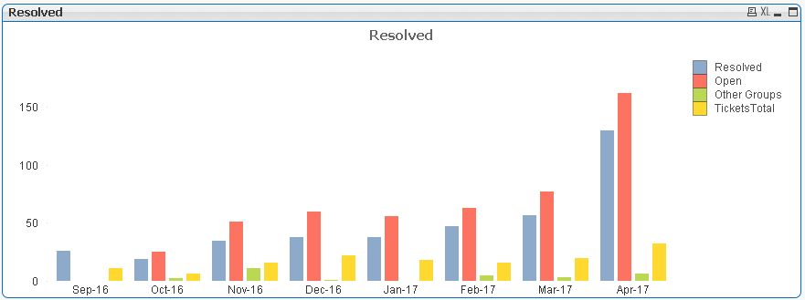
Something like this?
You have to transform your data using Enable Transformation Step from TableFiles. It is not straight forward. Let me know if this is what you are looking?
- Mark as New
- Bookmark
- Subscribe
- Mute
- Subscribe to RSS Feed
- Permalink
- Report Inappropriate Content
Yes, But in the Tickets total i need to represent two colours like stacked bar that represent the Backlog and Received Information and for other one more bar also same represent two colours in the same bar that will represent the Inprogress and Pending with User/vendor data.
- Mark as New
- Bookmark
- Subscribe
- Mute
- Subscribe to RSS Feed
- Permalink
- Report Inappropriate Content
You excel sheet data is not consistent, can you give me some comprehensive data sample with good field names.
- Mark as New
- Bookmark
- Subscribe
- Mute
- Subscribe to RSS Feed
- Permalink
- Report Inappropriate Content
That is my original data bro...
Attached image is the required output and need to add colours to the bars based on the field1 data.
- Mark as New
- Bookmark
- Subscribe
- Mute
- Subscribe to RSS Feed
- Permalink
- Report Inappropriate Content
You are basically asking a Grouped chart combined with stacked bar chart for few expressions? Are you ? If yes, it is not possible to have Grouped and Stacked in the same chart. You have to use layover charts for that. Like two bar charts with one transparent.
Read here:
Combination of grouped and stacked bar chart (s... | Qlik Community