Unlock a world of possibilities! Login now and discover the exclusive benefits awaiting you.
- Qlik Community
- :
- All Forums
- :
- QlikView App Dev
- :
- Re: Displaying Million, Billion etc
- Subscribe to RSS Feed
- Mark Topic as New
- Mark Topic as Read
- Float this Topic for Current User
- Bookmark
- Subscribe
- Mute
- Printer Friendly Page
- Mark as New
- Bookmark
- Subscribe
- Mute
- Subscribe to RSS Feed
- Permalink
- Report Inappropriate Content
Displaying Million, Billion etc
Greetings 
I want to display thousands, millions, billions etc. I came across this thread https://community.qlik.com/thread/117407
Mr. Marco Wedel solution suits my needs.
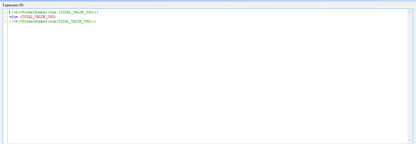
SET vSize = Div(Log10($1),3);
SET vFormatNumber = Dual(Num($1/Pow(10,3*$(vSize($1))),'#,##0')&' '&Pick($(vSize($1)),'K','Mil','Bil','Tril'),$1);
In my Analysis I have Dimension Month, My current Expression
=Sum(TOTAL_VALUE_USD)
I added the above two lines of code in my Script (Control + E)
Used the following expression
=$(vFormatNumber(Sum (TOTAL_VALUE_USD)))
The value on Data points displayed on the chart is not displaying Mil, bil etc
How do I display Millions, Billions on Value on Data Points?
Thank you
Accepted Solutions
- Mark as New
- Bookmark
- Subscribe
- Mute
- Subscribe to RSS Feed
- Permalink
- Report Inappropriate Content
Yes, you're right.
I only tried to show in data point 'Mil', because I saw that your data were in that order of magnitude.
Loading param data, as was my first attempt (it was in the app that I loaded in my previous post), you can get 'Mil' or 'Bil' in data point, setting Expression Default in Chart Properties-Number, but only if you don't enter any Million, Billion, etc. Symbol for axis.
I conclude that 'Mil', 'Bil', etc symbol that QlikView show on axis is referred also to data point values.
My imagination suggest me a not-elegat solution: you can do a chart with data point showed in million and make transparent all other element in this second chart.
Then you will place it on another chart, with Thousand, Million, Billion Symbol filled.
As data source is the same, charts will update together.
- Mark as New
- Bookmark
- Subscribe
- Mute
- Subscribe to RSS Feed
- Permalink
- Report Inappropriate Content
Have you selected expression default formatting on the Number's tab of the chart properties?
- Mark as New
- Bookmark
- Subscribe
- Mute
- Subscribe to RSS Feed
- Permalink
- Report Inappropriate Content
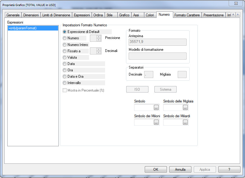
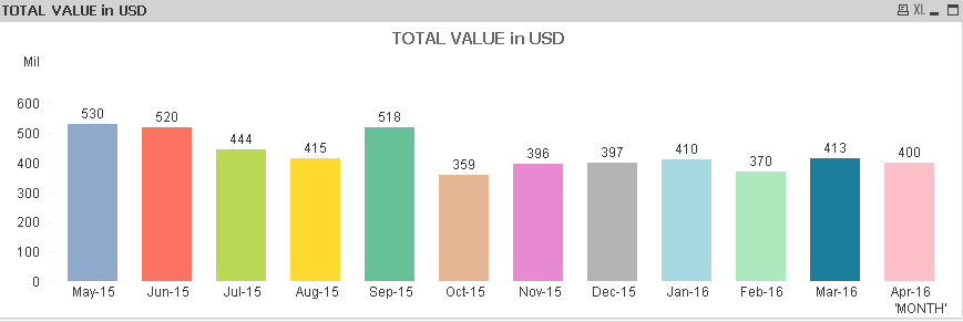
I tried to solve your problem using the solution you found in the community.
After loading data, I set Chart Properties -> Number as Default Expression.
I could obtain correct format of value in Data Point, but Axis numbers are not correctly formatted.
I tried to build a Graph from original values, setting this Chart Properties:
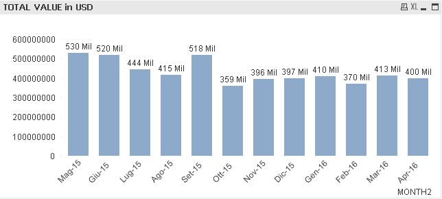
I have this chart:
I hope this is what you need.
- Mark as New
- Bookmark
- Subscribe
- Mute
- Subscribe to RSS Feed
- Permalink
- Report Inappropriate Content
It would be great if you could add your sample file with the chart from your example.
- Mark as New
- Bookmark
- Subscribe
- Mute
- Subscribe to RSS Feed
- Permalink
- Report Inappropriate Content
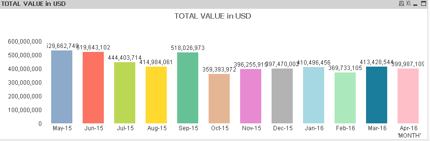
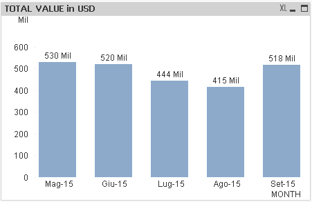
Hi Toni
Thanks. My Qlik Sense is not working in Windows 8 and unable to start. So I am using QlikView Free edition.
I am sharing the data here for easy reference.
| 'MONTH' | TOTAL VALUE in USD |
| May-15 | 529,662,749 |
| Jun-15 | 519,643,102 |
| Jul-15 | 444,403,714 |
| Aug-15 | 414,984,061 |
| Sep-15 | 518,026,973 |
| Oct-15 | 359,393,972 |
| Nov-15 | 396,255,915 |
| Dec-15 | 397,470,002 |
| Jan-16 | 410,496,456 |
| Feb-16 | 369,733,105 |
| Mar-16 | 413,428,544 |
| Apr-16 | 399,987,109 |
- Mark as New
- Bookmark
- Subscribe
- Mute
- Subscribe to RSS Feed
- Permalink
- Report Inappropriate Content
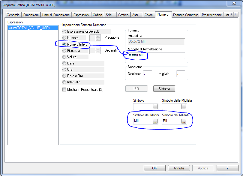
Thanks Paola Valenti
In your example you have hard coded Mil in Integer format. So Mil is reflected. if the value is more than Billion it will still reflect as Mil not Bil. Correct me if I am incorrect.?
Without using any Variables, now my settings and chart as follows
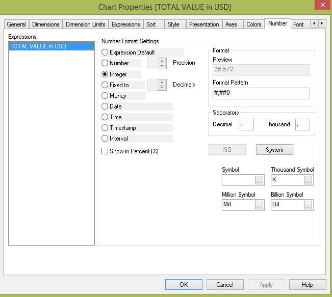
If I follow as per your inputs but changed Mil to Bil in Integer format, the value is in Millions but it is displaying as Bil.
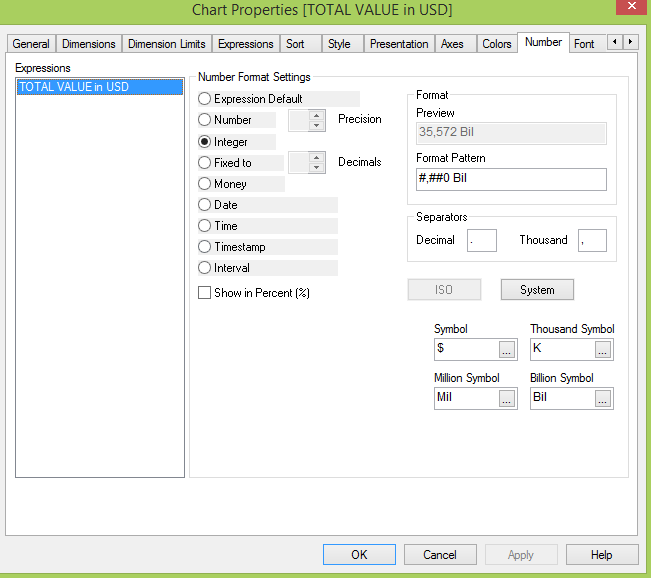
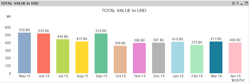
How do I display Mil, Bil etc in Chart. It is showing in Y Axis. But I would like to display next to the individual graphs.
- Mark as New
- Bookmark
- Subscribe
- Mute
- Subscribe to RSS Feed
- Permalink
- Report Inappropriate Content
Qlik Sense failing to start is most likley caused by the Qlik Sense Desktop shortcut having a invalid "Start In Path" value.
- Right-click the Qlik Sense Desktop shortcut
- Select "Properties"
- Select the "Shortcut" tab
- Find the "Start in" field
- Replace any current value with %LOCALAPPDATA%\Programs\Qlik\Sense
- Apply the change and try again
If that does not resolve the issue please reach out to Qlik Support for further help.
- Mark as New
- Bookmark
- Subscribe
- Mute
- Subscribe to RSS Feed
- Permalink
- Report Inappropriate Content
Yes, you're right.
I only tried to show in data point 'Mil', because I saw that your data were in that order of magnitude.
Loading param data, as was my first attempt (it was in the app that I loaded in my previous post), you can get 'Mil' or 'Bil' in data point, setting Expression Default in Chart Properties-Number, but only if you don't enter any Million, Billion, etc. Symbol for axis.
I conclude that 'Mil', 'Bil', etc symbol that QlikView show on axis is referred also to data point values.
My imagination suggest me a not-elegat solution: you can do a chart with data point showed in million and make transparent all other element in this second chart.
Then you will place it on another chart, with Thousand, Million, Billion Symbol filled.
As data source is the same, charts will update together.
- Mark as New
- Bookmark
- Subscribe
- Mute
- Subscribe to RSS Feed
- Permalink
- Report Inappropriate Content
Thank you Paola. It is one way as you said it is not a elegant way. Looks like there is an opportunity for Qlikview to improve the design or I am anware of any better solution.