Unlock a world of possibilities! Login now and discover the exclusive benefits awaiting you.
- Qlik Community
- :
- All Forums
- :
- QlikView App Dev
- :
- Re: Does anyone understand how this attached Paral...
- Subscribe to RSS Feed
- Mark Topic as New
- Mark Topic as Read
- Float this Topic for Current User
- Bookmark
- Subscribe
- Mute
- Printer Friendly Page
- Mark as New
- Bookmark
- Subscribe
- Mute
- Subscribe to RSS Feed
- Permalink
- Report Inappropriate Content
Does anyone understand how this attached Parallel Coordinates chart works?
Hi !
Long time lurker, first time poster! Anyway, I'm really interested in creating a parallel coordinates chart in QlikView for exploratory data analysis of multivariate data. A coworker of mine tracked down the attached parallel coordinates chart off the web. It looks like an official QlikView demo for the insurance industry. However, I'm really struggling to understand how it works. The load script appears to be hidden, but perhaps that isn't important.
Specifically the expressions used for the dimensions and for the expressions themselves appear to be generic. Anyone understand how they work? And anyone know if generic expressions are required for a parallel coordinates chart? Any insight or advice is greatly appreciated.
Thanks!
Mike Carpenter
- « Previous Replies
-
- 1
- 2
- Next Replies »
- Mark as New
- Bookmark
- Subscribe
- Mute
- Subscribe to RSS Feed
- Permalink
- Report Inappropriate Content
Hi Mike,
I am curently looking at this myself, the first expression is indeed generic how ever the second one (used to calculate node percentage) and the third one are specific to your document. I have my graph working just not the node percentages.
The third is used for the line percent split but I am still trying to get this working perfectly. The load statement isn't needed for this graph everything you need is in the chart itself and the field box next to it (they use a variable for the colours but it's not needed really).
Hope this helps!
Tom
- Mark as New
- Bookmark
- Subscribe
- Mute
- Subscribe to RSS Feed
- Permalink
- Report Inappropriate Content
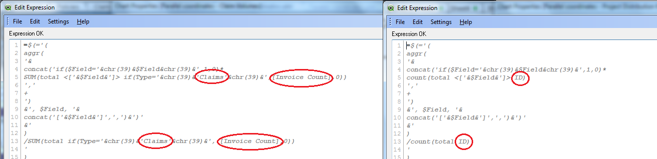
Ah thanks for looking into this and the update Tom ! On Friday I was trying to figure out the generic expression used as a dimension, to no avail. I tried parsing the expression by hand, and I'll try to attach an image of my effort. I just don't really understand what that expression is doing, and how it works. And I'm definitely interested to hear how your graph works out ! In the meantime I'll work on the 2 expressions that you mentioned are graph specific.
Thanks!
Mike
- Mark as New
- Bookmark
- Subscribe
- Mute
- Subscribe to RSS Feed
- Permalink
- Report Inappropriate Content
Hi
Can u please explain how does parallel chart works,
I'm not understand what that expression is doing, and how it works.??
- Mark as New
- Bookmark
- Subscribe
- Mute
- Subscribe to RSS Feed
- Permalink
- Report Inappropriate Content
The Parallel Coordinate chart is created with a generic expression in the dimension. Best way to understand this is using a simple data set. Each of the expressions are created using dollar expansion. So you need to decode it to identify the actual expression used. For example if you select the fields [Channel],[Customer Gender],[Customer Marital Status] then the below expression
=$(='if('&concat('NOT IsNull(['&$Field&'])',' AND ')&', hash128('& concat('['&$Field&']',',')&'))' )
will give result as
Hash128([Channel],[Customer Gender],[Customer Marital Status])
So you can create a Sample QVW with a simple data set (using few fields) and then copy the chart to your QVW
And then you can change the expressions to see how the chart is working. I've created a sample Parallel Coordinates for a dummy Project Management Dashboard where you can see how all my projects are distributed over different dimensions. I've attached the files for your reference.
The parallel coordinate chart consists of multiple dimensions placed parallel to each other on one axis. Each data elements of the dimensions are displayed as a series of connected points along the dimensions/axes.
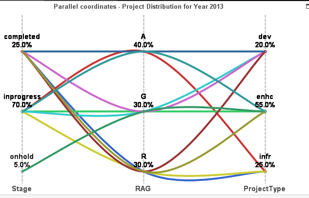
From the above sample you can see the Overall project distribution across different cuts that means you can see 70% of my total projects are in progress or I can see that majority of my projects are in AMBER. Further if I click on Stage as inprogress then I can further see the distribution of all inprogress items through out RAG and Project Type. Well these all requirements together can be shown in this one chart avoiding the need for creating multiple charts.
- Mark as New
- Bookmark
- Subscribe
- Mute
- Subscribe to RSS Feed
- Permalink
- Report Inappropriate Content
Hi Suddeep,
Could u please explain parallel Coordinates in detail ??
The expression in node_percent and line_percent
Thanks in advance
Keerthi
- Mark as New
- Bookmark
- Subscribe
- Mute
- Subscribe to RSS Feed
- Permalink
- Report Inappropriate Content
Hi,
Could u please explain how the expression works in node_percent and line_percent ?
Thanks,
Soumya
- Mark as New
- Bookmark
- Subscribe
- Mute
- Subscribe to RSS Feed
- Permalink
- Report Inappropriate Content
The node_percent calculates the relative value or value in percentages. I'm giving an example of node_percent related to the project management sample example I attached above. You can create a straight table by adding dimensions as $Field and ProjectType then add an expression as :count(ID)/count(TOTAL ID) which simply gives you what percentage each values of the field "ProjectType" makes out of the total project counts. I've total 20 projects and the field ProjectType has values like dev, infr, enhc which are making percentages as 4/20=20%, 5/20=25% and 11/20= 55%.
Now to make it generic so that it should work based on the selection of fields, the creator of the Parallel Coordinate example used the expression like below:
$(=
'(
aggr('&concat('if($Field='&chr(39)&$Field&chr(39)&',1,0)*count(total <['&$Field&']> [id])','+')
&', $Field, '&concat('['&$Field&']',',')&')'&')
/count(total [id])
')
so if I just consider one field (ProjectType) then it should look like below.
aggr(if([$Field]='ProjectType',1,0)* count(TOTAL <ProjectType>ID),[$Field],ProjectType)/count(TOTAL ID)
- Mark as New
- Bookmark
- Subscribe
- Mute
- Subscribe to RSS Feed
- Permalink
- Report Inappropriate Content
Hi Suddeep,
If i remove node_percent and line_percent also its working fine.What is use of node_percent and line_percent.
And
Can u please explain the below expression ??
dual(
$(=concat('if($Field='&chr(39)&$Field&chr(39)&',concat(distinct ['&$Field&']))','&'))&'
'&num( 100*node_percent, '#,##0.#', '.' , ',' )&'%'
,
$(=concat('if(textcount(total ['&$Field&'])=0,if($Field='&chr(39)&$Field&chr(39)&',0.1+((min(['&$Field&'])-min(total ['&$Field&']))/(max(total ['&$Field&'])-min(total ['&$Field&']))),0),if($Field='&chr(39)&$Field&chr(39)&',0.1+((aggr(nodistinct rank(['&$Field&'],4),['&$Field&'])-1)/rangemax( (count(distinct total ['&$Field&'])-1) ,1 )),0))','+'))
)
- Mark as New
- Bookmark
- Subscribe
- Mute
- Subscribe to RSS Feed
- Permalink
- Report Inappropriate Content
without node_percent you wont be able to see what percentage the data points are our of total count. the chart may not show you the distribution properly.
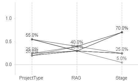
The dual function has two parameter, one for the percentages to be displayed in the chart to understand the distribution and another is to plot it in the chart. Please do the following to understand it better.
1. Create a very simple parallel coordinate chart
2. Just use one field (you can use the example I added and you can consider the ProjectType field)
3. Convert the line chart to a straight table which will help you to understand the values.
4. In the expression instead of Dual function just use node_percent you will find that you are able to see the percentages but the chart is not plotted properly that means the space between each data point is not even. like below
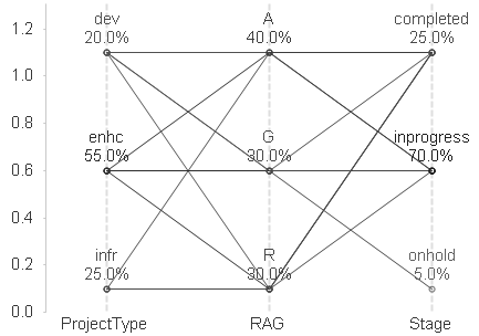
5. Now use Dual function taking node_percent as first parameter and
0.1+((Aggr(NODISTINCT rank(ProjectType,4),ProjectType)-1)/RangeMax((Count(DISTINCT TOTAL ProjectType)-1),1)) as second parameter (this will create the actual numbers to be plotted on the axis). the same chart will now changed to the below given snapshot
- « Previous Replies
-
- 1
- 2
- Next Replies »