Unlock a world of possibilities! Login now and discover the exclusive benefits awaiting you.
- Qlik Community
- :
- All Forums
- :
- QlikView App Dev
- :
- Draw Explicit Trend Line in Scatter Chart
- Subscribe to RSS Feed
- Mark Topic as New
- Mark Topic as Read
- Float this Topic for Current User
- Bookmark
- Subscribe
- Mute
- Printer Friendly Page
- Mark as New
- Bookmark
- Subscribe
- Mute
- Subscribe to RSS Feed
- Permalink
- Report Inappropriate Content
Draw Explicit Trend Line in Scatter Chart
Hello,
I have the following Scatter Chart:
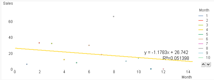
With Dimension = Month, and Expressions = ONLY(Month) and SUM(Sales).
What I needed is to get the Trend Line formula (y=mx+b) showed on the chart.
I got that by using:
for M value = linest_m(total aggr(sum(Sales),Month),Month) -> -1.1783
for B value = linest_b(total aggr(sum(Sales),Month),Month) -> 26.742
The thing is I need to draw that line as a reference line on the chart (without using the automatic trend line) and get it fixed with those values, even if I make selections.
Do you know how could I do that?
I attach the QVW file.
Thanks.
- Mark as New
- Bookmark
- Subscribe
- Mute
- Subscribe to RSS Feed
- Permalink
- Report Inappropriate Content
Hi Micro,
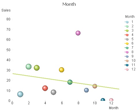
This is at least close to what you need.
Remove the trendline you have.
Add this expression:
=LINEST_M({1}Total Aggr(sum({1}Sales),Month),Month) * Month
+LINEST_B({1}Total Aggr(sum({1}Sales),Month),Month)
Add a trendline to this one.
In the Axes tab make the x and y static min =1
Make the x static max : Max({1}Month) +1
Make the y static max : 20+max({1}Aggr(sum({1}Sales),Month))
Now if you pick a few points we get :
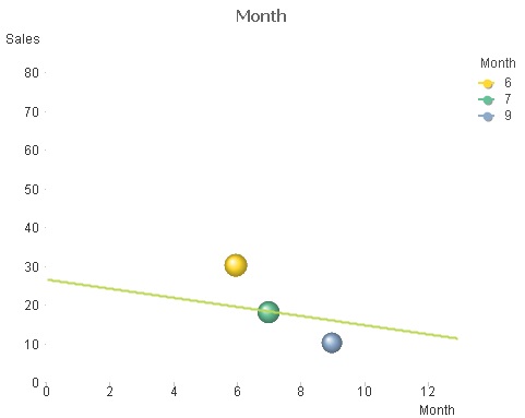
Sadly the line disappears if you select one point only - hope that's not too disappointing. Maybe a little tweak can correct this.
Cheers
Andrew