Unlock a world of possibilities! Login now and discover the exclusive benefits awaiting you.
- Qlik Community
- :
- All Forums
- :
- QlikView App Dev
- :
- Dual dimensions: Performance curve with data?
- Subscribe to RSS Feed
- Mark Topic as New
- Mark Topic as Read
- Float this Topic for Current User
- Bookmark
- Subscribe
- Mute
- Printer Friendly Page
- Mark as New
- Bookmark
- Subscribe
- Mute
- Subscribe to RSS Feed
- Permalink
- Report Inappropriate Content
Dual dimensions: Performance curve with data?
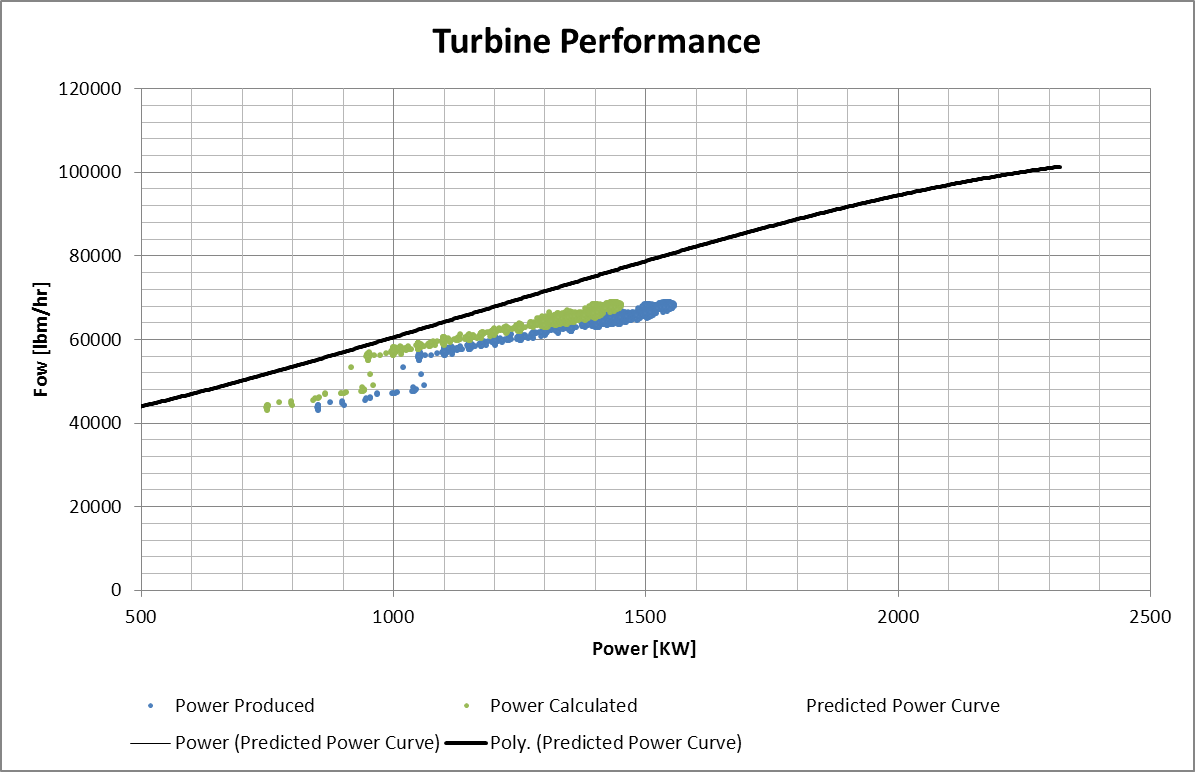
Hi all, I am VERY new to Qlikview, and really struggling to understand how to use the expressions and really pull out the power for charting. My applications are very different from most of the sales data that is out there. I typically only have/need one dimension, i.e. Date, Power, Flow. My goal is to graph a performance curve (for which I have data of Power vs. Speed, or some similar correlation). I also have real operating data that I would like to plot on the same chart, so that I can see how the unit is performing with respect to its design. I have been able to create the performance curve, but I'm not able to successfully plot the data on the same curve. The data uses a different Power dimension than the Performance curve.
Any help would be greatly appreciated
- « Previous Replies
-
- 1
- 2
- Next Replies »
- Mark as New
- Bookmark
- Subscribe
- Mute
- Subscribe to RSS Feed
- Permalink
- Report Inappropriate Content
you could load the qvd prior to this resident load using
LOAD * FROM yourdata.qvd (qvd);
or perform the aggregation in the qvd load like
tabData:
LOAD
  [Turbine Power (kW)] as [Power (kW)],
  Avg([STG1_Inlet_Steam_Flow]) as [Flow (lbm/hr)],
  'measured' as DataType
FROM yourdata.qvd (qvd)
Group By [Turbine Power (kW)];
regards
Marco
- « Previous Replies
-
- 1
- 2
- Next Replies »