Unlock a world of possibilities! Login now and discover the exclusive benefits awaiting you.
- Qlik Community
- :
- All Forums
- :
- QlikView App Dev
- :
- Re: Fat vs Thin bar charts with modified Axes
- Subscribe to RSS Feed
- Mark Topic as New
- Mark Topic as Read
- Float this Topic for Current User
- Bookmark
- Subscribe
- Mute
- Printer Friendly Page
- Mark as New
- Bookmark
- Subscribe
- Mute
- Subscribe to RSS Feed
- Permalink
- Report Inappropriate Content
Fat vs Thin bar charts with modified Axes
Hi there,
Two questions.
Q1:
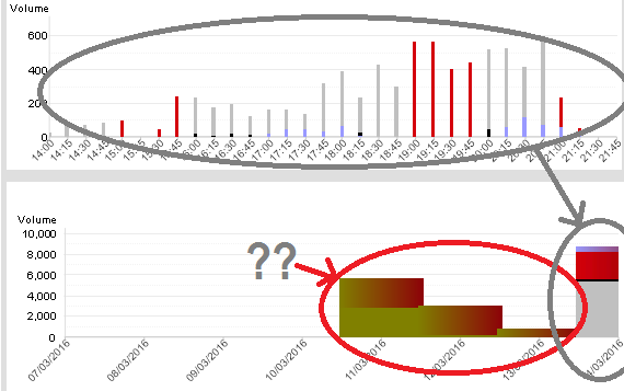
I modified axes on bar chart with INTERVAL('00:15', 'hh:mm') in Static Step and pushed the Min and Max to min and max of a working shift. Sometimes I get a thin bar chart with gaps between them (which I want!) but sometimes I get a thick bar chart without any empty spaces (i.e. bars start next to each other). I tried "Allow Thin Bars" in Presentation bu there is not much I can do as the Axes are set on "Continuous" to show gaps in time (so if no work has been done between two time intervals of 15 mins that are two hours apart we would see the whole shift of 8 hour from start to finish with two bars say one at hour 4 and another at hour 6 of the shift).
Anyone knows why this inconsistency exists? Any solution for it?
Thanks!
Second Question:
I have problem with colour coding the bar charts over several days. I pushed the axes to show today() -7 days, it shows the colours fine for today but messes things up for the past week.
How can I solve this?

- Mark as New
- Bookmark
- Subscribe
- Mute
- Subscribe to RSS Feed
- Permalink
- Report Inappropriate Content
Hi Experts,
I am also facing almost the same issue. The answer for this question will help me to resolve my issue too.
Thanks and Regards
Mahesh Gadde
- Mark as New
- Bookmark
- Subscribe
- Mute
- Subscribe to RSS Feed
- Permalink
- Report Inappropriate Content
I raised a ticket with Qlik on this one... it was with their R&D team and I was told that the solution will be included in the next release. Don't know which next release tho ![]()