Unlock a world of possibilities! Login now and discover the exclusive benefits awaiting you.
- Qlik Community
- :
- All Forums
- :
- QlikView App Dev
- :
- Formatting Bugs/issues
Options
- Subscribe to RSS Feed
- Mark Topic as New
- Mark Topic as Read
- Float this Topic for Current User
- Bookmark
- Subscribe
- Mute
- Printer Friendly Page
Turn on suggestions
Auto-suggest helps you quickly narrow down your search results by suggesting possible matches as you type.
Showing results for
Not applicable
2014-05-14
09:54 AM
- Mark as New
- Bookmark
- Subscribe
- Mute
- Subscribe to RSS Feed
- Permalink
- Report Inappropriate Content
Formatting Bugs/issues
Hi there,
Might be on a hiding to nothing with these questions but it's worth a try. They center on formatting and getting things to look the way I'd like them to.
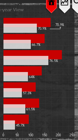
1. In the following grouped bar chart, I'd like the white % figure to be centered and at the end of the two bars, as shown in the top one. Is this possible?
2. In the following stacked, 100% bar chart, I'd like to change the font size and colour of the labelling. I'd also like to be able to wrap the label text. Possible?

Ignore the %s, of course.
Thank you very much!
Alex
370 Views
0 Replies