Unlock a world of possibilities! Login now and discover the exclusive benefits awaiting you.
- Qlik Community
- :
- All Forums
- :
- QlikView App Dev
- :
- Gant Chart Help
- Subscribe to RSS Feed
- Mark Topic as New
- Mark Topic as Read
- Float this Topic for Current User
- Bookmark
- Subscribe
- Mute
- Printer Friendly Page
- Mark as New
- Bookmark
- Subscribe
- Mute
- Subscribe to RSS Feed
- Permalink
- Report Inappropriate Content
Gant Chart Help
Dear Qlik Users,
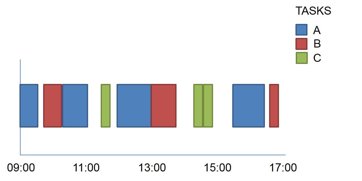
I am trying to produce a Gant chart that shows activity over a day. The table of data is similar to the below:
| Task | Job | Start Time | Duration |
|---|---|---|---|
| A | 1 | 09:00 | 00:15 |
| A | 9 | 17:00 | 00:15 |
| C | 4 | 12:00 | 00:20 |
| C | 8 | 16:00 | 00:20 |
| A | 2 | 10:00 | 00:20 |
| B | 3 | 11.00 | 00:15 |
| B | 7 | 13:00 | 00:15 |
| A | 7 | 15:00 | 00:15 |
| B | 6 | 14:00 | 00:20 |
My desired outcome would look similar to the below - where "non captured" time is simply a gap between tasks
Can anyone give me some guidance on how to do it? Please note that my data is not ordered.
I've tried previously to create a bar chart with the Jobs plotting across the bottom and using a bar offset to plot the duration amounts in the correct place but I don't think it is possible to overlap the separate jobs so it is only in one column?
Any advice/help would be greatly appreciated.
Many thanks.
Drew
- Mark as New
- Bookmark
- Subscribe
- Mute
- Subscribe to RSS Feed
- Permalink
- Report Inappropriate Content
It seems you need to adjust the scale
- Mark as New
- Bookmark
- Subscribe
- Mute
- Subscribe to RSS Feed
- Permalink
- Report Inappropriate Content
Try stacked chart
- Mark as New
- Bookmark
- Subscribe
- Mute
- Subscribe to RSS Feed
- Permalink
- Report Inappropriate Content
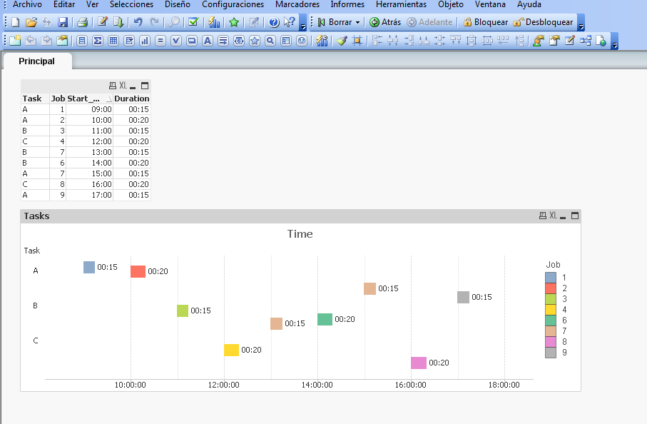
Here you are an example of Gannt
- Mark as New
- Bookmark
- Subscribe
- Mute
- Subscribe to RSS Feed
- Permalink
- Report Inappropriate Content
Hi Enrique,
This is useful but I would now need to plot all of the "promocion"s on one column - the reason I that my data might have 300 "promocion" options.
Thanks,
Drew
- Mark as New
- Bookmark
- Subscribe
- Mute
- Subscribe to RSS Feed
- Permalink
- Report Inappropriate Content
- Mark as New
- Bookmark
- Subscribe
- Mute
- Subscribe to RSS Feed
- Permalink
- Report Inappropriate Content
OK, you can modify input data with gaps in colour=blank
- Mark as New
- Bookmark
- Subscribe
- Mute
- Subscribe to RSS Feed
- Permalink
- Report Inappropriate Content
Hi Enrique,
This is useful but your jobs are still not showing on one column? The issue is that in my data I may have Jobs up to number 200 so this wouldn't visually work with this amount of data. Thank you for your help though.
Drew
- Mark as New
- Bookmark
- Subscribe
- Mute
- Subscribe to RSS Feed
- Permalink
- Report Inappropriate Content
Does anyone else have any thoughts on this? I need to have the information plotted on the same bar (in excel you can use series overlap)
- Mark as New
- Bookmark
- Subscribe
- Mute
- Subscribe to RSS Feed
- Permalink
- Report Inappropriate Content
Hi,
You could try this approach:
How to create a Gantt chart using a Pivot table
It's different because it uses colored cells in a pivot table instead of using a bar chart. Still it may be helpful.