Unlock a world of possibilities! Login now and discover the exclusive benefits awaiting you.
- Qlik Community
- :
- All Forums
- :
- QlikView App Dev
- :
- Graph with a cumulative value
- Subscribe to RSS Feed
- Mark Topic as New
- Mark Topic as Read
- Float this Topic for Current User
- Bookmark
- Subscribe
- Mute
- Printer Friendly Page
- Mark as New
- Bookmark
- Subscribe
- Mute
- Subscribe to RSS Feed
- Permalink
- Report Inappropriate Content
Graph with a cumulative value
Hi freinds,
i need to create a graph like the attached image.
I have a list of stores with their monthly revenue (store_name, store_revenue).
the purpuse of the graph is to show how meany stores are creating how meany percent of the total company revenue.
the x - axis shows the number of stores and the y - shows is the comulative percent (until we get to 100%), that way you can see that 1 store is making 10% of the revenue, and 80 stores are creating
90% of revenue etc.
I would like to know how can do this in qlikview.
Many thanks
Shlomo
- Mark as New
- Bookmark
- Subscribe
- Mute
- Subscribe to RSS Feed
- Permalink
- Report Inappropriate Content
You can use a calculated dimension
=aggr(num(rank(sum(Value),4)),Store)
for the x-axis, sorted by numerical value.
Then use
=sum(Value) / sum(total Value)
as expression, enable show as percentage in number tab.
See also attached.
Regards,
Stefan
- Mark as New
- Bookmark
- Subscribe
- Mute
- Subscribe to RSS Feed
- Permalink
- Report Inappropriate Content
Thank you,
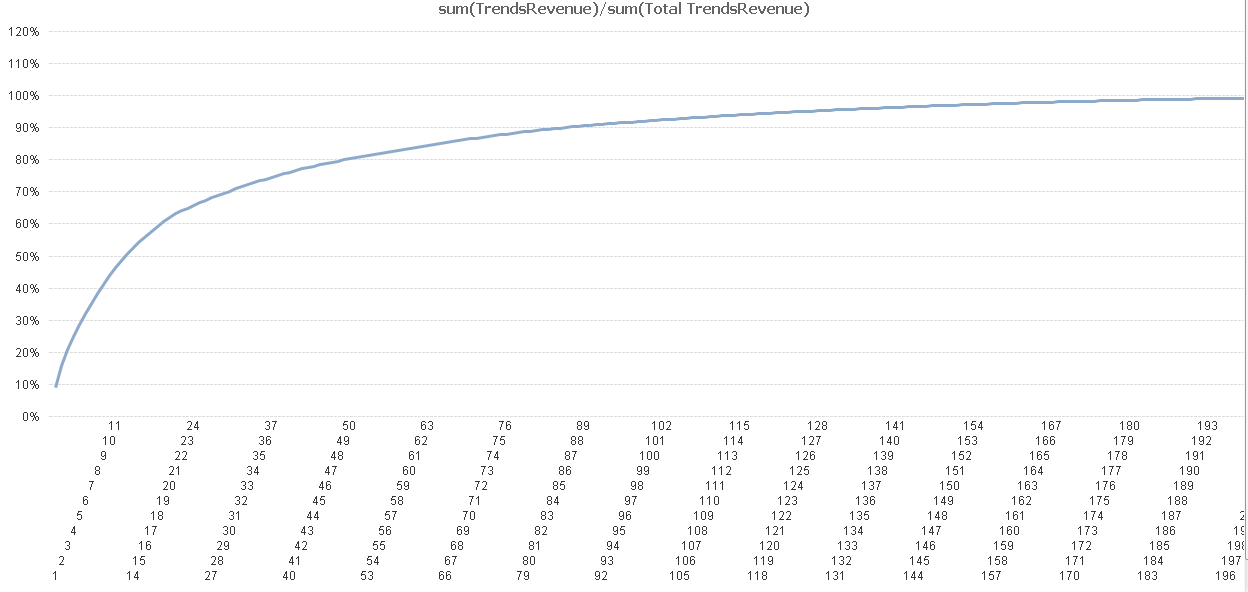
Your example is very helpful. But I was left with one small problem:
Now I get on the x-axis over 200 stores (image attached), how can i make a smaller view as it was in the first picture I attached.
- Mark as New
- Bookmark
- Subscribe
- Mute
- Subscribe to RSS Feed
- Permalink
- Report Inappropriate Content
I think a good possible solution is to use a continuous axis.
Another approach might be to use class() function in the dimension around the aggr() function.
See also attached.