Unlock a world of possibilities! Login now and discover the exclusive benefits awaiting you.
- Qlik Community
- :
- All Forums
- :
- QlikView App Dev
- :
- Re: Graph
- Subscribe to RSS Feed
- Mark Topic as New
- Mark Topic as Read
- Float this Topic for Current User
- Bookmark
- Subscribe
- Mute
- Printer Friendly Page
- Mark as New
- Bookmark
- Subscribe
- Mute
- Subscribe to RSS Feed
- Permalink
- Report Inappropriate Content
Graph
Hello everyone!
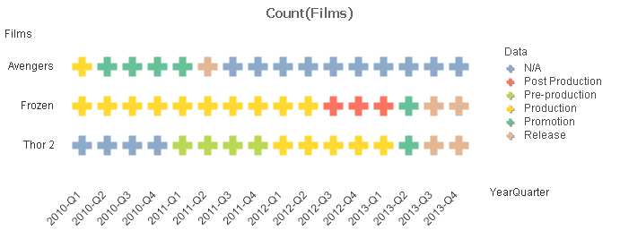
I have had help on this before (thank you Rahul) but it's not quite what my client ended up wanting and I'm stuck again. So in the file attached, ideally I would want to have yearquarter and films as dimensions, and the bar chart to show how those process stages change over time. I also attached a drawn mock up for better visual representation.
Thank you,
Anna
- Tags:
- new_to_qlikview
- Mark as New
- Bookmark
- Subscribe
- Mute
- Subscribe to RSS Feed
- Permalink
- Report Inappropriate Content
I don't think a bar chart can do this. Perhaps a grid chart will do.
talk is cheap, supply exceeds demand
- Mark as New
- Bookmark
- Subscribe
- Mute
- Subscribe to RSS Feed
- Permalink
- Report Inappropriate Content
please find the attachement
- Mark as New
- Bookmark
- Subscribe
- Mute
- Subscribe to RSS Feed
- Permalink
- Report Inappropriate Content
Maybe this can make your client happy
- Mark as New
- Bookmark
- Subscribe
- Mute
- Subscribe to RSS Feed
- Permalink
- Report Inappropriate Content
Thank you, gentlemen, that worked. However, the bubbles or crosses created the white space, which with more films look a little funny to the eye. I tried working with the bubble sizes to reduce the effect, but they just became huge and the spaces are still visible. Is there a way to draw them closer or a chance to change the bubbles/crosses into squares to make them look more bar chart-like?
- Mark as New
- Bookmark
- Subscribe
- Mute
- Subscribe to RSS Feed
- Permalink
- Report Inappropriate Content
Hi Anna Neshina, I´ve tryied here and didn´t find either a way of minimizing that gap.
Sorry