Unlock a world of possibilities! Login now and discover the exclusive benefits awaiting you.
- Qlik Community
- :
- All Forums
- :
- QlikView App Dev
- :
- Help! Dynamic Axes Ranges
- Subscribe to RSS Feed
- Mark Topic as New
- Mark Topic as Read
- Float this Topic for Current User
- Bookmark
- Subscribe
- Mute
- Printer Friendly Page
- Mark as New
- Bookmark
- Subscribe
- Mute
- Subscribe to RSS Feed
- Permalink
- Report Inappropriate Content
Help! Dynamic Axes Ranges
Help! I am new to Qlikview and would welcome some assistance with the following:
I have a basic chart which reports Period WTE values (Y Axis) for a given month (X Axis). The value could range from 1 right up to around 10,000 per month. Can I use a function in the "Scale - Static Min/Max" to dynamically alter the expressions Y axis range based on the min/max value + or - 500 of the expression value or even a percentage increase/decrease of the expression value? i.e If the value is 1000 for month 1 and 2000 for month 2 I would like the Y Axis range to start at 500 and max out at 2500?
Any help on the expression required would be gratefully received.
Accepted Solutions
- Mark as New
- Bookmark
- Subscribe
- Mute
- Subscribe to RSS Feed
- Permalink
- Report Inappropriate Content
Hi James, using 10% precentage of the max/min expression value you can use something like:
Min:
Min(Aggr(Expression), Dimension1, Dimension2...) * 0.9
Max:
Max(Aggr(Expression), Dimension1, Dimension2...) * 1.1
- Mark as New
- Bookmark
- Subscribe
- Mute
- Subscribe to RSS Feed
- Permalink
- Report Inappropriate Content
Thanks Ruben, worked a treat
Regards
James
- Mark as New
- Bookmark
- Subscribe
- Mute
- Subscribe to RSS Feed
- Permalink
- Report Inappropriate Content
Hi James
Could you please mark Rubens answer as correct answer.
- Mark as New
- Bookmark
- Subscribe
- Mute
- Subscribe to RSS Feed
- Permalink
- Report Inappropriate Content
Ruben, I have a similar question and would like to ask for your help.
I would like to set the y axis change dynamic when I change the x range at the green rectangle scroll part.
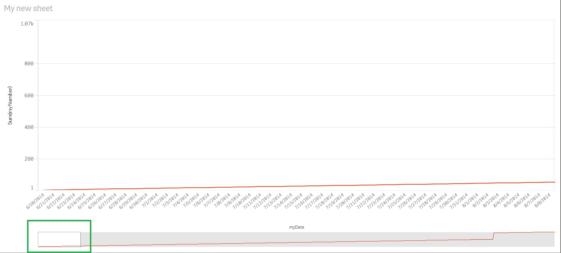
I use the following min/max at Y-axis custom range, but the y axis still keep the same when I change x range at the green rectangle scroll part.
Min ( Aggr ( Sum ( myNumber ) , myDate ))
Max ( Aggr ( Sum ( myNumber ) , myDate ))
I also attach the qvf.
Could you please give any suggestion?
Thanks!
- Mark as New
- Bookmark
- Subscribe
- Mute
- Subscribe to RSS Feed
- Permalink
- Report Inappropriate Content
Hi, so far I know the default chart sets the min and max values of the axis for all the chart.
With extensions you can create the zooming effect but I'm still learning using d3 and I didn't tried yet to implement this functionality in a visualization.
Hope some other user can give you more help.