Unlock a world of possibilities! Login now and discover the exclusive benefits awaiting you.
- Qlik Community
- :
- All Forums
- :
- QlikView App Dev
- :
- Re: Help trying to create chart
- Subscribe to RSS Feed
- Mark Topic as New
- Mark Topic as Read
- Float this Topic for Current User
- Bookmark
- Subscribe
- Mute
- Printer Friendly Page
- Mark as New
- Bookmark
- Subscribe
- Mute
- Subscribe to RSS Feed
- Permalink
- Report Inappropriate Content
Help trying to create chart
Hi All,
Is there a way i can create a chart that looks like the following?
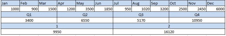
i want to see the values by the different timeframes in the same chart if possible..
I have attached a qvw with the above data in.
Can someone help please? 
- Tags:
- new_to_qlikview
- « Previous Replies
-
- 1
- 2
- Next Replies »
- Mark as New
- Bookmark
- Subscribe
- Mute
- Subscribe to RSS Feed
- Permalink
- Report Inappropriate Content
the exact representation we cannot achieve in Qlikview 
- Mark as New
- Bookmark
- Subscribe
- Mute
- Subscribe to RSS Feed
- Permalink
- Report Inappropriate Content
thats what i thought but thought i would ask the question. thanks everyone
- Mark as New
- Bookmark
- Subscribe
- Mute
- Subscribe to RSS Feed
- Permalink
- Report Inappropriate Content
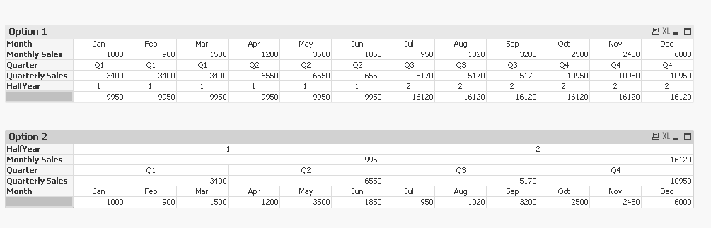
Created these using pivot table, does one of them help you achieve what you wanted?
Best,
Sunny
- Mark as New
- Bookmark
- Subscribe
- Mute
- Subscribe to RSS Feed
- Permalink
- Report Inappropriate Content
Unfortunately, this is the closest you will be able to get to what you want
HTH
Best,
Sunny
- Mark as New
- Bookmark
- Subscribe
- Mute
- Subscribe to RSS Feed
- Permalink
- Report Inappropriate Content
Hi Ruchi -
I think you should start a new thread for your requirement so that others including me can help you. Posting in someone else's post is generally not a good idea. If you have posted your question somewhere, I would rather respond to you there then here.
I hope it make sense?
Best,
Sunny
- Mark as New
- Bookmark
- Subscribe
- Mute
- Subscribe to RSS Feed
- Permalink
- Report Inappropriate Content
Hi Sunindia,
It does makes sense. I am just new to QV and this forum so didnt knew the rules of it. Thanks
- Mark as New
- Bookmark
- Subscribe
- Mute
- Subscribe to RSS Feed
- Permalink
- Report Inappropriate Content
Not a problem
I am glad you already did what I asked and got responses from some really smart experts, so it all worked out well for you.
Best,
Sunny
- Mark as New
- Bookmark
- Subscribe
- Mute
- Subscribe to RSS Feed
- Permalink
- Report Inappropriate Content
Hi Sunindia, thanks, i used the last example you gave. it was almost what they wanted
- Mark as New
- Bookmark
- Subscribe
- Mute
- Subscribe to RSS Feed
- Permalink
- Report Inappropriate Content
Awesome
I am glad we got close enough to what the user wanted.
Best,
Sunny
- « Previous Replies
-
- 1
- 2
- Next Replies »