Unlock a world of possibilities! Login now and discover the exclusive benefits awaiting you.
- Qlik Community
- :
- All Forums
- :
- QlikView App Dev
- :
- Help with calculated dimensions and expression for...
- Subscribe to RSS Feed
- Mark Topic as New
- Mark Topic as Read
- Float this Topic for Current User
- Bookmark
- Subscribe
- Mute
- Printer Friendly Page
- Mark as New
- Bookmark
- Subscribe
- Mute
- Subscribe to RSS Feed
- Permalink
- Report Inappropriate Content
Help with calculated dimensions and expression for Segregation of duties Dashboards and KPIS
Hello community,
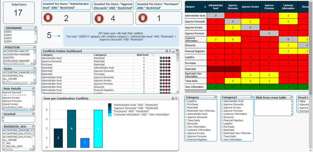
I am currently working on a segregation of duties dashboard, for which I have defined a theoretical matrix that crosses 13 groups of business process categories with each other. Depending on the combination between the category pairs, the conflict risks of the incompatibility can have 4 levels: 1 = Low, 2 = Medium, 3 = High, 4 = Very High.
In data model, it includes other tables with the detail of the users, business roles, the detail of the operations for each role, enabled permissions and the category that would correspond according to the matrix of incompatibilities.
I would like to include a pivot chart that in the dimensions shows all the possible combinations that exists in the Field "Category" ... for example "Category name 1" And "Category name 2 ", Category name 1 "And " Category name 3 " ... and so on. In the expressions i need to include a field that counts the number of users that exist in each combination.
The aboveI tried it from a bar chart but it has no dimensions and to tell the truth, the dashboard loses dynamism. I'm sure there is a better way.
I would also like to include an object text that serves as a KPI to count all users who have a group of categories with very high risk. The example dashboard includes some calculations but it is by combination of specific categories, I need a global one to be able to view the users with very high incompatibilities.
Thank you very much experts!! for the help you can give me
- Mark as New
- Bookmark
- Subscribe
- Mute
- Subscribe to RSS Feed
- Permalink
- Report Inappropriate Content
Best I can offer is the Design Blog area of Community, you might find some examples out there that could help, but I am not even sure which ones to try to point you to on this one. My post will kick things back out too, so maybe someone else will have some ideas for you at this point.
https://community.qlik.com/t5/Qlik-Design-Blog/bg-p/qlik-design-blog
Regards,
Brett
I now work a compressed schedule, Tuesday, Wednesday and Thursday, so those will be the days I will reply to any follow-up posts.
