Unlock a world of possibilities! Login now and discover the exclusive benefits awaiting you.
- Qlik Community
- :
- All Forums
- :
- QlikView App Dev
- :
- Re: Highlighting forecasted income
- Subscribe to RSS Feed
- Mark Topic as New
- Mark Topic as Read
- Float this Topic for Current User
- Bookmark
- Subscribe
- Mute
- Printer Friendly Page
- Mark as New
- Bookmark
- Subscribe
- Mute
- Subscribe to RSS Feed
- Permalink
- Report Inappropriate Content
Highlighting forecasted income
Hi,
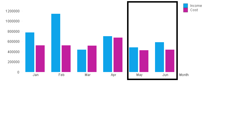
I visualized below chart. Last 2 months data is not actual ,it is forecasted data. I thought of wrapping a box around that 2 months and highlight as forecast. but when user select a signle month box is adjusting as per section but this box is appearing awkawardly irrelevant.Please suggest if there is any better way to differentiate actual and forecast information.
Accepted Solutions
- Mark as New
- Bookmark
- Subscribe
- Mute
- Subscribe to RSS Feed
- Permalink
- Report Inappropriate Content
Where is cost?
How to identify that May and June data are Forecast data?
I mean is there any flag or field or criteria to define Forecast and actual data?
- Mark as New
- Bookmark
- Subscribe
- Mute
- Subscribe to RSS Feed
- Permalink
- Report Inappropriate Content
You can show them by different color. Provide sample data ,would work on this for you.
- Mark as New
- Bookmark
- Subscribe
- Mute
- Subscribe to RSS Feed
- Permalink
- Report Inappropriate Content
Sample data is here
| INCOME | Month |
| 775980.4 | 1/1/2015 |
| 1143367 | 2/1/2015 |
| 440096.1 | 3/1/2015 |
| 702325.7 | 4/1/2015 |
| 483749 | 5/1/2015 |
| 584405 | 6/1/2015 |
- Mark as New
- Bookmark
- Subscribe
- Mute
- Subscribe to RSS Feed
- Permalink
- Report Inappropriate Content
Where is cost?
How to identify that May and June data are Forecast data?
I mean is there any flag or field or criteria to define Forecast and actual data?
- Mark as New
- Bookmark
- Subscribe
- Mute
- Subscribe to RSS Feed
- Permalink
- Report Inappropriate Content
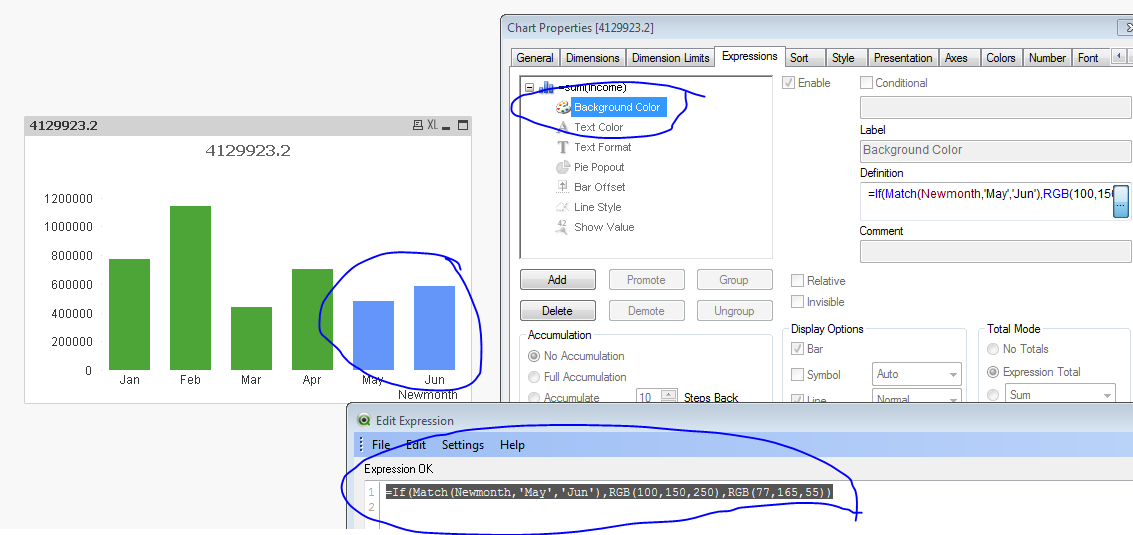
It is a good idea to have flag, Thanks for that As of now last two months are foretasted so, I will create a flag in Data model and use a little light color to showcase forecast. Thanks
- Mark as New
- Bookmark
- Subscribe
- Mute
- Subscribe to RSS Feed
- Permalink
- Report Inappropriate Content
are u like this way?
- Mark as New
- Bookmark
- Subscribe
- Mute
- Subscribe to RSS Feed
- Permalink
- Report Inappropriate Content
Thanks bro awesome I liked it and I will use this idea
- Mark as New
- Bookmark
- Subscribe
- Mute
- Subscribe to RSS Feed
- Permalink
- Report Inappropriate Content
np 