Unlock a world of possibilities! Login now and discover the exclusive benefits awaiting you.
- Qlik Community
- :
- All Forums
- :
- QlikView App Dev
- :
- Highlighting zones in a scatter chart
- Subscribe to RSS Feed
- Mark Topic as New
- Mark Topic as Read
- Float this Topic for Current User
- Bookmark
- Subscribe
- Mute
- Printer Friendly Page
- Mark as New
- Bookmark
- Subscribe
- Mute
- Subscribe to RSS Feed
- Permalink
- Report Inappropriate Content
Highlighting zones in a scatter chart
Dear community,
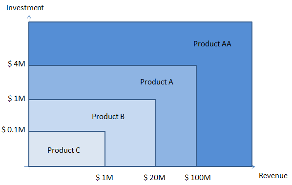
How is it possible to highlight zones on a scatter chart like in this image? I created markers with reference lines, but it's not really what's required.
Any ideas?
Thank you,
image added
Accepted Solutions
- Mark as New
- Bookmark
- Subscribe
- Mute
- Subscribe to RSS Feed
- Permalink
- Report Inappropriate Content
Yes, I mean the reference lines. You can enter a static value for a reference line. But you can also use an expression that returns a value. You can make your expression use selections and calculate an appropriate value that fits in the scale.
talk is cheap, supply exceeds demand
- Mark as New
- Bookmark
- Subscribe
- Mute
- Subscribe to RSS Feed
- Permalink
- Report Inappropriate Content
The only way I know of is to create a background image with the zones and use that image as plot background. That will of course only work if you know the scales in advance and can make sure the scatter chart will use those fixed scales.
talk is cheap, supply exceeds demand
- Mark as New
- Bookmark
- Subscribe
- Mute
- Subscribe to RSS Feed
- Permalink
- Report Inappropriate Content
That looks too complicated to adjust the scales with the background image, sure I had not thought of it!
Maybe with dynamic markers/ reference lines?
- Mark as New
- Bookmark
- Subscribe
- Mute
- Subscribe to RSS Feed
- Permalink
- Report Inappropriate Content
You can create dynamic reference lines, but that will only give you lines, not a different background color.
talk is cheap, supply exceeds demand
- Mark as New
- Bookmark
- Subscribe
- Mute
- Subscribe to RSS Feed
- Permalink
- Report Inappropriate Content
Hi Gysbert,
How to create dynamic lines? you mean the refrence lines?
- Mark as New
- Bookmark
- Subscribe
- Mute
- Subscribe to RSS Feed
- Permalink
- Report Inappropriate Content
Yes, I mean the reference lines. You can enter a static value for a reference line. But you can also use an expression that returns a value. You can make your expression use selections and calculate an appropriate value that fits in the scale.
talk is cheap, supply exceeds demand