Unlock a world of possibilities! Login now and discover the exclusive benefits awaiting you.
- Qlik Community
- :
- All Forums
- :
- QlikView App Dev
- :
- How can I calculate a logarithmic trend in QlikVie...
- Subscribe to RSS Feed
- Mark Topic as New
- Mark Topic as Read
- Float this Topic for Current User
- Bookmark
- Subscribe
- Mute
- Printer Friendly Page
- Mark as New
- Bookmark
- Subscribe
- Mute
- Subscribe to RSS Feed
- Permalink
- Report Inappropriate Content
How can I calculate a logarithmic trend in QlikView?
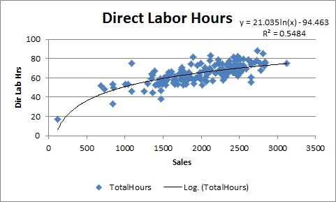
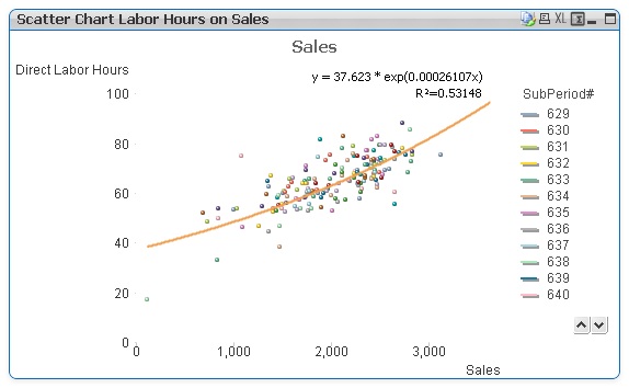
I would like to be able to get a logarithmic trend line in a QlikView scatter chart (or any other type of chart like a straight table) like I can get in Excel. For example, I want to get a logarithmic trend line on direct labor hours (Y axis) and sales (X axis) like this Excel chart. The second chart below it I created using QlikView and with trendline Exponential, but as you will see, the curve is quite different. QlikView does not have Logarithmic as a trendline option.
The idea is we should gain labor efficiency as sales increases, so we want a line that is more like this Excel chart. The trend line (direct labor hours) should increase as sales increases but then start to gradually level off or have a slight inclease (slope) to it. I found some formulas that could simulate it in Excel using a formula like this =LINEST( LN(Known Y Values), LN(Known X Values)) as an array in Excel or a regular Excel formula =INDEX( LINEST( LN(C58:C65), LN(B58:B65)), 1). The problem I'm having is there is not a LN function in QlikView. I'm not strong at trigonometry so there may be another way to solve this using QlikView functions. I have attached the sample data if anyone needs it. Can anyone help me?


- Mark as New
- Bookmark
- Subscribe
- Mute
- Subscribe to RSS Feed
- Permalink
- Report Inappropriate Content
In QlikView, the natural logarithm (Base e) is calculated using function log()
log(x )
The natural logarithm of x. The function is only defined if x > 0. The result is a number.
So compared to Excel, QlikViews logarithmic functions are called log(), log10(), while in Excel they are called ln(), log10().
Hope this helps,
Stefan
- Mark as New
- Bookmark
- Subscribe
- Mute
- Subscribe to RSS Feed
- Permalink
- Report Inappropriate Content
To my knowledge qv supports only few trendline options in which log is not avaiable. I am not sure if this is included in qv 11.
Regards,
Kiran Rokkam.
- Mark as New
- Bookmark
- Subscribe
- Mute
- Subscribe to RSS Feed
- Permalink
- Report Inappropriate Content
Thanks, I will give that a try.
Ross
On Mon, Jul 2, 2012 at 12:58 PM, swuehl <