Unlock a world of possibilities! Login now and discover the exclusive benefits awaiting you.
- Qlik Community
- :
- All Forums
- :
- QlikView App Dev
- :
- Re: How to Show Stacked Bar Chart as Percentage?
- Subscribe to RSS Feed
- Mark Topic as New
- Mark Topic as Read
- Float this Topic for Current User
- Bookmark
- Subscribe
- Mute
- Printer Friendly Page
- Mark as New
- Bookmark
- Subscribe
- Mute
- Subscribe to RSS Feed
- Permalink
- Report Inappropriate Content
How to Show Stacked Bar Chart as Percentage?
Hi all,
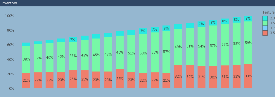
I'm trying to make a stacked bar chart that shows the "mixes" of certain items, relative to the whole. The graph below is 80% of the answer I want, but the percentages aren't all adding up to 100. It's showing percentages of the most recent data point.

Basically, I'd like all of the bars to be the same length, and show percentages in them. This way we can see how the "mixes" of these items change over time.
The expression is one used to calculate inventory whereby it counts Arrivals and subtracts Sales up until a certain date (I'm showing inventory).
COUNT({$<DateType={'Arrival'}>} OrderLineID) - COUNT({$<DateType={'Sale'}>} OrderLineID)
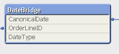
This links to a Date Bridge table that looks like the following:
I think I'm really close to achieving what I'm looking for, but I just need to know that one extra step.
Thank you very much for any and all help!
- « Previous Replies
-
- 1
- 2
- Next Replies »
- Mark as New
- Bookmark
- Subscribe
- Mute
- Subscribe to RSS Feed
- Permalink
- Report Inappropriate Content
Can you try this:
(Count({$<DateType={'Arrival'}>} OrderLineID) - Count({$<DateType={'Sale'}>} OrderLineID))/
Sum(TOTAL <DateField> Aggr(Count({$<DateType={'Arrival'}>} OrderLineID) - Count({$<DateType={'Sale'}>} OrderLineID), DateField, SecondDimension))
Here replace DateField with whatever date dimension you are using in your chart and replace SecondDimension with the second dimension in your chart
- Mark as New
- Bookmark
- Subscribe
- Mute
- Subscribe to RSS Feed
- Permalink
- Report Inappropriate Content
Hi Sunny,
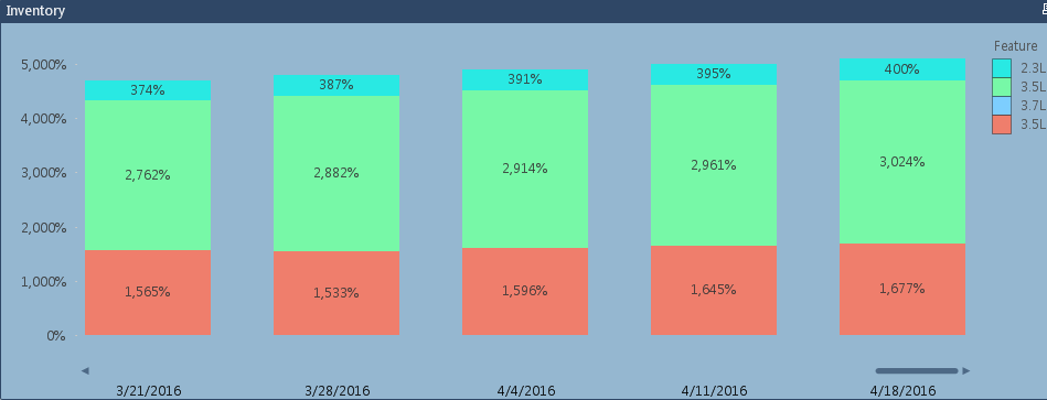
Thank you for the excellently formatted answer! This answer got me closer, but still not quite right. As you can see, the percentages aren't in reference to the current week. Or, all the percentages don't add up to 100. I'd like to have the bars be equal size for each week, and you could easily see the changes in percentages for each particular feature.
Here is the result using the code you provided. I think it is along the same lines, a closer answer than I had achieved, but still partially incorrect. (Why is only the last bar equal to 100%?)
- Mark as New
- Bookmark
- Subscribe
- Mute
- Subscribe to RSS Feed
- Permalink
- Report Inappropriate Content
Have you unchecked relative on the expression tab for this expression?
- Mark as New
- Bookmark
- Subscribe
- Mute
- Subscribe to RSS Feed
- Permalink
- Report Inappropriate Content
If I uncheck relative, then the numbers make no sense at all. Here see it with only 5 intervals so the numbers are clearer:
Also, please note that this features "Full Accumulation"
- Mark as New
- Bookmark
- Subscribe
- Mute
- Subscribe to RSS Feed
- Permalink
- Report Inappropriate Content
Oh so you have full accumulation on as well. Would you be able to share a sample to test it out. I think we might have to ditch the full accumulation and use RangeSum(Above()), but exact syntax will have to be tested.
- Mark as New
- Bookmark
- Subscribe
- Mute
- Subscribe to RSS Feed
- Permalink
- Report Inappropriate Content
Are you happen to be using QV12 by any chance? Will make life so much easier if you are.
- Mark as New
- Bookmark
- Subscribe
- Mute
- Subscribe to RSS Feed
- Permalink
- Report Inappropriate Content
Hi Sunny,
Unfortunately due to data sensitivity, I cannot share this document  (In addition to the sensitivity, the underlying data model will pull data in from multiple QVDs that are on a shared drive, etc.)
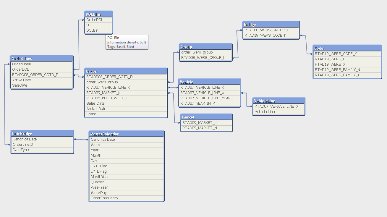
However, I can share with you the data model and how I have been calculating the time dimension up until now:
If(CanonicalDate <= $(=RangeMin( Max({<Type = {"Inventory"}>} [Arrival Date]),Max({<Type = {"Sales"}>} [Sales Date]) )), if(Type='Weekly',WEEKSTART(CanonicalDate),MonthStart(CanonicalDate)))
(It currently uses the RangeMin function to find out which date is the latest that is shared by both Arrival and Sales Date, this is so my inventory and sales graph line up on the same dates, despite the fact that there might be one but not the other on a given date). (Type is a selector by the user to choose month or week so the graph aggregates by the selected type).
The Data model is shown below. The other dimension we are using is: RTAD19_WERS_X
I really appreciate your help with this Sunny!
- Mark as New
- Bookmark
- Subscribe
- Mute
- Subscribe to RSS Feed
- Permalink
- Report Inappropriate Content
We only have QV11 available
- Mark as New
- Bookmark
- Subscribe
- Mute
- Subscribe to RSS Feed
- Permalink
- Report Inappropriate Content
If you are using QV12, you can try this:
=(RangeSum(Above(TOTAL (Count({$<DateType={'Arrival'}>} OrderLineID)), 0, RowNo(TOTAL))) - RangeSum(Above(TOTAL (Count({$<DateType={'Sale'}>} OrderLineID)), 0, RowNo(TOTAL))))/
Sum(TOTAL <Date>Aggr(RangeSum(Above(TOTAL (Count({$<DateType={'Arrival'}>} OrderLineID)), 0, RowNo(TOTAL))) - RangeSum(Above(TOTAL (Count({$<DateType={'Sale'}>} OrderLineID)), 0, RowNo(TOTAL))), (Date, (NUMERIC)), Dim))
But the portion in Red will only work if you have QV12
- « Previous Replies
-
- 1
- 2
- Next Replies »