Unlock a world of possibilities! Login now and discover the exclusive benefits awaiting you.
- Qlik Community
- :
- All Forums
- :
- QlikView App Dev
- :
- Re: How to add $ and the % symbols to the same cha...
- Subscribe to RSS Feed
- Mark Topic as New
- Mark Topic as Read
- Float this Topic for Current User
- Bookmark
- Subscribe
- Mute
- Printer Friendly Page
- Mark as New
- Bookmark
- Subscribe
- Mute
- Subscribe to RSS Feed
- Permalink
- Report Inappropriate Content
How to add $ and the % symbols to the same chart
Hi Qlik experts,
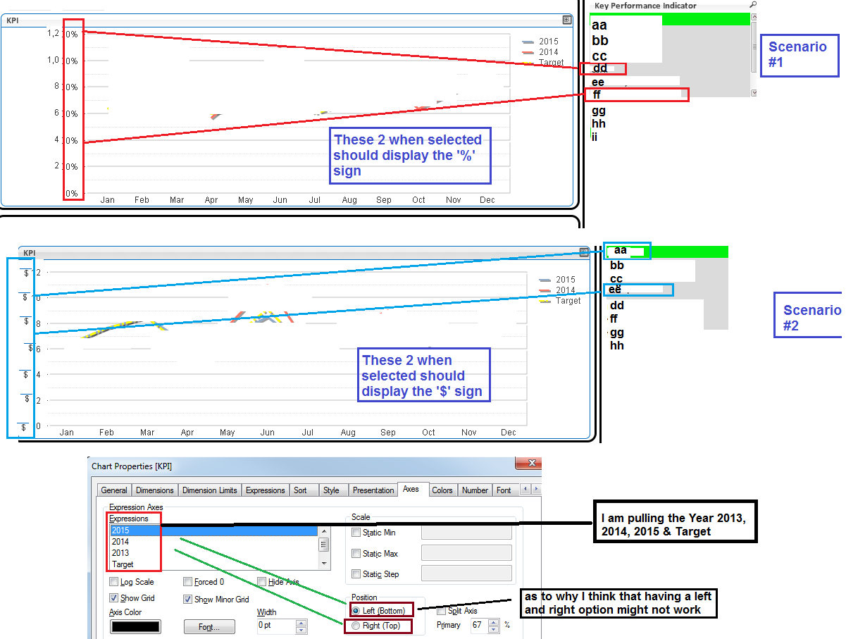
I am new to Qlikview and have been tasked on creating a dashboard but this chart contains data that needs to be represented as % and other with the $ sign in the Y axis of the line chart.
I know that if you have only one selection in the List Box pointing to the chart you can just go to the Number tab and select the Show in Percentage but again this would convert everything to the format you chose.
FYI, the column populating this chart has some data that is percentage and other that is dollar and some that is straight numbers but all this is in the same List Box pulling it from the same SQL column. For example the SQL column is yearlyGoals but each department row reports the data in a different format such as budget is $ but targetGoal is % as to why this makes is a little more difficult.
Your help on this matter is so much appreciated.
Dan
- Tags:
- new_to_qlikview
- Mark as New
- Bookmark
- Subscribe
- Mute
- Subscribe to RSS Feed
- Permalink
- Report Inappropriate Content
You can use an if statement that checks when $ or % should be used and then uses one of two expressions to format the value using the num function. Something like =if( Measure='targetGoal', num(sum(MyValue), '0%'), num(sum(MyValue),'$ #,##0'))
talk is cheap, supply exceeds demand
- Mark as New
- Bookmark
- Subscribe
- Mute
- Subscribe to RSS Feed
- Permalink
- Report Inappropriate Content
Thanks Gysbert,
I have tried to enter the formula pattern you suggested in the Expression Definition of the chart but even though doesn't give me an error the $ or % shows up on the individual points but not on the Y axis label.
I want the symbol to show/change in the Y axis depending on the selection; and I suspect this is more of a presentation issue.

- Mark as New
- Bookmark
- Subscribe
- Mute
- Subscribe to RSS Feed
- Permalink
- Report Inappropriate Content
Can you post a small qlikview document that demonstrates the problem?
talk is cheap, supply exceeds demand
- Mark as New
- Bookmark
- Subscribe
- Mute
- Subscribe to RSS Feed
- Permalink
- Report Inappropriate Content
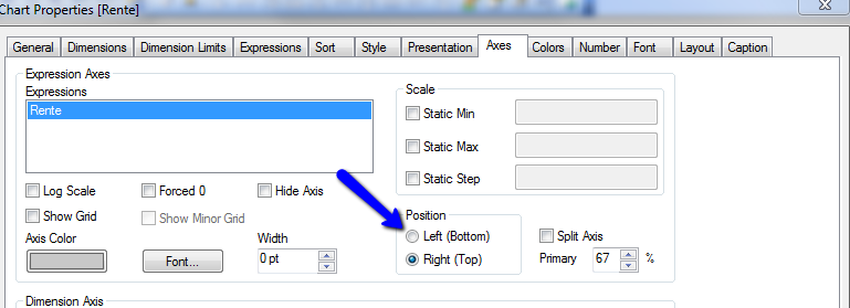
Create for de $ values an expression and a second expression for the % values. Place the $ expression on the left axis and the % expression on the right axis :
- Mark as New
- Bookmark
- Subscribe
- Mute
- Subscribe to RSS Feed
- Permalink
- Report Inappropriate Content