Unlock a world of possibilities! Login now and discover the exclusive benefits awaiting you.
- Qlik Community
- :
- All Forums
- :
- QlikView App Dev
- :
- Re: How to add value at run time?
- Subscribe to RSS Feed
- Mark Topic as New
- Mark Topic as Read
- Float this Topic for Current User
- Bookmark
- Subscribe
- Mute
- Printer Friendly Page
- Mark as New
- Bookmark
- Subscribe
- Mute
- Subscribe to RSS Feed
- Permalink
- Report Inappropriate Content
How to add value at run time?
HI All,
I have brand list and its some value like
Brand Value
A 10
B 20
C 30
So, what I am doing is.
I have created bar chart. in that want to show below and above avg.
So for that I want to create 1 extra bar with avg.
So, I can identify below and above.
By add in database I can achieve
But it will show in filter as well so I don't want that thing.
Thanks
- Mark as New
- Bookmark
- Subscribe
- Mute
- Subscribe to RSS Feed
- Permalink
- Report Inappropriate Content
Why not use a Reference line? (see Properties->Presentation->Reference Lines) They're made for this and add a clear indicator without rearranging your object or taking away the focus from the actual values. Also, a reference line will behave better when a lot of brand values are displayed, while an additional bar may disappear altogether...
Add an expression like =avg(Value), and a suitable line text. The label can include the numerical value if you create a label expression like:
='Avg = ' & num(avg(Value), '#0')
- Mark as New
- Bookmark
- Subscribe
- Mute
- Subscribe to RSS Feed
- Permalink
- Report Inappropriate Content
In the actions or triggers of objects (buttons for example) you can generate extra sql code to add more information, go to External -> Dynamic Update
Take a look at the help online ... and let me know
- Mark as New
- Bookmark
- Subscribe
- Mute
- Subscribe to RSS Feed
- Permalink
- Report Inappropriate Content
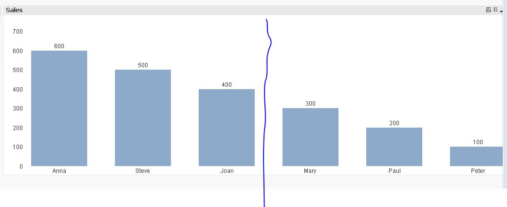
Peter I want like this.
which is not possible with that reference line.
So, I am going for 1 extra bar.
- Mark as New
- Bookmark
- Subscribe
- Mute
- Subscribe to RSS Feed
- Permalink
- Report Inappropriate Content
I'm with you.
Have a look at this great post (as always) by HIC: http://community.qlik.com/blogs/qlikviewdesignblog/2013/12/09/pareto-analysis
He explains how to divide bars into categories and how to let them stand-out based on specific conditions. The same technique can be applied to your situation, I think.
- Mark as New
- Bookmark
- Subscribe
- Mute
- Subscribe to RSS Feed
- Permalink
- Report Inappropriate Content
Sorry for that statement.
I have gone through that link. But peter my requirement is like vertical line. So, ..
Thanks.
- Mark as New
- Bookmark
- Subscribe
- Mute
- Subscribe to RSS Feed
- Permalink
- Report Inappropriate Content
Can you give any example how to use that dynamic update in qlikview?