Unlock a world of possibilities! Login now and discover the exclusive benefits awaiting you.
- Qlik Community
- :
- All Forums
- :
- QlikView App Dev
- :
- Re: How to create QV tables in scripts
- Subscribe to RSS Feed
- Mark Topic as New
- Mark Topic as Read
- Float this Topic for Current User
- Bookmark
- Subscribe
- Mute
- Printer Friendly Page
- Mark as New
- Bookmark
- Subscribe
- Mute
- Subscribe to RSS Feed
- Permalink
- Report Inappropriate Content
How to create QV tables in scripts
Hello,
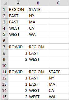
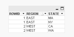
What's the QV script syntax to produce the following tables? See attached screen. This is what
I'm looking for. Given the data in rows 1 thru 5, how do you write the QV code to produce two additional
tables (rows 7-9 and rows 11-15)?
I'm sure this isn't that difficult for some of the more experienced QV developers.
I appreciate your help.
- « Previous Replies
-
- 1
- 2
- Next Replies »
- Mark as New
- Bookmark
- Subscribe
- Mute
- Subscribe to RSS Feed
- Permalink
- Report Inappropriate Content
The ROWID is not being displayed when I ran it.
- Mark as New
- Bookmark
- Subscribe
- Mute
- Subscribe to RSS Feed
- Permalink
- Report Inappropriate Content
you can use autonumber to make unique ROWID for each REGION
SOURCE:
LOAD * INLINE [
REGION , STATE
EAST, NY
EAST, MA
WEST, CA
WEST, WA
];
OUTPUT1:
load AutoNumber(REGION) as ROWID, REGION Resident SOURCE;
Left Join (SOURCE) load * Resident OUTPUT1;
- Mark as New
- Bookmark
- Subscribe
- Mute
- Subscribe to RSS Feed
- Permalink
- Report Inappropriate Content
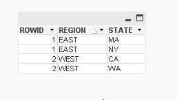
I see you've a screenshot showing the output I wanted. When I looked the model, I see this and none of the table
gives me the ROWID, REGION and STATE columns. Is this what I'm expecting to see?
- Mark as New
- Bookmark
- Subscribe
- Mute
- Subscribe to RSS Feed
- Permalink
- Report Inappropriate Content
do you really need 3 tables? why?
or may be you can stay with 1?
SOURCE:
LOAD * INLINE [
REGION , STATE
EAST, NY
EAST, MA
WEST, CA
WEST, WA
];
Left Join (SOURCE) load Distinct REGION, AutoNumber(REGION) as ROWID Resident SOURCE;
- Mark as New
- Bookmark
- Subscribe
- Mute
- Subscribe to RSS Feed
- Permalink
- Report Inappropriate Content
MG,
This is perfect ! That's exactly what I was looking for.
Thanks.
- Mark as New
- Bookmark
- Subscribe
- Mute
- Subscribe to RSS Feed
- Permalink
- Report Inappropriate Content
- Mark as New
- Bookmark
- Subscribe
- Mute
- Subscribe to RSS Feed
- Permalink
- Report Inappropriate Content
MG,
I'm just coming back to what you had posted earlier which is this
SOURCE:
LOAD * INLINE [
REGION , STATE
EAST, NY
EAST, MA
WEST, CA
WEST, WA
];
OUTPUT1:
load AutoNumber(REGION) as ROWID,
REGION
Resident SOURCE;
Left Join (SOURCE) load * Resident OUTPUT1;
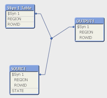
What would I need to do so I can see the last resultset in the data diagram? I guess it would be the result of running that very last statement in above which the LEFT JOIN. I tried to alias it with a table name right before it and I still didn't see it in the diagram. I know you already provided a perfect solution to me but I wanted to learn how to get this
working as well.
- Mark as New
- Bookmark
- Subscribe
- Mute
- Subscribe to RSS Feed
- Permalink
- Report Inappropriate Content
Not sure to understand your last question
In the table viewer (ctrl + t) you see the qlik data model.
You don't need a table for every different chart you want to show.
You don't need all the fields of your chart in the same table.
You can build a chart using all the fields in the data model.
If you want this, just add a tablebox object with the 3 fields
- « Previous Replies
-
- 1
- 2
- Next Replies »