Unlock a world of possibilities! Login now and discover the exclusive benefits awaiting you.
- Qlik Community
- :
- All Forums
- :
- QlikView App Dev
- :
- Re: How to draw a qlikview Scatter Chart
- Subscribe to RSS Feed
- Mark Topic as New
- Mark Topic as Read
- Float this Topic for Current User
- Bookmark
- Subscribe
- Mute
- Printer Friendly Page
- Mark as New
- Bookmark
- Subscribe
- Mute
- Subscribe to RSS Feed
- Permalink
- Report Inappropriate Content
How to draw a qlikview Scatter Chart
Dear Experts,
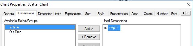
I have have a requirement where I am supposed to configure a scatter chart to show the number of employees arriving in a particular time interval.I have the data of employee ids and their corresponding entry time(in-time).I was able to create a datafield termed TimeBucket as given below .Now I need support to create a scatter chart to show the count of employees arriving at a particular TimeBucket.I tried creating with Emp-id as dimension,TimeBucket in x-axis,in-time in y-axis and Emp-id as bubble size expression but I am not getting the desired result.A sample of straight chart output is given below.In this example the number of employees arriving between 8am-9am is 1,9am-10am is 3,10am-11am is 2 and 11am-12pm is 1 which should be the size of bubble.Thank you for your time and consideration.
| Emp-id | in-time | TimeBucket |
|---|---|---|
1900 | 08:30:23 | 8 am - 9 am |
| 1901 | 09:10:10 | 9 am - 10 am |
| 2000 | 09:40:29 | 9 am - 10 am |
| 1995 | 09:45:23 | 9 am - 10 am |
| 2501 | 10:05:09 | 10 am - 11 am |
| 1989 | 10:30:12 | 10 am - 11 am |
| 1850 | 11:02:45 | 11 am - 12 pm |
Regards
Rishi
Accepted Solutions
- Mark as New
- Bookmark
- Subscribe
- Mute
- Subscribe to RSS Feed
- Permalink
- Report Inappropriate Content
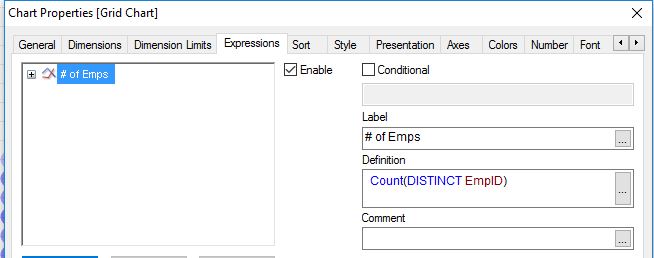
I think what you need is a bar chart and showing a histogram:
Use TimeBucket as dimension and
=Count(DISTINCT Emp-Id)
as expression.
If you really want to use a scatter chart, please elaborate which axis expressions you want to use, using TimeBucket and in-time doesn't make much sense to me.
- Mark as New
- Bookmark
- Subscribe
- Mute
- Subscribe to RSS Feed
- Permalink
- Report Inappropriate Content
Hi,
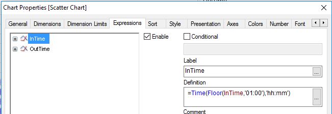
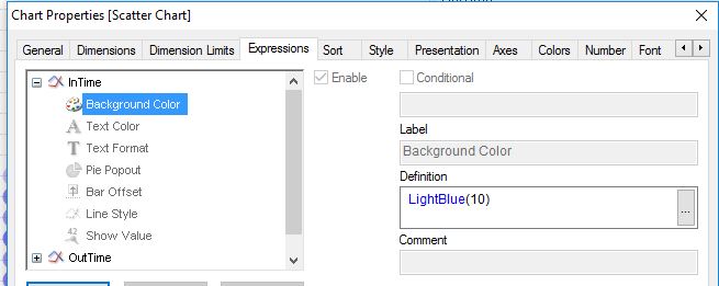
as a scatter chart might not be appropriate to visualize In-time buckets and number of employees, maybe you could add an out-time bucket as second expression to define the bubble position. The number of employees might as well be colour coded instead of using bubble sizes:
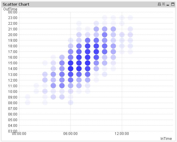
Another solution could be a grid chart instead:
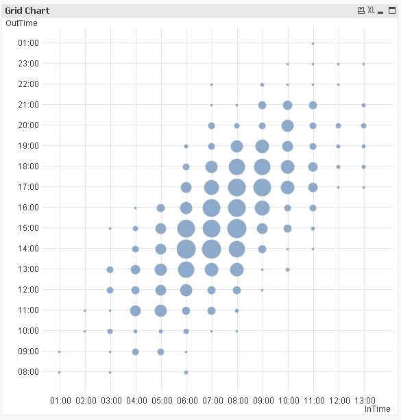
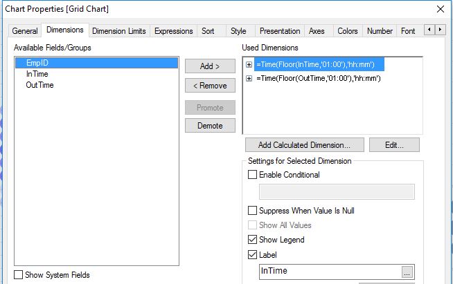
tabEmpTime:
LOAD *,
    Time(InTime+NORMINV(Rand(),'08:00','02:00')) as OutTime;
LOAD 999+RecNo() as EmpID,
    Time(NORMINV(Rand(),'08:00','02:00')) as InTime
AutoGenerate 1000;
hope this helps
regards
Marco
- Mark as New
- Bookmark
- Subscribe
- Mute
- Subscribe to RSS Feed
- Permalink
- Report Inappropriate Content
Dear Macro
Thank you for your quick response.I hope its better to use bar chart for better understanding as suggested.Thank you for making me understand as how to accomplish the same through these charts.
- Mark as New
- Bookmark
- Subscribe
- Mute
- Subscribe to RSS Feed
- Permalink
- Report Inappropriate Content
Dear Swuehi
I thought to use scatter chart but bar chart explains pretty well.Thank you for your consideration and helping me
Regards
Rishi