Unlock a world of possibilities! Login now and discover the exclusive benefits awaiting you.
- Qlik Community
- :
- All Forums
- :
- QlikView App Dev
- :
- Re: How to embed a straight table into a Combo cha...
- Subscribe to RSS Feed
- Mark Topic as New
- Mark Topic as Read
- Float this Topic for Current User
- Bookmark
- Subscribe
- Mute
- Printer Friendly Page
- Mark as New
- Bookmark
- Subscribe
- Mute
- Subscribe to RSS Feed
- Permalink
- Report Inappropriate Content
How to embed a straight table into a Combo chart
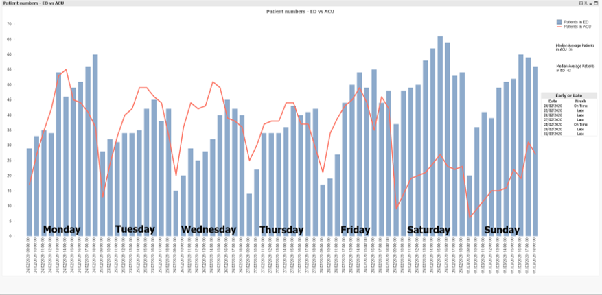
I have a combo chart and over that i have created a small straight table as per picture:
Is there a way to embed the straight table into the chart so i can export the image and easily print it?
Thanks.
Accepted Solutions
- Mark as New
- Bookmark
- Subscribe
- Mute
- Subscribe to RSS Feed
- Permalink
- Report Inappropriate Content
By concat you could add a third parameter to order the results, like:
concat(aggr(Date & ' ' & [Early Finish or Late],Date),Chr(10), Date)
Important is that the parameter is numeric - means here it must be a real date.
- Marcus
- Mark as New
- Bookmark
- Subscribe
- Mute
- Subscribe to RSS Feed
- Permalink
- Report Inappropriate Content
I think it's not directly possible. Your table doesn't look very complex and therefore you may re-create the table within one or several textboxes - I mean the free text feature from the tab presentation (bottom right). For it you will need some aggr() and some logic to align - usually counting the length of the items and using it as parameter for a repeat() or similar - the content within it - maybe something in this way:
concat(aggr(Date & ' ' & YourExpression, Date), chr(10))
- Marcus
- Mark as New
- Bookmark
- Subscribe
- Mute
- Subscribe to RSS Feed
- Permalink
- Report Inappropriate Content
Thanks for coming back to me.
That isn't quite working it just shows 7 lines of 0
The Expression i used was: =concat(aggr(Date&''=[Early Finish or Late],Date),Chr(10))
I was also wanting it to be able to colour code the responses, on the original table i used this expression within the text color field to produce this:
Pick(Match(Finish,'On Time','Early','Late'),Blue(),Green(),Red())
I tried to input that code into the Font, Base Color, Calculated field but it just said bad field for Finish.
Any ideas?
- Mark as New
- Bookmark
- Subscribe
- Mute
- Subscribe to RSS Feed
- Permalink
- Report Inappropriate Content
The syntax isn't right - it should be rather:
= concat(aggr(Date & ' ' & [Early Finish or Late],Date),Chr(10))
and it might be helpful to play with the logic within a dummy-textbox instead of the chart (easier access to the properties and less calculations). It might be also needed that you adds some more logic - further dimensions in which context the calculation should happens, any needed set analysis and so on and of course using the right fields/expressions.
Any coloring here won't be possible - but ou may use upper/lower() and/or further ascii-chars to highlight respectively differ more between the results.
- Marcus
- Mark as New
- Bookmark
- Subscribe
- Mute
- Subscribe to RSS Feed
- Permalink
- Report Inappropriate Content
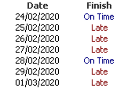
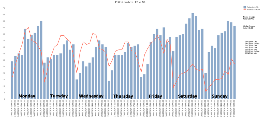
So that has worked beautifully with one small complication.
Its decided to put the 01/03/20 date at the top of the list so it looks like this:
Any ideas why?
Its a shame about the lack of colouring but i'm sure we can live with it.
- Mark as New
- Bookmark
- Subscribe
- Mute
- Subscribe to RSS Feed
- Permalink
- Report Inappropriate Content
By concat you could add a third parameter to order the results, like:
concat(aggr(Date & ' ' & [Early Finish or Late],Date),Chr(10), Date)
Important is that the parameter is numeric - means here it must be a real date.
- Marcus
- Mark as New
- Bookmark
- Subscribe
- Mute
- Subscribe to RSS Feed
- Permalink
- Report Inappropriate Content
Thank you, this is great and has also helped me with a couple of other elements too using the same idea in the syntax.
Its a shame the colour picking on the expression doesn't work but you can't have everything.
Thank you!


