Unlock a world of possibilities! Login now and discover the exclusive benefits awaiting you.
- Qlik Community
- :
- All Forums
- :
- QlikView App Dev
- :
- Re: How to get monthly salary and Yearly bonus in ...
- Subscribe to RSS Feed
- Mark Topic as New
- Mark Topic as Read
- Float this Topic for Current User
- Bookmark
- Subscribe
- Mute
- Printer Friendly Page
- Mark as New
- Bookmark
- Subscribe
- Mute
- Subscribe to RSS Feed
- Permalink
- Report Inappropriate Content
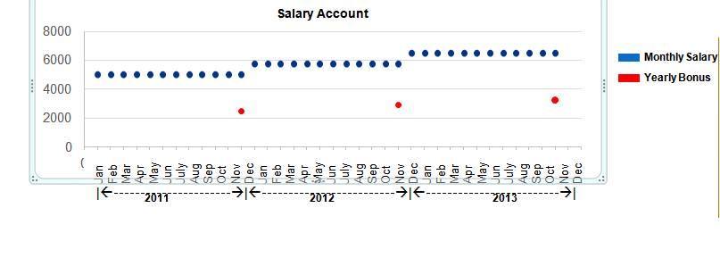
How to get monthly salary and Yearly bonus in same chart?
Hi All,
I have requirement to show Monthly salary and Yearly bonus in same chart.
In Y-axis expression is like sum({<AccountDescription={salaries}>}Amount) as Monthly salary,
and sum({<AccountDescription={'Salary & Other Comp'}>}Amount) as Yearly Bonus.
For better understanding Plz see below image .
Accepted Solutions
- Mark as New
- Bookmark
- Subscribe
- Mute
- Subscribe to RSS Feed
- Permalink
- Report Inappropriate Content
I should get Blue dot for all month year but red colour dot(Bonus ) only at the end of each year.
Your data says otherwise. If the bonus amount were only available in the last month of the year you would see that reflected in the chart.
talk is cheap, supply exceeds demand
- Mark as New
- Bookmark
- Subscribe
- Mute
- Subscribe to RSS Feed
- Permalink
- Report Inappropriate Content
Combine the Year and Month dimensions into one dimension. The best option is to create this field in the script. If that's not an option you can use a calculated dimension: =MyYearField & '/' & MyMonthField
talk is cheap, supply exceeds demand
- Mark as New
- Bookmark
- Subscribe
- Mute
- Subscribe to RSS Feed
- Permalink
- Report Inappropriate Content
Thank you ,
Issue is ,Salary is month wise but Bonus is once in a year.
I should get Blue dot for all month year but red colour dot(Bonus ) only at the end of each year.
- Mark as New
- Bookmark
- Subscribe
- Mute
- Subscribe to RSS Feed
- Permalink
- Report Inappropriate Content
I should get Blue dot for all month year but red colour dot(Bonus ) only at the end of each year.
Your data says otherwise. If the bonus amount were only available in the last month of the year you would see that reflected in the chart.
talk is cheap, supply exceeds demand
- Mark as New
- Bookmark
- Subscribe
- Mute
- Subscribe to RSS Feed
- Permalink
- Report Inappropriate Content
Hi
May be try like this
You can create a flag for Last Month of every year and use in the "Yearly Bonus" expression.
Ex: = if(Month = 'Dec', 1, 0) as Flag
sum({<AccountDescription={'Salary & Other Comp'}, Flag = {1}>}Amount)
Please close the thread by marking correct answer & give likes if you like the post.
- Mark as New
- Bookmark
- Subscribe
- Mute
- Subscribe to RSS Feed
- Permalink
- Report Inappropriate Content
Thank you ,
You valuable answer made me think more about data, let me check once again.
- Mark as New
- Bookmark
- Subscribe
- Mute
- Subscribe to RSS Feed
- Permalink
- Report Inappropriate Content
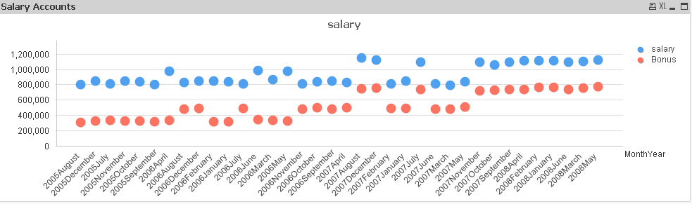
Hi Mahantesh,
PFA.
Hope it works.
Regards
KC
KC