Unlock a world of possibilities! Login now and discover the exclusive benefits awaiting you.
- Qlik Community
- :
- All Forums
- :
- QlikView App Dev
- :
- Re: How to have 2*y axis in one diagram + areas + ...
- Subscribe to RSS Feed
- Mark Topic as New
- Mark Topic as Read
- Float this Topic for Current User
- Bookmark
- Subscribe
- Mute
- Printer Friendly Page
- Mark as New
- Bookmark
- Subscribe
- Mute
- Subscribe to RSS Feed
- Permalink
- Report Inappropriate Content
How to have 2*y axis in one diagram + areas + bars + lines
Dear all,
I do need a diagram which looks like the one below:
...having
1. a barchart (blue bars) - no problem
2. a calculated black line - minor problem: The line should follow relative values (%) while the bars have absolute values!
3. a lower boundary-area for the black line (red)
4. an upper boundary-area for the black line (green)
5. TWO y-axis (one relative for lines/areas, one absolute for the bars).
Could anyone please help me? I did not find anything suitable in QlikView manual.
Thanks a lot
Oliver

- Mark as New
- Bookmark
- Subscribe
- Mute
- Subscribe to RSS Feed
- Permalink
- Report Inappropriate Content
You need to choose proper axes settings on properties axes tab\
Firstly, you select the expression and then for the seleted expression you choose axis position (Lefr or right).
There you can also scale those axes so that the 100% suits the highest bar value.
- Mark as New
- Bookmark
- Subscribe
- Mute
- Subscribe to RSS Feed
- Permalink
- Report Inappropriate Content
Thanks a lot - I had missed this option.
Now I get a diagram like this:
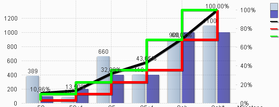
Is there any way to get the green line / red line appear as areas (see 3.+4. in my initial question)
Thanks Oliver
- Mark as New
- Bookmark
- Subscribe
- Mute
- Subscribe to RSS Feed
- Permalink
- Report Inappropriate Content
The worst solution (and unfortunately the only i came upon) is to place 2 chart, one above the other. One only with Upper and lower bound.