Unlock a world of possibilities! Login now and discover the exclusive benefits awaiting you.
- Qlik Community
- :
- All Forums
- :
- QlikView App Dev
- :
- Re: How to set dimensions for x-axis in chart
- Subscribe to RSS Feed
- Mark Topic as New
- Mark Topic as Read
- Float this Topic for Current User
- Bookmark
- Subscribe
- Mute
- Printer Friendly Page
- Mark as New
- Bookmark
- Subscribe
- Mute
- Subscribe to RSS Feed
- Permalink
- Report Inappropriate Content
How to set dimensions for x-axis in chart
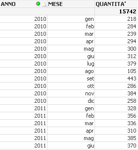
I have a table which represents the quantities of sold product for each month in different years from 2010 up to 2014

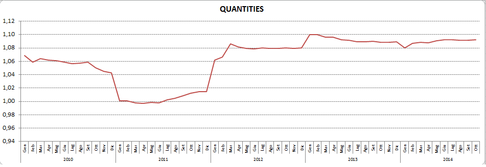
I would like to have in QV the same chart I have with excel

but what I can have is like the below example

where there is not a single line but it is referred to each month.
My set is:
dimensions:
Year
Month
expression:
=SUM({<My_year=,My_month=>} Quantità)
by using the set analysis.
How can I have something like excel chart?
Thanks
Massimo
- Tags:
- new_to_qlikview
Accepted Solutions
- Mark as New
- Bookmark
- Subscribe
- Mute
- Subscribe to RSS Feed
- Permalink
- Report Inappropriate Content
Month(Mese) as My_month,
Date(MonthStart (Mese), 'MMM-YYYY') as MonthYear,
Year(Mese) as My_year,
- Mark as New
- Bookmark
- Subscribe
- Mute
- Subscribe to RSS Feed
- Permalink
- Report Inappropriate Content
I would suggest to create a YearMonth field in the script and use that in your chart instead.
Add this to your MasterCalendar (or any table you are using the date from):
Date(MonthStart (DateField), 'MMM-YYYY') as MonthYear,
Would that work for you?
- Mark as New
- Bookmark
- Subscribe
- Mute
- Subscribe to RSS Feed
- Permalink
- Report Inappropriate Content
Dear Onno,
In my script I set the below:
LOAD
Month(Mese) as My_month,
Year(Mese) as My_year,
since Mese is stated as JAN-2014, FEB-2014, etc.
Where and how I can use your suggest?
I apologise for that but I am not an expert.
Thanks in advance
- Mark as New
- Bookmark
- Subscribe
- Mute
- Subscribe to RSS Feed
- Permalink
- Report Inappropriate Content
use Month(Mese) & '-' & Year(Mese) as MonthYear in your script.
- Mark as New
- Bookmark
- Subscribe
- Mute
- Subscribe to RSS Feed
- Permalink
- Report Inappropriate Content
Hi,
Can you please try loading an extra column as
date#(MESE&'-'ANNO ,'MMM-YYYY') AS [MON-YYYY]
and using that column in the chart.
- Mark as New
- Bookmark
- Subscribe
- Mute
- Subscribe to RSS Feed
- Permalink
- Report Inappropriate Content
Month(Mese) as My_month,
Date(MonthStart (Mese), 'MMM-YYYY') as MonthYear,
Year(Mese) as My_year,
- Mark as New
- Bookmark
- Subscribe
- Mute
- Subscribe to RSS Feed
- Permalink
- Report Inappropriate Content
What Zeeshanuddin suggests would be a calculated dimension.
Calculated dimensions are bad for performance, so if you have the choice to add the MonthYear field to your script and use that instead, it would be better for performance.
- Mark as New
- Bookmark
- Subscribe
- Mute
- Subscribe to RSS Feed
- Permalink
- Report Inappropriate Content
That would result in month numbers instead of month abbreviations (the 3 letters).
So, Massimo, take what you like ![]() .
.
- Mark as New
- Bookmark
- Subscribe
- Mute
- Subscribe to RSS Feed
- Permalink
- Report Inappropriate Content
Thanks Onno,
it works perfectly.
Massimo