Unlock a world of possibilities! Login now and discover the exclusive benefits awaiting you.
- Qlik Community
- :
- All Forums
- :
- QlikView App Dev
- :
- How to show chart y-axis like Millions and Thousan...
- Subscribe to RSS Feed
- Mark Topic as New
- Mark Topic as Read
- Float this Topic for Current User
- Bookmark
- Subscribe
- Mute
- Printer Friendly Page
- Mark as New
- Bookmark
- Subscribe
- Mute
- Subscribe to RSS Feed
- Permalink
- Report Inappropriate Content
How to show chart y-axis like Millions and Thousandas?
Hi ,
please find the below attached file
How to Display Y-AXIS lik this
1 K
2 K
3 K
4 M
please help me
Thanks
- Mark as New
- Bookmark
- Subscribe
- Mute
- Subscribe to RSS Feed
- Permalink
- Report Inappropriate Content
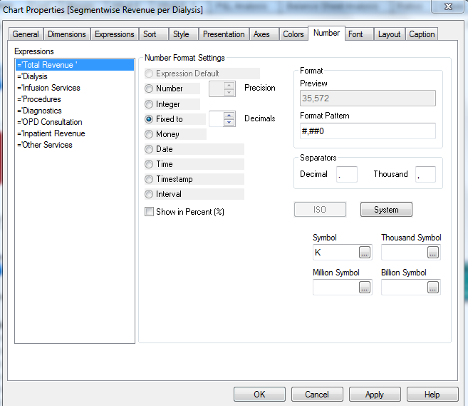
Hi,
Please find below snapshot.
- Mark as New
- Bookmark
- Subscribe
- Mute
- Subscribe to RSS Feed
- Permalink
- Report Inappropriate Content
i tried but not working
in the chart both millions and thousands will display.
- Mark as New
- Bookmark
- Subscribe
- Mute
- Subscribe to RSS Feed
- Permalink
- Report Inappropriate Content
i tried but not working
in the chart both millions and thousands will display.
- Mark as New
- Bookmark
- Subscribe
- Mute
- Subscribe to RSS Feed
- Permalink
- Report Inappropriate Content
To make this function correctly you need to enter K, M and B into the Thousand, Million and Billion boxes respectively. The symbol field is for putting a unit of measure in, for instance you may go for $, $K, $M and $B into into each of the boxes.
Hope that helps,
Steve
- Mark as New
- Bookmark
- Subscribe
- Mute
- Subscribe to RSS Feed
- Permalink
- Report Inappropriate Content
Kristamma, Qlikview does not have the dynamic multiple assignment you're seeking. Using the built-in symbols will allow you to format an axis as thousands, millions, or billions, but it will always use a consistent unit for the entire axis. In your example above, it would show $500k as $0.5M. Or you could shift everything to thousands, but that would be more confusing.
Many graphing products work in a similar manner. Consistency helps to avoid confusion.
Sorry. Hope it helps!