Unlock a world of possibilities! Login now and discover the exclusive benefits awaiting you.
- Qlik Community
- :
- All Forums
- :
- QlikView App Dev
- :
- Re: How to show less value bar along with Forced 0...
- Subscribe to RSS Feed
- Mark Topic as New
- Mark Topic as Read
- Float this Topic for Current User
- Bookmark
- Subscribe
- Mute
- Printer Friendly Page
- Mark as New
- Bookmark
- Subscribe
- Mute
- Subscribe to RSS Feed
- Permalink
- Report Inappropriate Content
How to show less value bar along with Forced 0 in Axis...?
Hello every one,
We have a bar chart where the we are calculating the variance between the bars.
last 2 months data along with the current month will be displayed at a time.
Values are in Millions for the remaining bars where as one bar with just 103 count its laying on the Y axis ,
its very difficult to observe the bar in the first glance.
and we are not allowed to remove the Forced 0 ( Properties - Axis ) option which is alternate for this issue.
is there any other alternate to achieve this.
It will be great if any one comes with an approach.
attaching the sample Qvw and Source file.
Regards,
dhasharadh.
- Mark as New
- Bookmark
- Subscribe
- Mute
- Subscribe to RSS Feed
- Permalink
- Report Inappropriate Content
May be change the axis (From Left to Right) for one of the bar, the information might be skewed, but you may be able to force a maximum for the axis.
- Mark as New
- Bookmark
- Subscribe
- Mute
- Subscribe to RSS Feed
- Permalink
- Report Inappropriate Content
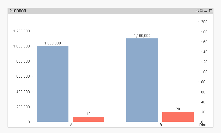
Something like this
- Mark as New
- Bookmark
- Subscribe
- Mute
- Subscribe to RSS Feed
- Permalink
- Report Inappropriate Content
Thank you Sunny for the Work around  ,
,
here in your example : the second expression always take the Right side axis ,
if we get always small values in the second bar this method is Perfect.
But In my situation the values in the second bar varies from Millions to hundreds for different selections.
So I want the Scale also take the appropriate values as per the bar values.
Any Idea for this.
- Mark as New
- Bookmark
- Subscribe
- Mute
- Subscribe to RSS Feed
- Permalink
- Report Inappropriate Content
Can you share an example of your situation?
- Mark as New
- Bookmark
- Subscribe
- Mute
- Subscribe to RSS Feed
- Permalink
- Report Inappropriate Content
Hello Sunny ,
Please find the Attached Sample Qvw and Excel file.
- Mark as New
- Bookmark
- Subscribe
- Mute
- Subscribe to RSS Feed
- Permalink
- Report Inappropriate Content
Probably use a Offset number to bring it to a range, As example below
If(Sum(FieldValue)>=1000000,Num(Sum(FieldValue)/1000000,'#,##0 M'),Num(Sum(FieldValue)/1000,'#,##0 K'))
Although you might want to inform the Users for the same