Unlock a world of possibilities! Login now and discover the exclusive benefits awaiting you.
- Qlik Community
- :
- All Forums
- :
- QlikView App Dev
- :
- Issue with line graph; plotting measure on dimensi...
- Subscribe to RSS Feed
- Mark Topic as New
- Mark Topic as Read
- Float this Topic for Current User
- Bookmark
- Subscribe
- Mute
- Printer Friendly Page
- Mark as New
- Bookmark
- Subscribe
- Mute
- Subscribe to RSS Feed
- Permalink
- Report Inappropriate Content
Issue with line graph; plotting measure on dimension over time
Dear all
I struggle with an issue which should be easy to resolve (I hope).
I want to plot a Combo Chart (or line if possible) over time for a particular measure (sales), per operating company.
OPCO and time are dimensions, sales the expression
Graph shows both dimensions in the x-axis, and graph is unreadable.
However i want to have the graph show different (sales) lines per OPCO.
Is this possible?
Thank you in advance!!
BR,
Jeroen
- Tags:
- new_to_qlikview
- Mark as New
- Bookmark
- Subscribe
- Mute
- Subscribe to RSS Feed
- Permalink
- Report Inappropriate Content
Do you want the chart like the one in the attached file?
- Mark as New
- Bookmark
- Subscribe
- Mute
- Subscribe to RSS Feed
- Permalink
- Report Inappropriate Content
Hi There,
This should just be a case of choosing the right chart type (Line), putting the dimensions in the right order (Time first) and ensuring your sort order is correct (Time ascending). The example that has been posted shows this fine.
Is the issue that your time dimension is actually a string rather than a date? This will cause some odd behaviour (and you will need to use a date# function), but it should still work.
Can you post a screenshot or an example document that shows the problem?
Regards,
- Mark as New
- Bookmark
- Subscribe
- Mute
- Subscribe to RSS Feed
- Permalink
- Report Inappropriate Content
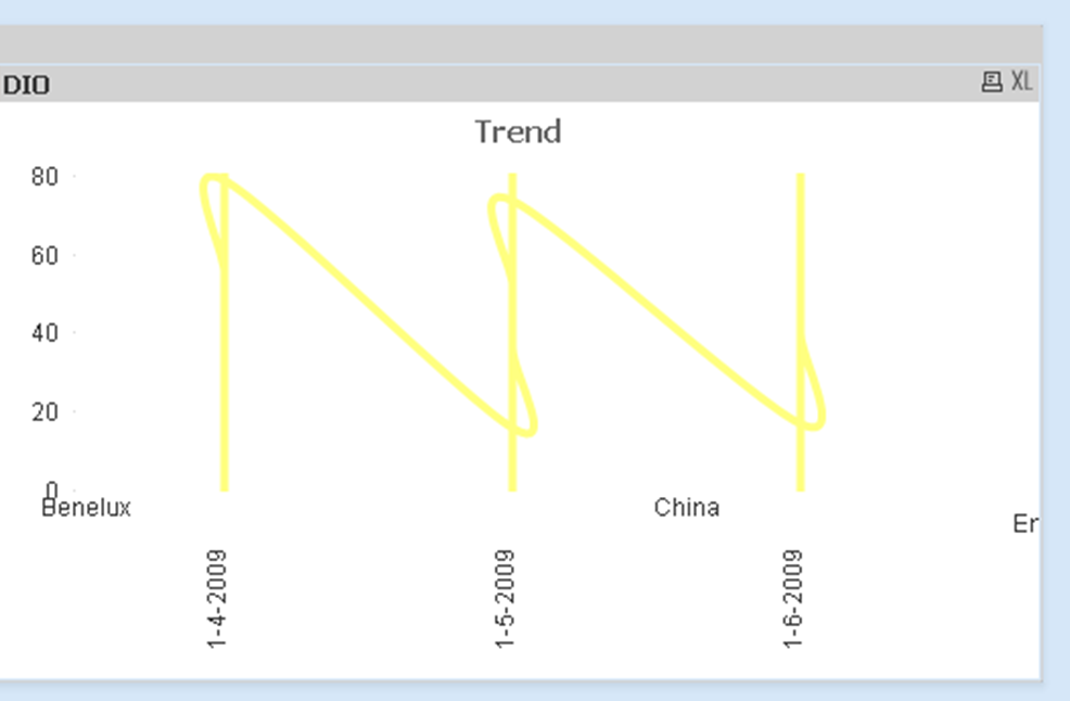
i currently have personal version, so unfortunately can't open the qvw file. Issue does not seem related to time not being date. To be sure i added the Date# function, but still doesn't work. Pls see above screenshot.
For me only works with combo chart. With line chart i see only 1 line for the total of countries.
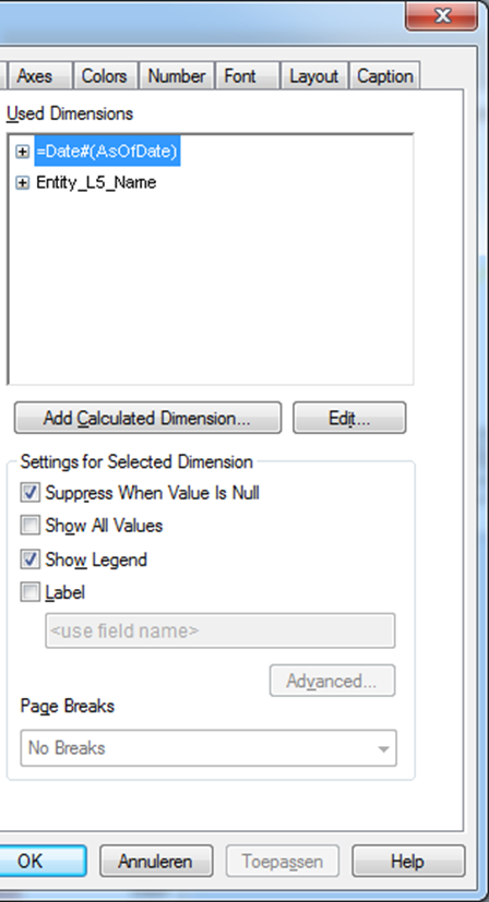
this is how dimensions look:
- Mark as New
- Bookmark
- Subscribe
- Mute
- Subscribe to RSS Feed
- Permalink
- Report Inappropriate Content
Hi there,
This is looking very odd. Can you please change the chart type to straight table and post up a screenshot of the output. Can you please also post the expression you are using - it needs to be an aggregation such as sum? Do you have any Trendlines turned on - suggest you switch these off for the time being.
Are both fields in your dimension in the same table? If not are you sure of the associations between the tables?
Posting up the .qvw or an anonymised version thereof would certainly help with working out what is going on.
Kind regards
- Steve
- Mark as New
- Bookmark
- Subscribe
- Mute
- Subscribe to RSS Feed
- Permalink
- Report Inappropriate Content
Hi Steve,
First of all thank you for your quick reply!
Unfortunately i can´t easily upload this dashboard related to working capital
However i think i found part of reason for the issue:
my source data looks something like this:
OPCO Date Measure Value
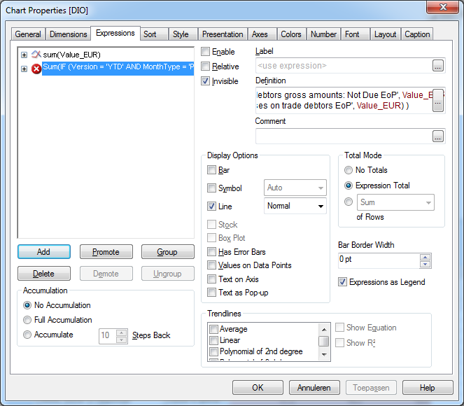
To arrive at the DIO I first in the expressions create new expressions with an IF statement SUM(IF Measure = Inventory, Value) and same for COGS. (real calcs are more complex, but same principle applies)
In DIO I divide these. Only want to show DIO in graph. I put other 2 expressions on Enable, but also invisible
As far as i can see, i need to have them enabled, otherwise DIO is not calculated.
When testing same chart only sum(value) graph DOES work. When I add another expression with a sum(if( in it, it shows graph as in prev posting. When i disable box before ´Enable´ chart is ok. But as stated before I do need these expression calculations to arrive at the final expression.
Hope I am stating this in an understandable matter?
Thanks in advance!
Jeroen
- Mark as New
- Bookmark
- Subscribe
- Mute
- Subscribe to RSS Feed
- Permalink
- Report Inappropriate Content
I found the solution!
instead of ticking the ´Invisible´ option, i should choose enable, but leave all display options blank. Now it works perfectly. Another issue i had with the axes referring to the other expressions is now also resolved.
Thanks for thinking along, this helped me find the solution 
BR, Jeroen
- Mark as New
- Bookmark
- Subscribe
- Mute
- Subscribe to RSS Feed
- Permalink
- Report Inappropriate Content
Hi Jeroen,
Glad you found the solution - thanks for posting back to the group.
As a rule of thumb the more calcs you can do in the load script the better as it can make chart expressions simpler -don't know if this will be possible with the scenario you have described above though.
Regards,
Steve