Unlock a world of possibilities! Login now and discover the exclusive benefits awaiting you.
- Qlik Community
- :
- All Forums
- :
- QlikView
- :
- Line Chart for timestamp
- Subscribe to RSS Feed
- Mark Topic as New
- Mark Topic as Read
- Float this Topic for Current User
- Bookmark
- Subscribe
- Mute
- Printer Friendly Page
- Mark as New
- Bookmark
- Subscribe
- Mute
- Subscribe to RSS Feed
- Permalink
- Report Inappropriate Content
Line Chart for timestamp
Hello Everyone,
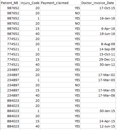
I need some help figuring this out. in the below, when a patient attends the doctor the patient gets paid (Payment_claimed) if the Injury_Code is equal to 20.
using A line Chart (feel free to suggest something else) I would like to show the Patient's attendance and highlight where the Patient made a claim but didn't attend the doctor.
we know if the patient attended when the Doctor_Invoice_Date is not null. The Excel File is attached
I appreciate any help/idea
Regards
Accepted Solutions
- Mark as New
- Bookmark
- Subscribe
- Mute
- Subscribe to RSS Feed
- Permalink
- Report Inappropriate Content
Hi Didier,
I would probably just use a pivot chart and use color expressions for your appointment counts. This way you can group all the patient IDs in to buckets and then sub group their appointment dates within that.
You seem to have 3 main scenarios to be concerned with based on your data: 1) Did not attend and claimed 2) Did attend and claimed but wasn't a code 20 3) All others. You could expand that to include several other scenarios and would just need to add additional 'if statements' to cover them. However, based on the three above I created this quick chart to give an example.
Red for those that didn't attend and claimed
Cyan for those that did attend and claimed but wasn't a code 20
Blue for all others
Hope this helps!
Rick
- Mark as New
- Bookmark
- Subscribe
- Mute
- Subscribe to RSS Feed
- Permalink
- Report Inappropriate Content
Hi,
Check the attached file...
- Mark as New
- Bookmark
- Subscribe
- Mute
- Subscribe to RSS Feed
- Permalink
- Report Inappropriate Content
Thanks so much everyone ,I am going to start testing all your ideas and will mark them off.
Regards
Didier