Unlock a world of possibilities! Login now and discover the exclusive benefits awaiting you.
- Qlik Community
- :
- All Forums
- :
- QlikView App Dev
- :
- Line and Scatter Chart in 1 Chart?
- Subscribe to RSS Feed
- Mark Topic as New
- Mark Topic as Read
- Float this Topic for Current User
- Bookmark
- Subscribe
- Mute
- Printer Friendly Page
- Mark as New
- Bookmark
- Subscribe
- Mute
- Subscribe to RSS Feed
- Permalink
- Report Inappropriate Content
Line and Scatter Chart in 1 Chart?
Hello,
I am a total Qlikview newbie and I have the following problem.:I want to show 2 types of graphs in one graph.
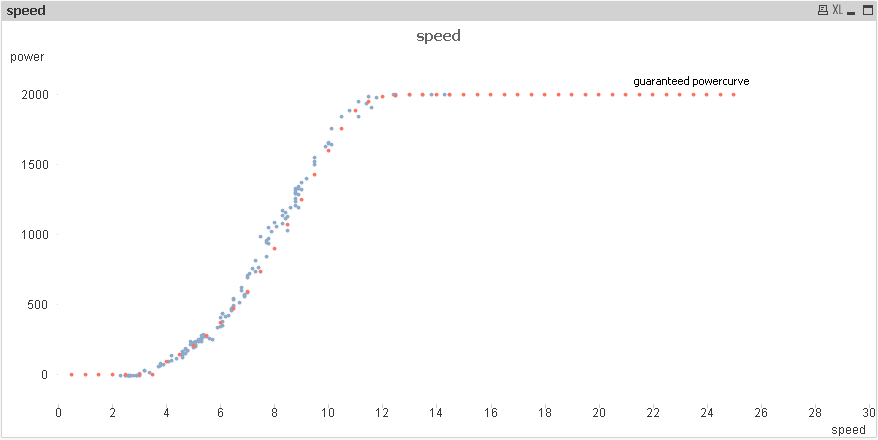
I have data in a .xls file, to graphically draw a windturbine powercurve as a Line Chart. This is the guaranteed powercurve from the turbine manufacturer. I then use another .xls table to import real measured data of power (Wh) per wind speed (m/s). I want to display this real data as a scatter plot over my Line Chart.
I attached a word file with 2 screenshot of how it should look and how it looks in my case, and the 2 .xls files I get my data from.
Any help is very welcome.
BR,
Dirk
- Tags:
- new_to_qlikview
- Mark as New
- Bookmark
- Subscribe
- Mute
- Subscribe to RSS Feed
- Permalink
- Report Inappropriate Content
Dirk, you can´t use same graph for two types at same time.
The way you can fullfill your requirement is implementing two graphs and carefully position one on top of other and setting transparency to 100% at presentation tab of the toppest one
- Mark as New
- Bookmark
- Subscribe
- Mute
- Subscribe to RSS Feed
- Permalink
- Report Inappropriate Content
I believe it won't be possible directly within one object but you could use two each other overlapping charts by adjusting (hiding or coloring with argb(0,0,0,0)) various layout-settings like title, border, axis ... and so on.
- Marcus
- Mark as New
- Bookmark
- Subscribe
- Mute
- Subscribe to RSS Feed
- Permalink
- Report Inappropriate Content
Perhaps this scatter chart will do. See attached qvw.
talk is cheap, supply exceeds demand
- Mark as New
- Bookmark
- Subscribe
- Mute
- Subscribe to RSS Feed
- Permalink
- Report Inappropriate Content
Yeah Gysbert. By then putting in more and more values for the red dotted line I can make it apppear as a real line...Thats awesome! But also the other 2 solutions help a lot. Thanks everybody. I am really astonished by the very short repond time!