Unlock a world of possibilities! Login now and discover the exclusive benefits awaiting you.
- Qlik Community
- :
- All Forums
- :
- QlikView App Dev
- :
- Re: Line chart with 2 field's comparison
- Subscribe to RSS Feed
- Mark Topic as New
- Mark Topic as Read
- Float this Topic for Current User
- Bookmark
- Subscribe
- Mute
- Printer Friendly Page
- Mark as New
- Bookmark
- Subscribe
- Mute
- Subscribe to RSS Feed
- Permalink
- Report Inappropriate Content
Line chart with 2 field's comparison
Hi All,
I just started using Qlikview and I am stuck in comparing 2 fields in a same line chart. So, when I say comparing, means I am just looking at the trend by comparing two prices.
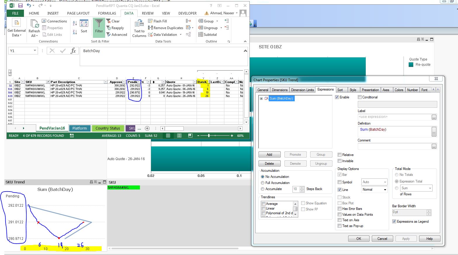
As you can see in my screen-shot there are two columns/fields APPROVED and PENDING, I want to see the trend in Line chart by comparing APPROVED and PENDING on a particular date which is BATCH.
So far what i am getting it looks like in my screen-shot 2 (Capture 2) and the reason is "Expression" which is not correct.
Current i am just using:
- sum (Pending)
you can see in 3rd screen-shot (Capture3)
Anybody can help?
anonymousjimhalpertafderikanick2009aesjulien.frechet bghbpnssh@
Accepted Solutions
- Mark as New
- Bookmark
- Subscribe
- Mute
- Subscribe to RSS Feed
- Permalink
- Report Inappropriate Content
You can go to axis tab on chart properties and play around with the settings, e.g. disable 'Forced 0'
- Mark as New
- Bookmark
- Subscribe
- Mute
- Subscribe to RSS Feed
- Permalink
- Report Inappropriate Content
327.52 for batch 1 and selected SKU seems correct compared to Capture1.jpg. What do you expect to see?
- Mark as New
- Bookmark
- Subscribe
- Mute
- Subscribe to RSS Feed
- Permalink
- Report Inappropriate Content
This is what i a expecting to see. I used 1 SKU as an example. AT x axis you can see the Batchday are basically dates.
- Mark as New
- Bookmark
- Subscribe
- Mute
- Subscribe to RSS Feed
- Permalink
- Report Inappropriate Content
You chart looks indeed a bit strange compared to your excel file.
But why are you using sum(BatchDay) as expression? And what is your dimension?
Could you upload a small sample (could contain mock up data)?
- Mark as New
- Bookmark
- Subscribe
- Mute
- Subscribe to RSS Feed
- Permalink
- Report Inappropriate Content
I am not good at Qlikview 
I am using PENDING as dimension because I wanna compare pending prices over dates. I know this expression is wrong. I am looking for right expression through which I can get accurate output. Can you suggest me what should I use instead?
- Mark as New
- Bookmark
- Subscribe
- Mute
- Subscribe to RSS Feed
- Permalink
- Report Inappropriate Content
I would guess you want BatchDay as dimension and as expression maybe
=Avg(PENDING)
or any other appropriate aggregation.
- Mark as New
- Bookmark
- Subscribe
- Mute
- Subscribe to RSS Feed
- Permalink
- Report Inappropriate Content
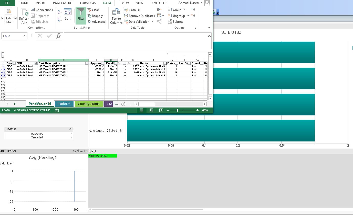
Awesome  . It seems like I am almost there. Is there any way, I can make the trend more visible i.e. zoom in
or any thing to show the Blue line moving left and right?
- Mark as New
- Bookmark
- Subscribe
- Mute
- Subscribe to RSS Feed
- Permalink
- Report Inappropriate Content
You can go to axis tab on chart properties and play around with the settings, e.g. disable 'Forced 0'
- Mark as New
- Bookmark
- Subscribe
- Mute
- Subscribe to RSS Feed
- Permalink
- Report Inappropriate Content
I appreciate your help. 