Unlock a world of possibilities! Login now and discover the exclusive benefits awaiting you.
- Qlik Community
- :
- All Forums
- :
- QlikView
- :
- Linear Gauge inside pivot table
- Subscribe to RSS Feed
- Mark Topic as New
- Mark Topic as Read
- Float this Topic for Current User
- Bookmark
- Subscribe
- Mute
- Printer Friendly Page
- Mark as New
- Bookmark
- Subscribe
- Mute
- Subscribe to RSS Feed
- Permalink
- Report Inappropriate Content
Linear Gauge inside pivot table
Hi all! 🙂
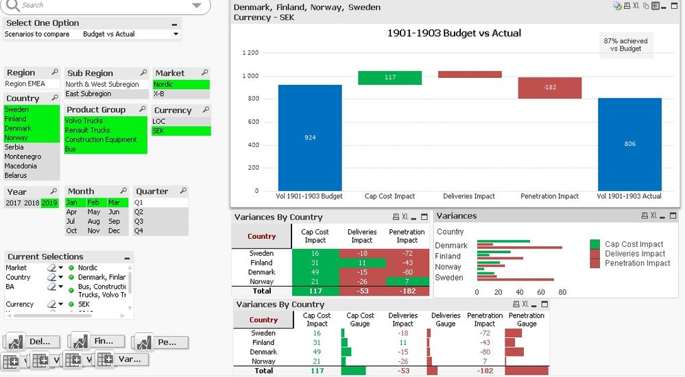
I'm struggling with Qlikview when building a pivot table which contains some complex calculations within the expressions. Basically I'm analyzing the performance of the retail volume vs budget. I built a waterfall that shows which indicators helped to reach out the budgeted vol and which others made it go down. Those indicators are units delivered, units financed and cap cost. My waterfall looks like this:
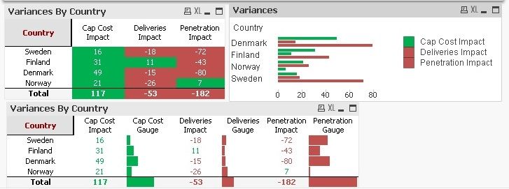
As you can see the graph shows the total of all selected countries but on the detailed summary I want to open it by country. So far I got to calculate all the variances for the waterfall chart in one table by country and to paint it red if its a negative impact or green if it is positive. But I would like to add a linear gauge to make it visually easier for the user to detect which countries are performing worse in which indicators which is what I attempted on the line chart and on the last pivot table with linear gauges. I have two problems:
1. How can I set the expression labels to work as dimenssion labels on the line chart?
2. All the linear gauges in the pivot table get the color of the total since I'm using conditional colouring but somehow it is just considering the value of the totals. Maybe this is because I'm using the 1 modifier in the set analysis expressions since I need to compare the retail volume during the selected period vs the retaile volume of another period that is not related with the selections (when the user wants to compare vs performance of same period previous year or the previous period).
I applied the fabs function and I want the bar to be red if the impact of the KPI is negative.
I've been trying many different things but nothing is working 😞
Thanks a lot!!!!!!!!!

