Unlock a world of possibilities! Login now and discover the exclusive benefits awaiting you.
- Qlik Community
- :
- All Forums
- :
- QlikView App Dev
- :
- Re: Linear guage chart labeling...
- Subscribe to RSS Feed
- Mark Topic as New
- Mark Topic as Read
- Float this Topic for Current User
- Bookmark
- Subscribe
- Mute
- Printer Friendly Page
- Mark as New
- Bookmark
- Subscribe
- Mute
- Subscribe to RSS Feed
- Permalink
- Report Inappropriate Content
Linear guage chart labeling...
Hi all,
I have two coloumns with FY Goal and Performance to FY Goal. I want to represent the status of performance with respect to FY Goal in a linear guage chart with lableling their respective values.
I have attached the sample images also.
Can anyone please help me?
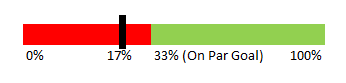
For example
The needle point at where they stand now, red color bar % changes every month (for example assuming FY goal is $100 then as of YTD April, they should have reached $100/12*4 = 33.33%, if YTD April the seller only reach 30% of FY goal, they are not on par and therefore showing as below.
Please also show the actual % as well
- Mark as New
- Bookmark
- Subscribe
- Mute
- Subscribe to RSS Feed
- Permalink
- Report Inappropriate Content
Would you able to provide sample application which demonstrates the issue
- Mark as New
- Bookmark
- Subscribe
- Mute
- Subscribe to RSS Feed
- Permalink
- Report Inappropriate Content
Hi Anil Babu,
Sure,I want to label at the needle point and at the segment 2 separation. 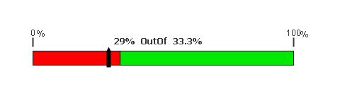
This is what I am able to do max for labeling.
But my requirement is this.
- Mark as New
- Bookmark
- Subscribe
- Mute
- Subscribe to RSS Feed
- Permalink
- Report Inappropriate Content
Hi Anil Babu,
Sure,I want to label at the needle point and at the segment 2 separation. 
This is what I am able to do max for labeling.
But my requirement is this.

- Mark as New
- Bookmark
- Subscribe
- Mute
- Subscribe to RSS Feed
- Permalink
- Report Inappropriate Content
Can you upload mock up application, That would better offer
- Mark as New
- Bookmark
- Subscribe
- Mute
- Subscribe to RSS Feed
- Permalink
- Report Inappropriate Content
You can use two segments in the Linear Gauge chart.
Like 
If your FY YTD Yield<30%, the color can be red, FY YTD Yield>30%<FY YTD Goal, the color can be ample or orange & FY Goal > FY YTD Goal, will be green.
- Mark as New
- Bookmark
- Subscribe
- Mute
- Subscribe to RSS Feed
- Permalink
- Report Inappropriate Content
Use these links to create your own kind: