Unlock a world of possibilities! Login now and discover the exclusive benefits awaiting you.
- Qlik Community
- :
- All Forums
- :
- QlikView App Dev
- :
- Re: More than 1 (stacked)barchart without dimensio...
- Subscribe to RSS Feed
- Mark Topic as New
- Mark Topic as Read
- Float this Topic for Current User
- Bookmark
- Subscribe
- Mute
- Printer Friendly Page
- Mark as New
- Bookmark
- Subscribe
- Mute
- Subscribe to RSS Feed
- Permalink
- Report Inappropriate Content
More than 1 (stacked)barchart without dimensions?
Hi all,
I am in a bit of a pickle. The requirements for a dashboard I am making are very specific. They have different time periods which are not available as a dimension, for example, Year-2, Year-1, YearMonth to date and Year.
To be able to present them the way they want I have to create 4 separate stacked bar charts, then strip them of legends etc, size them all correctly, Rangemax on all for etc. A nightmare.
Is there a way to make fake dimensions or is there any other way to put 4 'unrelated' stacked graphs into one chart?
the current method is ugly, doesnt work properly, high maitenance and doesnt work with pop up values because overlapping graphs.
thanks in advance!
Accepted Solutions
- Mark as New
- Bookmark
- Subscribe
- Mute
- Subscribe to RSS Feed
- Permalink
- Report Inappropriate Content
Hi Jasper, I supossed that each segment of each bar has the same expression, like if each color represent a department or a company.
If you really need a different espression for each color I think it should be a little different but... you really have a different expression for each color?
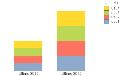
I made a simple sample, the same calculated dimension and as expression:
Pick(ValueList(Dual('Ultimo $(=Year(Today()))', 1), Dual('Ultimo $(=Year(Today())-1)', 2)),
//1st expr
1,
// 2nd Expr
2
)
So each color of the first bar has '1' and the 2nd bar has a value of '2' for each color

Instead of '1' or '2', it should have the same expression and only changing set analisys in each expression so it corresponds to the bar label (this year, lat year, ...)
- Mark as New
- Bookmark
- Subscribe
- Mute
- Subscribe to RSS Feed
- Permalink
- Report Inappropriate Content
You can either use ValueList or an Island Table to create synthetic dimensions
ValueList() – For those tricky situations
Missing Manual - ValueLoop() & ValueList()
I could not find anything on Island Table approach, but they essentially work the same way as ValueList, with one major difference that Value list if synthetic, while Island Table create a field which is totally unrelated to all the other fields in your application.
- Mark as New
- Bookmark
- Subscribe
- Mute
- Subscribe to RSS Feed
- Permalink
- Report Inappropriate Content
Hi Jasper, another option is using ValueList to create the dimension values... but in each expression you will need to have the expression for each of the dimension values.
In example the dimension can be:
=ValueList(Dual('Ultimo $(=Year(Today()))', 1), Dual('Ultimo $(=Year(Today())-1)', 2))
The expression thing can be done using:
Pick(ValueList(Dual('Ultimo $(=Year(Today()))', 1), Dual('Ultimo $(=Year(Today())-1)', 2)),
//Expression for 1st bar
...,
//Expression for 2nd bar
...
)
Not clean or elegant but it can work.
- Mark as New
- Bookmark
- Subscribe
- Mute
- Subscribe to RSS Feed
- Permalink
- Report Inappropriate Content
rubenmarin as it is a stacked graph, am I correct in assuming that for one period (value) the following things need to be done?
Calculated dimension:
=ValueList(Dual('Ultimo '& $(=Max(Kalender.Jaar) - 2), 1), Dual('Ultimo '& $(=Max(Kalender.Jaar) - 2), 2))
Expressions:
=Pick(ValueList(Dual('Ultimo '& $(=Max(Kalender.Jaar) - 2), EXPRESSION1.1
=Pick(ValueList(Dual('Ultimo '& $(=Max(Kalender.Jaar) - 2), EXPRESSION1.2
=Pick(ValueList(Dual('Ultimo '& $(=Max(Kalender.Jaar) - 2), EXPRESSION1.3
=Pick(ValueList(Dual('Ultimo '& $(=Max(Kalender.Jaar) - 1), EXPRESSION2.1
=Pick(ValueList(Dual('Ultimo '& $(=Max(Kalender.Jaar) - 1), EXPRESSION2.2
=Pick(ValueList(Dual('Ultimo '& $(=Max(Kalender.Jaar) - 1), EXPRESSION2.3
Or am I not interpretering it right?
- Mark as New
- Bookmark
- Subscribe
- Mute
- Subscribe to RSS Feed
- Permalink
- Report Inappropriate Content
Hi Jasper, I supossed that each segment of each bar has the same expression, like if each color represent a department or a company.
If you really need a different espression for each color I think it should be a little different but... you really have a different expression for each color?
I made a simple sample, the same calculated dimension and as expression:
Pick(ValueList(Dual('Ultimo $(=Year(Today()))', 1), Dual('Ultimo $(=Year(Today())-1)', 2)),
//1st expr
1,
// 2nd Expr
2
)
So each color of the first bar has '1' and the 2nd bar has a value of '2' for each color

Instead of '1' or '2', it should have the same expression and only changing set analisys in each expression so it corresponds to the bar label (this year, lat year, ...)
- Mark as New
- Bookmark
- Subscribe
- Mute
- Subscribe to RSS Feed
- Permalink
- Report Inappropriate Content
I got it working thank you very much!