Unlock a world of possibilities! Login now and discover the exclusive benefits awaiting you.
- Qlik Community
- :
- All Forums
- :
- QlikView App Dev
- :
- Need a line as an error bar on a chart
- Subscribe to RSS Feed
- Mark Topic as New
- Mark Topic as Read
- Float this Topic for Current User
- Bookmark
- Subscribe
- Mute
- Printer Friendly Page
- Mark as New
- Bookmark
- Subscribe
- Mute
- Subscribe to RSS Feed
- Permalink
- Report Inappropriate Content
Need a line as an error bar on a chart
Hello,
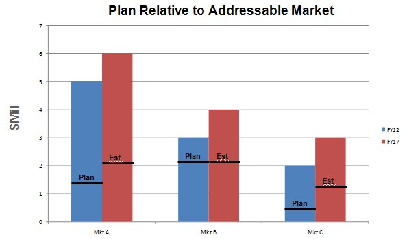
I would like to make a chart that looks like this:

Is this possible in QV 9.0 SR5?
I have been trying to make error bars work but they are always a range of values. I want to show a single value on top of each expression bar.
Thanks!
- Mark as New
- Bookmark
- Subscribe
- Mute
- Subscribe to RSS Feed
- Permalink
- Report Inappropriate Content
If this is not possible, does anyone have an idea on what the next closest thing I could do would be?
Thanks
- Mark as New
- Bookmark
- Subscribe
- Mute
- Subscribe to RSS Feed
- Permalink
- Report Inappropriate Content
go to chart->properties->presentation->reference lines->add-> in expression write any Expression or give any number you want
it will show you a line in ur graph
you can choose your color also for line
- Mark as New
- Bookmark
- Subscribe
- Mute
- Subscribe to RSS Feed
- Permalink
- Report Inappropriate Content
Thanks for that suggestion, Sunil. I will keep it in mind, however it doesn't really work for me since I have unique values for each "Market" column in the chart. If I could format a set of reference lines to only show on top of each Market column, then I would have something.
I will keep looking here.
- Mark as New
- Bookmark
- Subscribe
- Mute
- Subscribe to RSS Feed
- Permalink
- Report Inappropriate Content
You were asking for possible alternatives:
Well, it looks a little bit like a set of linear gauges.
Or maybe (depending of your numbers of dimension / expressions), try a group of stacked bars, where you calculate the expressions in a way that they give you the plan/estimated (lower) and actual (upper) part ( if the plan is always lower than the actual like in above example, this could work), thus simulating also a kind of linear gauge.
edit:
I think was a bit in a hurry before: I don't want to suggest a plain "normal" stacked bar chart, the stacked bars should give you the estimate or plan in lower part and then the Surplus of the actual in the upper part.
edited by swuehl