Unlock a world of possibilities! Login now and discover the exclusive benefits awaiting you.
- Qlik Community
- :
- All Forums
- :
- QlikView App Dev
- :
- New to QV: Pivot Chart - Differentiating between D...
- Subscribe to RSS Feed
- Mark Topic as New
- Mark Topic as Read
- Float this Topic for Current User
- Bookmark
- Subscribe
- Mute
- Printer Friendly Page
- Mark as New
- Bookmark
- Subscribe
- Mute
- Subscribe to RSS Feed
- Permalink
- Report Inappropriate Content
New to QV: Pivot Chart - Differentiating between Dimension and Expression
Hi
I am trying to create a pie chart out of the following data. It is literally one line of data. I would like to display a pie chart where, the Number of Green Accounts is shown as a percentage of the Total Number of All Colours Entity Accounts. I have tried various ways, but I am not getting it right. Can anyone please help.
| Line of Business | Type of Transaction | Number of Green Accounts | TotalNumber of AllColours Entity Accounts |
| Green Banking | Account Opening | 66,000 | 6,000,000 |
Thank you
- Tags:
- new_to_qlikview
- « Previous Replies
-
- 1
- 2
- Next Replies »
- Mark as New
- Bookmark
- Subscribe
- Mute
- Subscribe to RSS Feed
- Permalink
- Report Inappropriate Content
Hi Mazacini
I think I’ve got it working, but I will still attach the spreadsheet.
I’ll also include screenshots of the pie charts.
Thank you.
Natasha
- Mark as New
- Bookmark
- Subscribe
- Mute
- Subscribe to RSS Feed
- Permalink
- Report Inappropriate Content
Hi Natasha
You're nearly there!.
You are still using 2 dimensions, whereas i reckon you need to use only a single dimension "Line of Business".
Then you will need to use Set Analysis for each chart.
So, for Type of Transaction = Account Opening, enter this in expression:
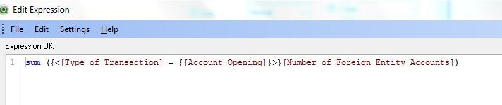
Then create separate charts for Type of Transactions = Payments to Foreign Entities etc, replacing Account Opening in the above formula.
For what it's worth, some thoughts:
I would make the comment (respectfully) that maybe Qlikview is not the ideal solution in this case?
Whilst I would be a huge fan of QV, in this case I would suggest that Excel might be a better option? (See attached spreadsheet).
Anyway, let me know if you need any more help.
- Mark as New
- Bookmark
- Subscribe
- Mute
- Subscribe to RSS Feed
- Permalink
- Report Inappropriate Content
Hi Mazacini
Thank you – you’ve been very helpful. I will implement the changes you suggested and let you know the outcome.
Re: QV vs Excel – I totally see where you’re coming from. I have been commissioned with evaluating QV, so I’ll be able to give an honest overview after this exercise J
I’ll update you soon.
Natasha
- Mark as New
- Bookmark
- Subscribe
- Mute
- Subscribe to RSS Feed
- Permalink
- Report Inappropriate Content
Mazacini
everything works perfectly now  . Thank you very much. You've been very helpful.
Much appreciated
Natasha
- « Previous Replies
-
- 1
- 2
- Next Replies »