Unlock a world of possibilities! Login now and discover the exclusive benefits awaiting you.
- Qlik Community
- :
- All Forums
- :
- QlikView App Dev
- :
- Re: Nprinting Alternate States Locked Fields
- Subscribe to RSS Feed
- Mark Topic as New
- Mark Topic as Read
- Float this Topic for Current User
- Bookmark
- Subscribe
- Mute
- Printer Friendly Page
- Mark as New
- Bookmark
- Subscribe
- Mute
- Subscribe to RSS Feed
- Permalink
- Report Inappropriate Content
Nprinting Alternate States Locked Fields
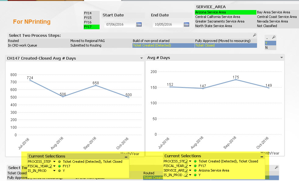
I created some charts with some locked fields and then I am running NPrinting reports and adding a filter on a year and cycling on SERVICE_AREA.
The chart on the right (Avg # Days inherited state) is correct and does not have any locked fields. The chart on the left (CH147 Alternate State A) is using an Alternate state and the PROCESS_STEP and IS_IN_PROD fields are locked. The NP report has a filter to select FY17 and then should cycle on the Service Area.
The problem is that SERVICE_AREA doesn't seem to be applied to the chart on the left even though FY17 looks fine.
What am I missing?
- « Previous Replies
-
- 1
- 2
- Next Replies »
- Mark as New
- Bookmark
- Subscribe
- Mute
- Subscribe to RSS Feed
- Permalink
- Report Inappropriate Content
So I am a little confused, for the chart on the left you want it to change based on selection i SERVICE_AREA or you don't want it to change?
- Mark as New
- Bookmark
- Subscribe
- Mute
- Subscribe to RSS Feed
- Permalink
- Report Inappropriate Content
The one on the left has 2 locked fields - Process step and Is_in_prod. It needs to react to FY and Service Area the same way the one on the right does.
- Mark as New
- Bookmark
- Subscribe
- Mute
- Subscribe to RSS Feed
- Permalink
- Report Inappropriate Content
The values seems to be changing when I click through different SERVICE_AREA, isn't it happening in your end? Or the values themselves are incorrect?
- Mark as New
- Bookmark
- Subscribe
- Mute
- Subscribe to RSS Feed
- Permalink
- Report Inappropriate Content
The values in both graphs should match. The chart on the right is correct. I don't know why Service Area is not being applied to the chart on the left.
- Mark as New
- Bookmark
- Subscribe
- Mute
- Subscribe to RSS Feed
- Permalink
- Report Inappropriate Content
May be this:
SUM({$}
Aggr(
Max({$}PROCESS_STEP_START_DATE)- Min({$}PROCESS_STEP_START_DATE)
,DEFECT_ID)
)
/(Count({$<DEFECT_ID = {"=Count({$}PROCESS_STEP) = GetSelectedCount(PROCESS_STEP)"}>}DISTINCT DEFECT_ID))
- Mark as New
- Bookmark
- Subscribe
- Mute
- Subscribe to RSS Feed
- Permalink
- Report Inappropriate Content
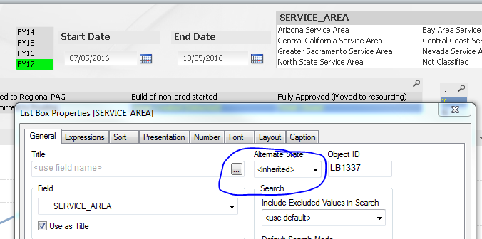
Any idea why the Service Area selection wouldn't show up in the Current Selections Box?
- Mark as New
- Bookmark
- Subscribe
- Mute
- Subscribe to RSS Feed
- Permalink
- Report Inappropriate Content
Because your list box is in Inherited state and your current selection box is in alternate state
- Mark as New
- Bookmark
- Subscribe
- Mute
- Subscribe to RSS Feed
- Permalink
- Report Inappropriate Content
But the FY box is set up the same way and it shows up in the current selections... either way, this may be what I needed. Thanks!
- Mark as New
- Bookmark
- Subscribe
- Mute
- Subscribe to RSS Feed
- Permalink
- Report Inappropriate Content
But it doesn't change if you change it from FY17 to FY16. You have FY17 selected in your alternate state and that is why it is showing up in the current selection box.
- « Previous Replies
-
- 1
- 2
- Next Replies »