Unlock a world of possibilities! Login now and discover the exclusive benefits awaiting you.
- Qlik Community
- :
- All Forums
- :
- QlikView App Dev
- :
- Re: Parallel Coordinates/Slope/Ranking Graph
- Subscribe to RSS Feed
- Mark Topic as New
- Mark Topic as Read
- Float this Topic for Current User
- Bookmark
- Subscribe
- Mute
- Printer Friendly Page
- Mark as New
- Bookmark
- Subscribe
- Mute
- Subscribe to RSS Feed
- Permalink
- Report Inappropriate Content
Parallel Coordinates/Slope/Ranking Graph
Hi everyone,
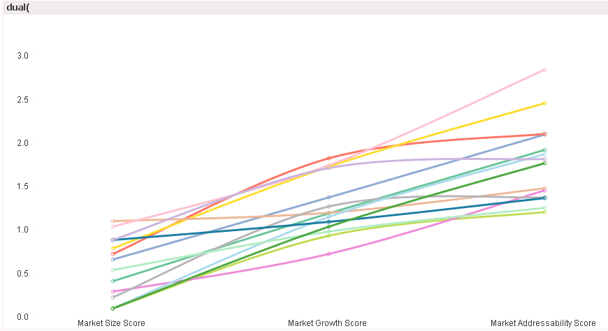
I need help building a chart. I have data that scores Markets by different measures, e.g.:
| Market | Size Score | Growth Score | Attractiveness |
| A | 3.0 | 4.0 | 7.0 |
| B | 2.0 | 6.0 | 4.0 |
| C | 5.0 | 1.0 | 3.0 |
I want a line chart where each market is a line and Size, Growth, and Attractiveness appears on the X axis. The values would appear in the Y axis as they do in the above table.
The chart would look like this:
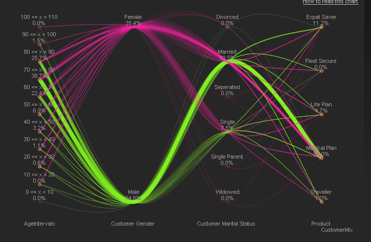
The only solution I know of to build this chart is to use the calculated dimension/expressions in the Parallel Coordinates chart provided in the QlikTech demo:
However, this chart is more complicated than my concept is. I do not need to calculate frequency, ranking, %s, or anything - I just want to show the data that I have. I tried to use a simpler solution, but it relies on using one time dimension - Year. I want to compare several dimensions.

Does anyone know a potential solution? i thought the best would be to manipulate the calculated dimension/expression of the parallel coordinates chart - could anyone help me do this? The two main formulas are:
Dimension:
=$(='if('&concat('NOT IsNull(['&CustomerMix&'])',' AND ')&', hash128('& concat('['&CustomerMix&']',',')&'))' )
Expression:
dual(
$(=concat('if(CustomerMix='&chr(39)&CustomerMix&chr(39)&',concat(distinct ['&CustomerMix&']))','&'))&'
'&num( 100*node_percent, '#,##0.#', '.' , ',' )&'%'
,
$(=concat('if(textcount(total ['&CustomerMix&'])=0,if(CustomerMix='&chr(39)&CustomerMix&chr(39)&',0.1+((min(['&CustomerMix&'])-min(total ['&CustomerMix&']))/(max(total ['&CustomerMix&'])-min(total ['&CustomerMix&']))),0),if(CustomerMix='&chr(39)&CustomerMix&chr(39)&',0.1+((aggr(nodistinct rank(['&CustomerMix&'],4),['&CustomerMix&'])-1)/rangemax( (count(distinct total ['&CustomerMix&'])-1) ,1 )),0))','+'))
)
Thanks,
Andrew
Accepted Solutions
- Mark as New
- Bookmark
- Subscribe
- Mute
- Subscribe to RSS Feed
- Permalink
- Report Inappropriate Content
i may be missing something or may be you are overthinking this...please see attached
- Mark as New
- Bookmark
- Subscribe
- Mute
- Subscribe to RSS Feed
- Permalink
- Report Inappropriate Content
i may be missing something or may be you are overthinking this...please see attached
- Mark as New
- Bookmark
- Subscribe
- Mute
- Subscribe to RSS Feed
- Permalink
- Report Inappropriate Content
Ohhh. You just have to gather the different score types into one dimension!
That is extra work, but I'm so happy I can build the chart now. Thank you jsaradhi!
- Mark as New
- Bookmark
- Subscribe
- Mute
- Subscribe to RSS Feed
- Permalink
- Report Inappropriate Content
you are welcome...if you are getting this data from a database, try and move the crosstable part into the database using relevant transpose functions. i do this as crosstable function takes up too much memory and sometimes is not clean!
- Mark as New
- Bookmark
- Subscribe
- Mute
- Subscribe to RSS Feed
- Permalink
- Report Inappropriate Content
In this case, the data comes from a more simple Excel file. However, I cannot change it. Is there a way to transpose those dimensions into one column with a calculated chart dimension? Otherwise, I was planning to construct a new table in a second Excel tab.
- Mark as New
- Bookmark
- Subscribe
- Mute
- Subscribe to RSS Feed
- Permalink
- Report Inappropriate Content
if the data size is not too big, you may be ok with doing it in Qlikview. my above post is more of a fyi to keep in mind. i would cross table it once instead of calculating the dimensions in UI qvw each time a user makes a selection.
- Mark as New
- Bookmark
- Subscribe
- Mute
- Subscribe to RSS Feed
- Permalink
- Report Inappropriate Content
Thanks for the warning, but if I wanted to do it in the QVW, how would I do it? 
- Mark as New
- Bookmark
- Subscribe
- Mute
- Subscribe to RSS Feed
- Permalink
- Report Inappropriate Content
take a look at the script in the qvw i attached for an example.
- Mark as New
- Bookmark
- Subscribe
- Mute
- Subscribe to RSS Feed
- Permalink
- Report Inappropriate Content
Ah, I understand now. Thank you!
- Mark as New
- Bookmark
- Subscribe
- Mute
- Subscribe to RSS Feed
- Permalink
- Report Inappropriate Content
np