Unlock a world of possibilities! Login now and discover the exclusive benefits awaiting you.
- Qlik Community
- :
- All Forums
- :
- QlikView App Dev
- :
- Pie Chart Label
- Subscribe to RSS Feed
- Mark Topic as New
- Mark Topic as Read
- Float this Topic for Current User
- Bookmark
- Subscribe
- Mute
- Printer Friendly Page
- Mark as New
- Bookmark
- Subscribe
- Mute
- Subscribe to RSS Feed
- Permalink
- Report Inappropriate Content
Pie Chart Label
Hi everyone. I have a question for all
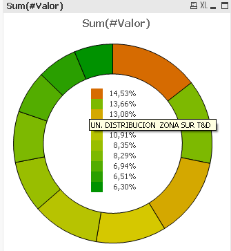
Does know someone a way to put a label in the squares-leyend in a pie chart?
When i put the mouse over the border of the chart, it shows me the name of the seller. I need that when i put the mouse over the square, it shows me the same thing.
Any idea? maybe someone knows a way or an extesion that can do that.
Thanks to everyone.
- « Previous Replies
-
- 1
- 2
- Next Replies »
Accepted Solutions
- Mark as New
- Bookmark
- Subscribe
- Mute
- Subscribe to RSS Feed
- Permalink
- Report Inappropriate Content
It's a bit of a hack, but the attached sample shows replacing the legend with a colored straight table. What you lose is the pie pop-out when you hover over the "legend square", but you do get the Empleado.NombreDependencia value.
I sorted both charts by rank(Sum(#Valor)) to make it easier to map the colors. It think it is possible to sort alpha as in your original example, but that does create some extra work in picking the color. Plus I think sorting by rank() makes a clearer "Top 10" chart.

-Rob
- Mark as New
- Bookmark
- Subscribe
- Mute
- Subscribe to RSS Feed
- Permalink
- Report Inappropriate Content
If you pressed ctrl+shift by activated chart you get red lines around the various chart-parts within the charts which you could drag and size with the mouse.

- Marcus
- Mark as New
- Bookmark
- Subscribe
- Mute
- Subscribe to RSS Feed
- Permalink
- Report Inappropriate Content
Thanks Marcus, i know that. But the names are too long, so i just need the percentage but when i put the mouse over the square then it shows me the name in a tool tip leyend. Am i clear?
- Mark as New
- Bookmark
- Subscribe
- Mute
- Subscribe to RSS Feed
- Permalink
- Report Inappropriate Content
Try it with a calculated dimension like:
=dual(aggr(YourExpression, YourDimension), YourDimension)

- Marcus
- Mark as New
- Bookmark
- Subscribe
- Mute
- Subscribe to RSS Feed
- Permalink
- Report Inappropriate Content
Hi,
I think you can use the power of Dual function to resolve this. Something like this
Dual(FieldToDisplay & ' (' & Num(Sum(FieldNameToSum)/Sum(Total FieldNameToSum),'$(vPercenFormat)') & ')', Sum(FieldNameToSum)).
Please attach sample data or .qvw file for exactness of fields and expression calculation.
Hope this helps
- Mark as New
- Bookmark
- Subscribe
- Mute
- Subscribe to RSS Feed
- Permalink
- Report Inappropriate Content
Its not working. I need the tooltip when the mouse is over the square. I have already attach a qvw
- Mark as New
- Bookmark
- Subscribe
- Mute
- Subscribe to RSS Feed
- Permalink
- Report Inappropriate Content
Hi, Sebastian,
I attached a file. That's what you need? I unchecked "Pop-up labels" in Presentation tab and checked "Text as Pop-up" in Expression Tab.
Regards.
- Mark as New
- Bookmark
- Subscribe
- Mute
- Subscribe to RSS Feed
- Permalink
- Report Inappropriate Content
Hi Romina.
No i dont need that. What i need is that when i put the cursor over the SQUARE leyend appeas a tooltip with the NombreDependencia.
Thank u for trying
- Mark as New
- Bookmark
- Subscribe
- Mute
- Subscribe to RSS Feed
- Permalink
- Report Inappropriate Content
Hola Sebastian,
I think the pop up you are looking it is not posible.
Try to contact your final user and recomend to use the over on the chart itself.
Hope you find the way.
- Mark as New
- Bookmark
- Subscribe
- Mute
- Subscribe to RSS Feed
- Permalink
- Report Inappropriate Content
It's a bit of a hack, but the attached sample shows replacing the legend with a colored straight table. What you lose is the pie pop-out when you hover over the "legend square", but you do get the Empleado.NombreDependencia value.
I sorted both charts by rank(Sum(#Valor)) to make it easier to map the colors. It think it is possible to sort alpha as in your original example, but that does create some extra work in picking the color. Plus I think sorting by rank() makes a clearer "Top 10" chart.

-Rob
- « Previous Replies
-
- 1
- 2
- Next Replies »