Unlock a world of possibilities! Login now and discover the exclusive benefits awaiting you.
- Qlik Community
- :
- All Forums
- :
- QlikView App Dev
- :
- Re: Pie chart drill down - label is showing incorr...
- Subscribe to RSS Feed
- Mark Topic as New
- Mark Topic as Read
- Float this Topic for Current User
- Bookmark
- Subscribe
- Mute
- Printer Friendly Page
- Mark as New
- Bookmark
- Subscribe
- Mute
- Subscribe to RSS Feed
- Permalink
- Report Inappropriate Content
Pie chart drill down - label is showing incorrectly
Hi All,
I got an issue while doing a drill down in a PIE chart and would like to ask for some advise on how to fix it. As per the requirement, I need to create a PIE chart with the below filtering requirement for example.
Origin Region: PRC
Origin Country: Hong Kong
Origin Port: HKG
Destination Region: ALL
Destination Country: ALL
Destination Port = ALL
Back & Forth: Yes
***(Back & Forth logic: YES means I need to get the sum of the 2 data sets with
1. Origin Region = PRC AND Origin Country = Hong Kong AND Origin Port = HKG AND Destination Region = ALL AND Destination Country = ALL AND Destination Port = ALL
2. Destination Region = PRC AND Destination Country = Hong Kong AND Destination Port = HKG AND Origin Region = ALL AND Origin Country = ALL AND Origin Port = ALL
Whilst NO means I only need to get 1 data set Origin Region = PRC AND Origin Country = Hong Kong AND Origin Port = HKG AND Destination Region = ALL AND Destination Country = ALL AND Destination Port = ALL)
So in EXPRESSION, I’ve added set analysis as per below logic
Sum ({$<[Destination Port]=$(vOriginPort),
[Destination Country Name]=$(vOriginCountry),
[Destination Region]=$(vOriginRegion),
[Sales Territory Description] = $(vSalesTerr),
[Origin Port]=,[Origin Country Name]=,[Origin Region]=
>+$} [Passenger Count])
Where the highlighted in blue is getting the 2nd data set and highlighted with yellow is getting the current selection which is the 1st data set.
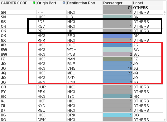
Using this logic, I was able to get the correct sum passenger count in the pie chart by carrier codes. I’ve also added a label in the pie chart to show the corresponding carrier codes. I set to show the top 10 carrier codes and the remaining ones will be grouped to OTHERS. However, when I try to click the OTHERS to drill down the pie chart, the label seems cannot show the correct carrier names. Pls refer to the attached file for the dump screen. In the second dump screen below, some of the carrier codes was set to grey colour and label was set to OTHERS instead of the correct carrier codes. After checking the data, I found out that those data (carrier codes) were fall under the 2nd data set. I guess somehow the labelling only shows the list of carrier codes available in the 1st data set.
Does anyone know how to fix this issue? As the requirement needs to set the pie chart properly to the corresponding carrier codes. Heard from my colleague that this is the normal behavior of the drill down function in PIE chart which only caters the current filtering selection data. Is it true? Is there any alternative way to solve this issue? Pls advise. Thanks.
- Mark as New
- Bookmark
- Subscribe
- Mute
- Subscribe to RSS Feed
- Permalink
- Report Inappropriate Content
I don't know if this solve your problem, but i take a look to your doc and see that you are comparing with null function incorrectly.
Put Null()
Post again if you continue with the problem.
- Mark as New
- Bookmark
- Subscribe
- Mute
- Subscribe to RSS Feed
- Permalink
- Report Inappropriate Content
Hi Juan,
I've amended the Null function but still got the same labelling problem. All the carrier codes that fall under the 2nd dataset in the set analysis are labelled as OTHERS... I guess the issue here is more on the functionality and behavior of a drill down in pie chart... As per my observation, it seems only caters all the datas that came from the normal filtering in the dashboard which is my 1st data set...
- Mark as New
- Bookmark
- Subscribe
- Mute
- Subscribe to RSS Feed
- Permalink
- Report Inappropriate Content
Hi,
Try this Expression
=if(not IsNull([%Carrier Code]),[%Carrier Code],'OTHERS')
instead of =if([%Carrier Code] <> NULL,[%Carrier Code],'OTHERS')
- Mark as New
- Bookmark
- Subscribe
- Mute
- Subscribe to RSS Feed
- Permalink
- Report Inappropriate Content
Hi Settu,
I've tried your expression but still have same issue. I've changed the pie chart into a table to show the data details for your reference. As you can see on the dump screen, the labels can be shown when origin port = HKG and destination port = * (normal filtering set in the dashboard) whilst when Origin port = * and Destination port = HKG (logic added in set analysis), all label were set to OTHERS.
