Unlock a world of possibilities! Login now and discover the exclusive benefits awaiting you.
- Qlik Community
- :
- All Forums
- :
- QlikView App Dev
- :
- Re: Qlik Sense: bar chart color by calculated dime...
- Subscribe to RSS Feed
- Mark Topic as New
- Mark Topic as Read
- Float this Topic for Current User
- Bookmark
- Subscribe
- Mute
- Printer Friendly Page
- Mark as New
- Bookmark
- Subscribe
- Mute
- Subscribe to RSS Feed
- Permalink
- Report Inappropriate Content
Qlik Sense: bar chart color by calculated dimension, gives only Null Values color
Dear Qlik enthusiasts:
I need to color a bar chart by calculated dimension, but it is not working. I searched the Community, found similar problems, but no clear explanation to the Sense behavior that I am experiencing. QVF attached.
Goal: classify supplier invoices into 2 categories
- Potentially Duplicate (>1 invoices for same value and supplier)
- Not duplicate (only 1 invoice with this value)
Preferably without creating additional columns in the script.
And color the 2 dimension values in a bar chart.
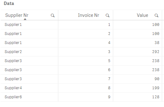
Here is my data:
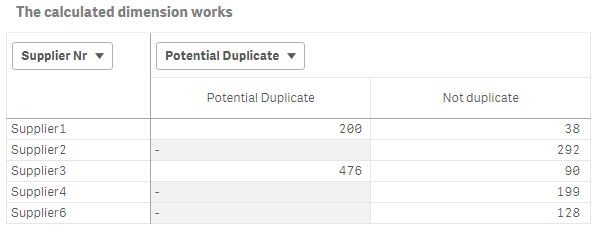
I have a calculated master dimension that works:
if(Aggr(Count(distinct [Invoice Nr]), [Supplier Nr],[Value])>1,'Potential Duplicate','Not duplicate')
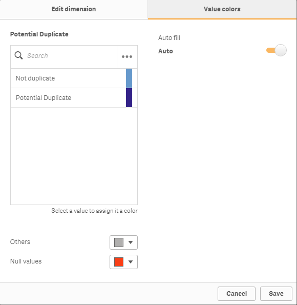
I have assigned colors to the 2 values returned by this calculated dimension:
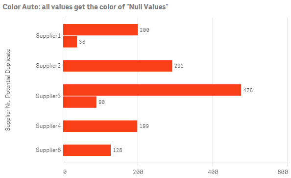
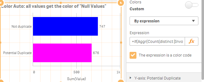
I dragged the dimension in the chart to color by dimension, like in this tutorial. However, if I use Colors = Auto, the chart is colored using "Null Values" color (red)!
Could you please point where I made an error?
Thank you,
Igor.
Accepted Solutions
- Mark as New
- Bookmark
- Subscribe
- Mute
- Subscribe to RSS Feed
- Permalink
- Report Inappropriate Content
Hi,
Maybe bug,
But work around is here :
Color :
Color by Expression.
=if(Aggr(Count(distinct [Invoice Nr]), [Supplier Nr],[Value])>1,LightMagenta(),LightBlue())
- Mark as New
- Bookmark
- Subscribe
- Mute
- Subscribe to RSS Feed
- Permalink
- Report Inappropriate Content
change it to color by dimension and switch on library colors
- Mark as New
- Bookmark
- Subscribe
- Mute
- Subscribe to RSS Feed
- Permalink
- Report Inappropriate Content
It seems like a bug... any workarounds maybe?
- Mark as New
- Bookmark
- Subscribe
- Mute
- Subscribe to RSS Feed
- Permalink
- Report Inappropriate Content
Hi,
Maybe bug,
But work around is here :
Color :
Color by Expression.
=if(Aggr(Count(distinct [Invoice Nr]), [Supplier Nr],[Value])>1,LightMagenta(),LightBlue())
- Mark as New
- Bookmark
- Subscribe
- Mute
- Subscribe to RSS Feed
- Permalink
- Report Inappropriate Content
Not helping.
- Mark as New
- Bookmark
- Subscribe
- Mute
- Subscribe to RSS Feed
- Permalink
- Report Inappropriate Content
Thank you Mohammed, this works.
Seems like Sense bug indeed.
Basically, this means that for now, until this functionality is fixed, I have to maintain 2 similar formulas:
- For the calculated dimension
- For the color expression
- Mark as New
- Bookmark
- Subscribe
- Mute
- Subscribe to RSS Feed
- Permalink
- Report Inappropriate Content
Hi Igor, I've tried this solution as well, and it doesn't work for me.
Which QS version are you using?