Unlock a world of possibilities! Login now and discover the exclusive benefits awaiting you.
- Qlik Community
- :
- All Forums
- :
- QlikView App Dev
- :
- Re: QlikView - YTD for each month in pivot chart
- Subscribe to RSS Feed
- Mark Topic as New
- Mark Topic as Read
- Float this Topic for Current User
- Bookmark
- Subscribe
- Mute
- Printer Friendly Page
- Mark as New
- Bookmark
- Subscribe
- Mute
- Subscribe to RSS Feed
- Permalink
- Report Inappropriate Content
QlikView - YTD for each month in pivot chart
I am trying to get a pivot chart to show me a running YTD for each month in my pivot chart.
e.g. Jan value is 50, Feb is 60, Mar is 70. Pivot should look like this.
Month Val YTD
Jan 50 50
Feb 60 110
Mar 70 180
See attached qvw.
Thanks.
- Mark as New
- Bookmark
- Subscribe
- Mute
- Subscribe to RSS Feed
- Permalink
- Report Inappropriate Content
An accumulation can do with a simple table.
- Mark as New
- Bookmark
- Subscribe
- Mute
- Subscribe to RSS Feed
- Permalink
- Report Inappropriate Content
See this document: Calculating rolling n-period totals, averages or other aggregations
talk is cheap, supply exceeds demand
- Mark as New
- Bookmark
- Subscribe
- Mute
- Subscribe to RSS Feed
- Permalink
- Report Inappropriate Content
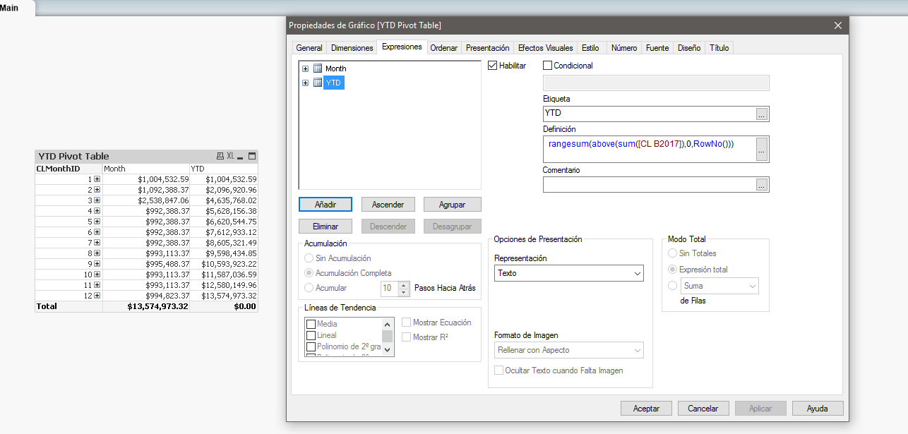
Try this:
=rangesum(above(sum([CL B2017]),0,RowNo()))
- Mark as New
- Bookmark
- Subscribe
- Mute
- Subscribe to RSS Feed
- Permalink
- Report Inappropriate Content
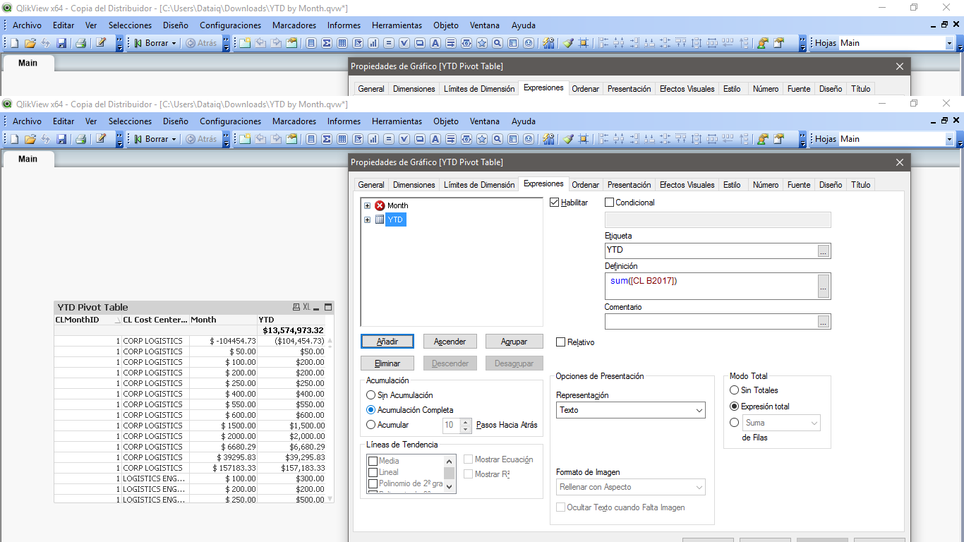
Thanks Raul. You solution does what I want at the month level, but when I expand the next dimension it does not.
See the screen shot attached. When I expand the first two months, for the first month (date in the red box), the Month and YTD should have the same value for each Cost Center. For he second month (highlighted yellow), YTD should be the sum of months 1 and 2 for each Cost Center. For example the YTD total for CORP LOGISTICS in Month 2 should be $104,454 + $120,310 for a displayed total of $224,765 with rounding.
Gareth.
- Mark as New
- Bookmark
- Subscribe
- Mute
- Subscribe to RSS Feed
- Permalink
- Report Inappropriate Content
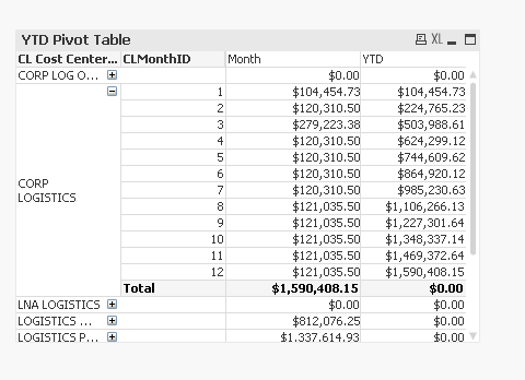
May be some like this?
- Mark as New
- Bookmark
- Subscribe
- Mute
- Subscribe to RSS Feed
- Permalink
- Report Inappropriate Content
A couple of reasons this doesn't work for me.
1. I want Month to be the primary dimension in the left most column
2. As you can see in your screen shot, unless Month is expanded, the YTD is zero.
Maybe what I want can't be accomplished in a Pivot? I have been looking for a solution for some time now with no luck.
I appreciate your ideas though.