Unlock a world of possibilities! Login now and discover the exclusive benefits awaiting you.
- Qlik Community
- :
- All Forums
- :
- QlikView App Dev
- :
- Re: Qlikview 11 sample question
- Subscribe to RSS Feed
- Mark Topic as New
- Mark Topic as Read
- Float this Topic for Current User
- Bookmark
- Subscribe
- Mute
- Printer Friendly Page
- Mark as New
- Bookmark
- Subscribe
- Mute
- Subscribe to RSS Feed
- Permalink
- Report Inappropriate Content
Qlikview 11 sample question
Hi, I will be posting a series of sample questions for qlikview. Please help me to get the answers.
Thanks.
This is the first one.
A customer needs to compare sales results for nine countries over four years for two salespersons. Which Trellis Chart by country should a designer use?
Bar Charts by year by salesperson with grouped style
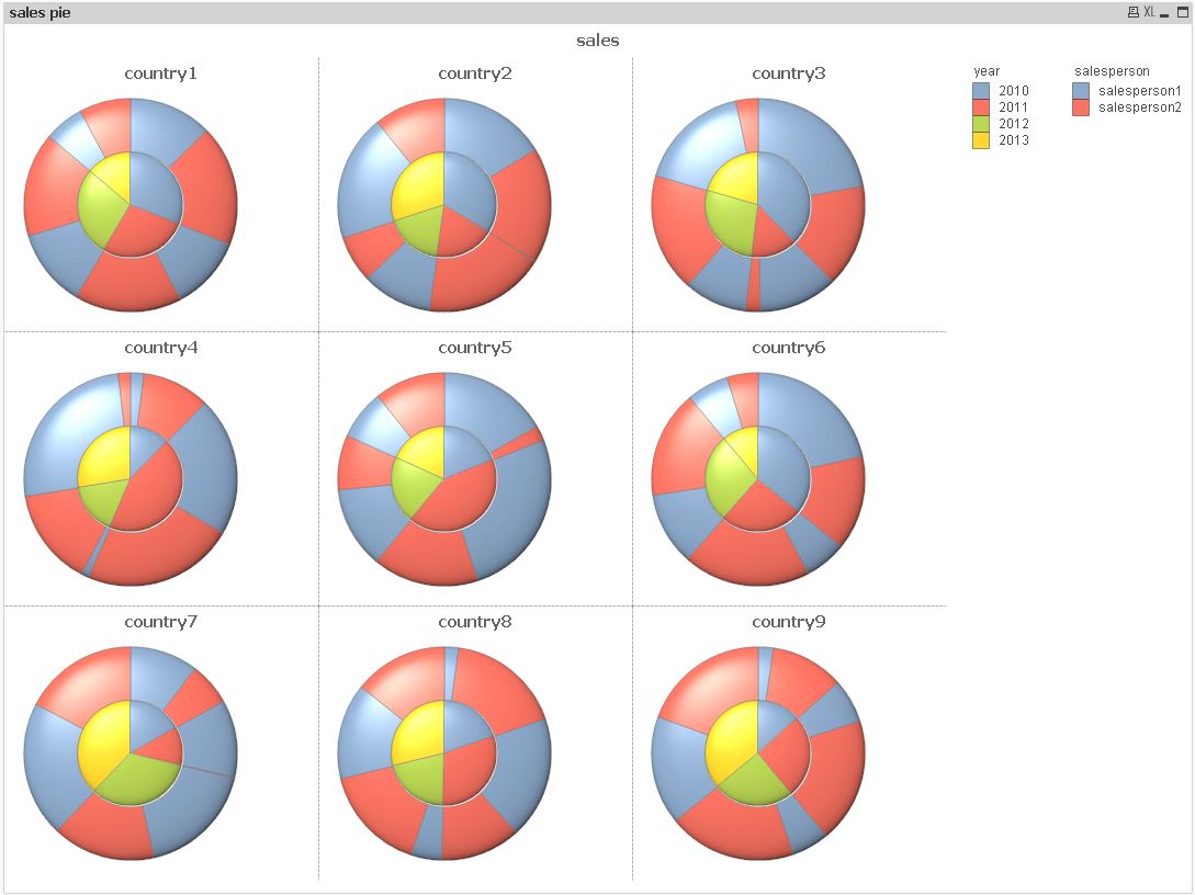
Pie Charts by year by salesperson with 3D style
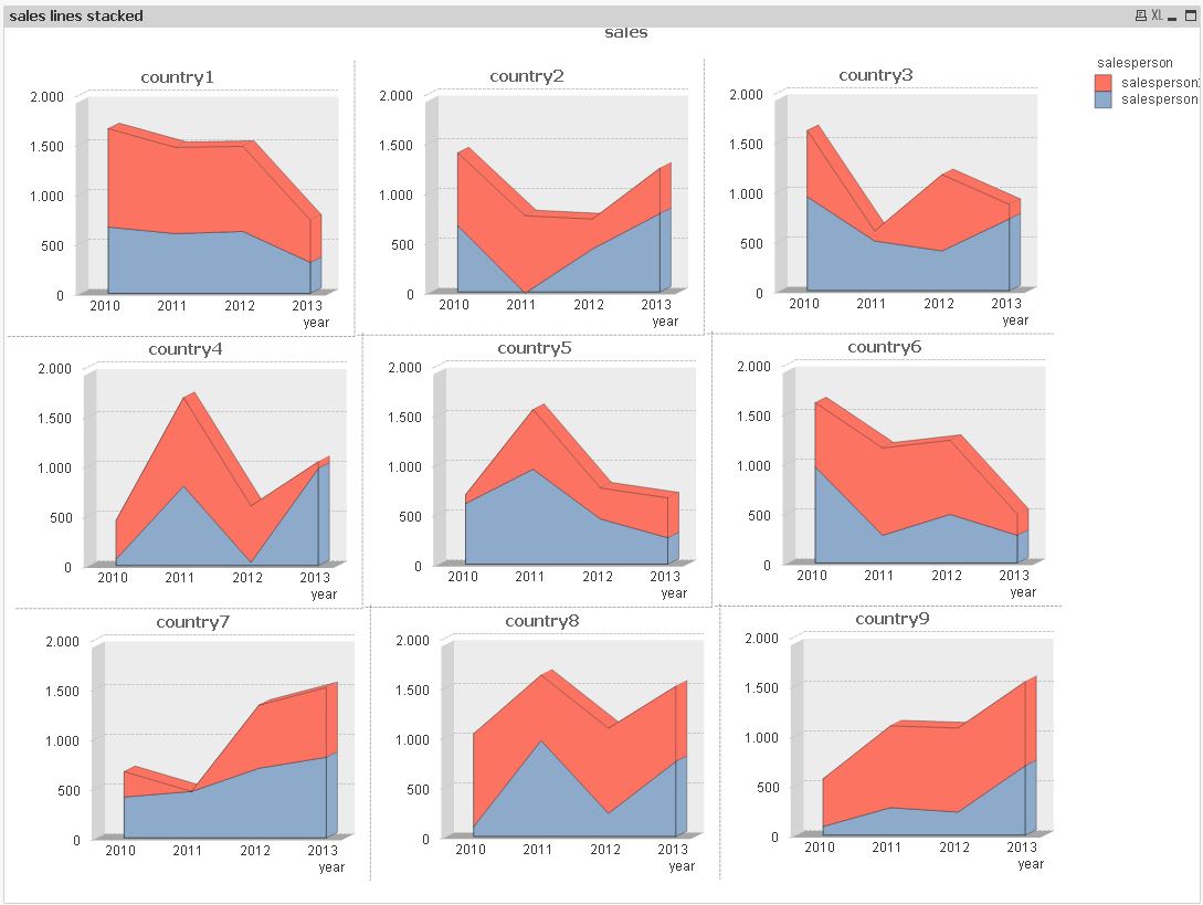
Line Charts by year by salesperson with stacked, 3D style
Block Charts by year by salesperson with stacked style
- Tags:
- new_to_qlikview
- « Previous Replies
-
- 1
- 2
- Next Replies »
- Mark as New
- Bookmark
- Subscribe
- Mute
- Subscribe to RSS Feed
- Permalink
- Report Inappropriate Content
Option 1. Bar Chart
- Mark as New
- Bookmark
- Subscribe
- Mute
- Subscribe to RSS Feed
- Permalink
- Report Inappropriate Content
Why 1 and why not the others ?
- Mark as New
- Bookmark
- Subscribe
- Mute
- Subscribe to RSS Feed
- Permalink
- Report Inappropriate Content
We get the Trellis option only on the 'Bar' charts.
- Mark as New
- Bookmark
- Subscribe
- Mute
- Subscribe to RSS Feed
- Permalink
- Report Inappropriate Content
Thanks. Where is the trellis option ? I tried to create a bar chart, but I could not find a trellis option in its settings.
- Mark as New
- Bookmark
- Subscribe
- Mute
- Subscribe to RSS Feed
- Permalink
- Report Inappropriate Content
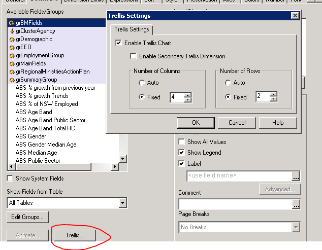
It is available under Dimensions tab
Sent from my iPhone
- Mark as New
- Bookmark
- Subscribe
- Mute
- Subscribe to RSS Feed
- Permalink
- Report Inappropriate Content
- Mark as New
- Bookmark
- Subscribe
- Mute
- Subscribe to RSS Feed
- Permalink
- Report Inappropriate Content
Hi John,
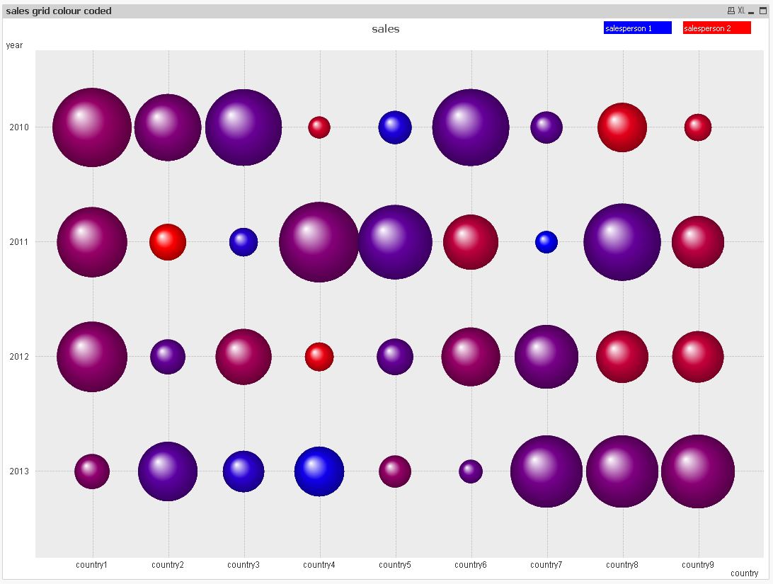
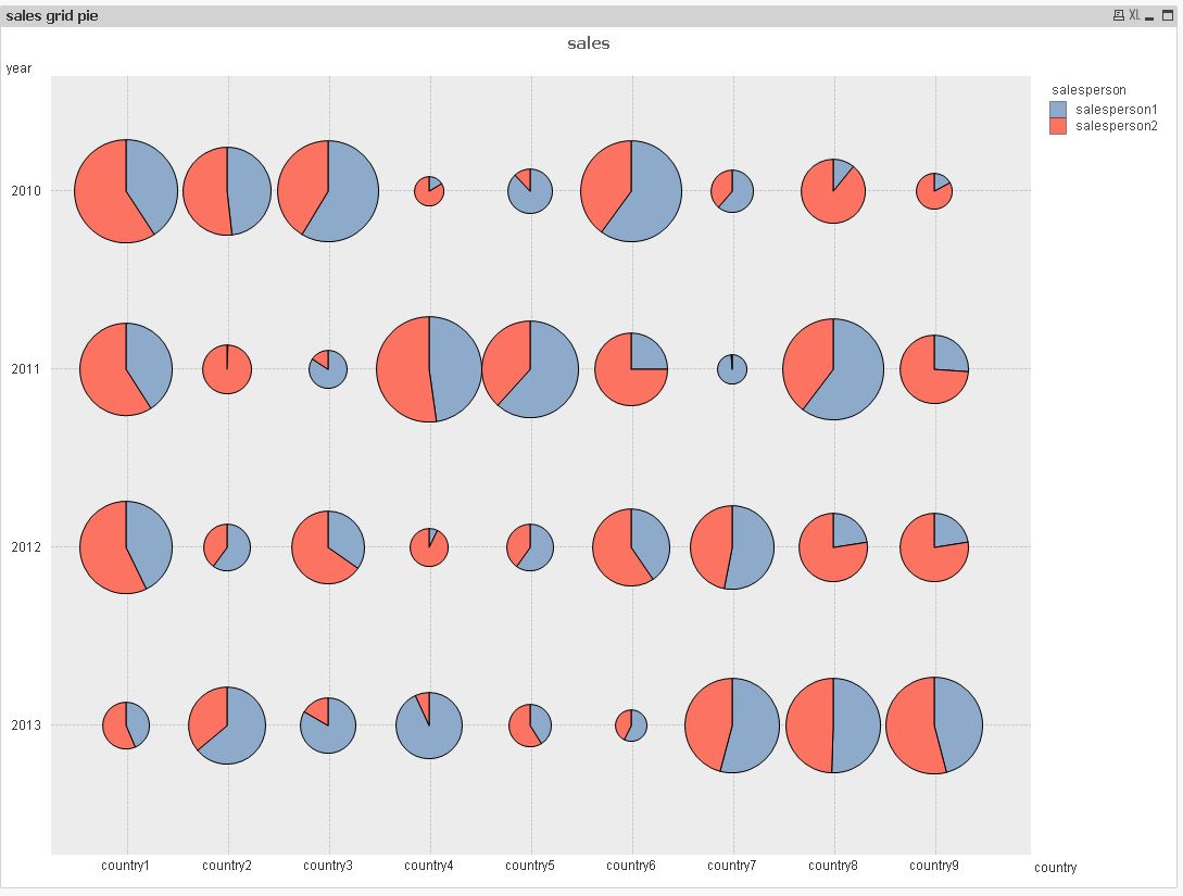
my favorites are bar charts and the grid chart for these cases.
For only two values in the salesperson dimension, you could color code the salesperson, e.g. like this:
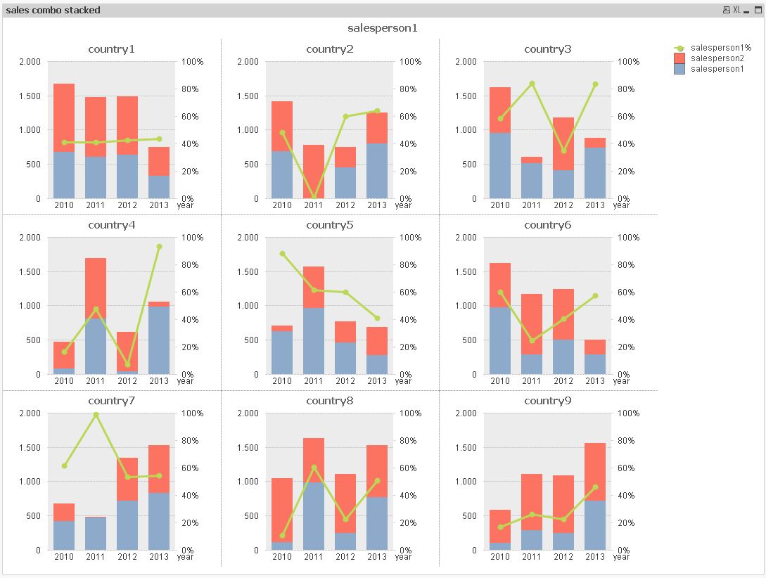
my second favorit is the combo chart with stacked bars and a line that indicates the sales ration of one salesperson:
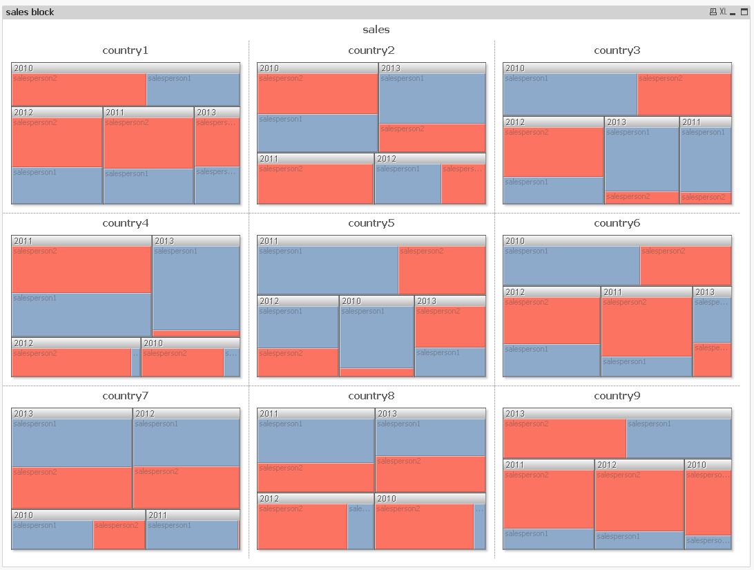
other charts I find inferior to these:
hope this helps
regards
Marco
- Mark as New
- Bookmark
- Subscribe
- Mute
- Subscribe to RSS Feed
- Permalink
- Report Inappropriate Content
Hi, I think most suitable answer is the first one. The ones that mention 3D I think that should be discarded because that visualization style tends to "distract" or alter proportions. And the block chart is almost never a good option over bars or lines. Trellis option is located in dimensions tab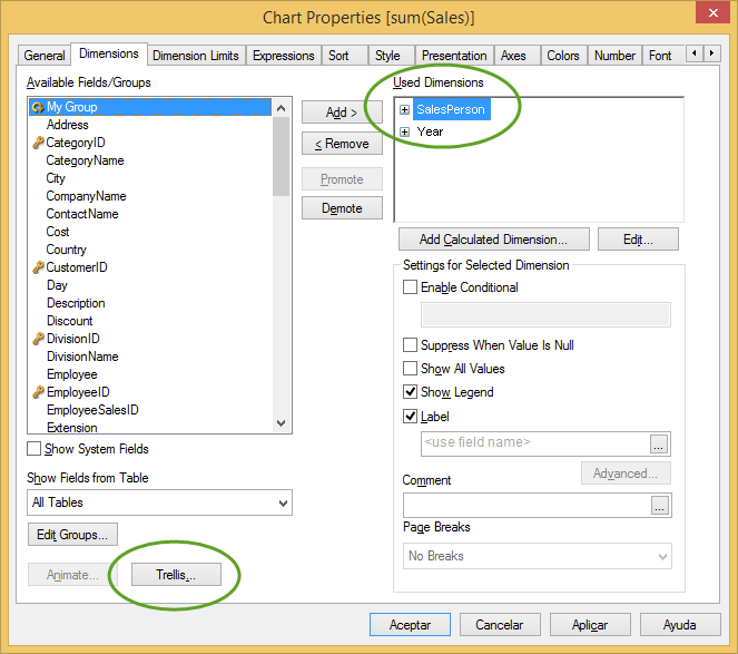
For more data visualization references, read material from Stephen Few,
regards
- Mark as New
- Bookmark
- Subscribe
- Mute
- Subscribe to RSS Feed
- Permalink
- Report Inappropriate Content
Thanks to all for the answers ! I appreciate your help. Btw, where is the mark answer button now ?
- « Previous Replies
-
- 1
- 2
- Next Replies »