Unlock a world of possibilities! Login now and discover the exclusive benefits awaiting you.
- Qlik Community
- :
- All Forums
- :
- QlikView App Dev
- :
- Re: Qlikview client activity
- Subscribe to RSS Feed
- Mark Topic as New
- Mark Topic as Read
- Float this Topic for Current User
- Bookmark
- Subscribe
- Mute
- Printer Friendly Page
- Mark as New
- Bookmark
- Subscribe
- Mute
- Subscribe to RSS Feed
- Permalink
- Report Inappropriate Content
Qlikview client activity
Hi all,
I'm trying to make a clear view of the client activity. I've done the following thing 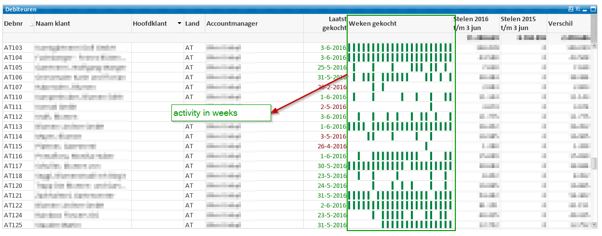
Here you can see the activity per week per client for the current year.
To make it more clear i would like to make the week where was no activity for the client red (instead of empty). I've tried the following adjustments but it didn't worked out yet.
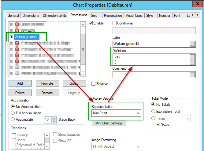
if(
sum({$<jaar = {"$(=Year(Today()))"}>} LEVTOTAAL)>0,
If(
sum({$<jaar = {"$(=Year(Today()))"}>} LEVTOTAAL)>0,
1,
-1)
)
Anyone who tried to do something similar and can help me out?
- Mark as New
- Bookmark
- Subscribe
- Mute
- Subscribe to RSS Feed
- Permalink
- Report Inappropriate Content
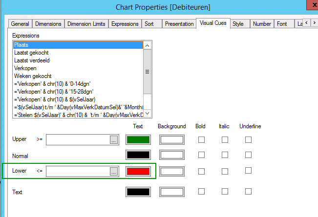
Hi Rob, in this situation maybe you can do a trick to color the minichart bars:
Set an expression that returns '1' for the blue green bars and '1-0.001' (a little less than '1') for the red bars.
In the minichart configuration you can set a color for the max values ('1') and a color for the min values ('1-0.001')
- Mark as New
- Bookmark
- Subscribe
- Mute
- Subscribe to RSS Feed
- Permalink
- Report Inappropriate Content
Hi Ruben,
A you can see in the expression I tried to give the sum of LEVTOTAAL value 1 when positive, otherwise a -1.
if(
sum({$<jaar = {"$(=Year(Today()))"}>} LEVTOTAAL)>0,
If(
sum({$<jaar = {"$(=Year(Today()))"}>} LEVTOTAAL)>0,
1,
-1)
)
- Mark as New
- Bookmark
- Subscribe
- Mute
- Subscribe to RSS Feed
- Permalink
- Report Inappropriate Content
Hi Rob, my trick is to show all bars almost equal in heigth, so instead of a '-1' you need to set a value wich is almost '1' like '1-1/100'. Visually it will look as equal bars but qlikview can identify wich bars are higher and set the colors according to the max and min values.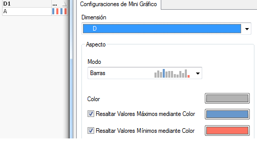
- Mark as New
- Bookmark
- Subscribe
- Mute
- Subscribe to RSS Feed
- Permalink
- Report Inappropriate Content
BTW, the expression maybe should be:
if(
sum({$<jaar = {"$(=Year(Today()))"}>} LEVTOTAAL)>0, 1, 1-1/100) //change '100' to '1000' or '10e6' if bars don't look equal
)